Home › Workflows › Custom highlight style
Custom highlight style
By the end of this you will have your own hover feedback style, usable by any interaction.
Steps
- Create a Blueprint deriving from
BPC_Highlight. - Override
StartHighlightandEndHighlightwith your effect. - Override
UpdateColorif your effect is colour-driven. - Set your new class as Highlight Class on any interaction component.
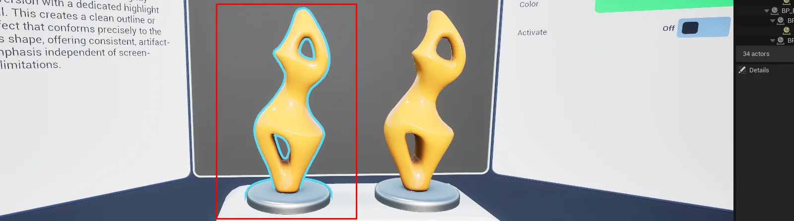
AFS_Core_Highlight_styles.pngThe three shipped highlight styles compared
Notes
The base class handles the lifetime for you: TickHighlight is called every frame while hovering,
and EndHighlight fires automatically once those calls stop. You never need to detect unhover.
Look at the three shipped styles for reference — BPC_Highlight_Material drives material parameters,
BPC_Highlight_MeshCopy spawns duplicate geometry, and BPC_Highlight_PostProcess uses a shared
stencil-based outline.