AFA_Colors
A palette of colour data assets in light, base and dark variants, referenced by UI and highlight code.
What it gives you
- A consistent named palette
- Three tones per hue
- Colours as assets rather than literals
Requires
None
Required by
Description
Colours are data assets rather than literal values so they can be referenced by name across the framework and swapped centrally. Each hue ships in three tones — base, light and dark — covering amber, blue, brown, cyan, gray, green, indigo, lime, orange, pink, purple, red, teal, yellow, plus black and white.
Notification colours, highlight colours and UI accents all reference these rather than hard-coding values.
Setup
- Enable
AFA_Colors. - Reference the
DA_Color_*assets wherever aPDA_Coloris requested.
Usage
Using a colour
Pass the data asset where a PDA_Color parameter appears, for example in
Notification_ShowDefaultNotification.
Adding your own
Duplicate a shipped colour asset into your project content and edit it.
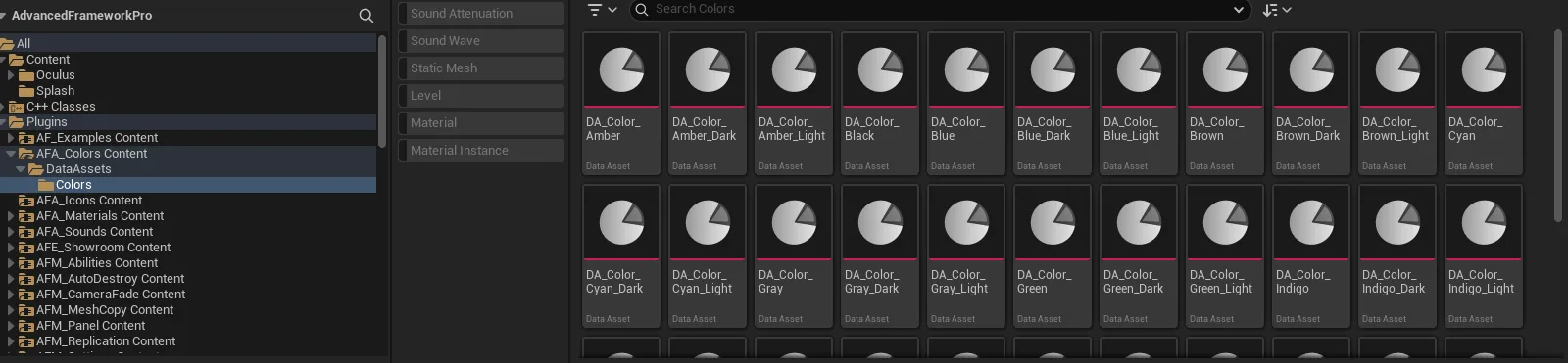
Key properties
| Property | When to change |
|---|---|
| Colour value | On a duplicate in your own content, never on the shipped assets |
Extending
Create additional PDA_Color assets in your project content.
Example map
Used throughout the UI and notification examples.
Troubleshooting
A colour looks wrong under a theme. Colour assets are absolute; theme ramps are relative. Use theme colours for anything that should change with the theme.
API reference
Every blueprint asset in this plugin. Expand an asset to see its members.
DataAssets
PDA_Color2 members
| Kind | Name | Signature | Description |
|---|---|---|---|
| var | Color | LinearColor | The colour this asset stands for. Widgets and highlights take their colour from the asset rather than a literal value, so changing it here restyles everything that references it. |
| fn | getColor | (out Color: LinearColor) | Returns the colour held by this asset. Use it wherever a plain colour value is needed, so the reference to the asset is kept and the value stays in one place. |