AFS_UI_Labels
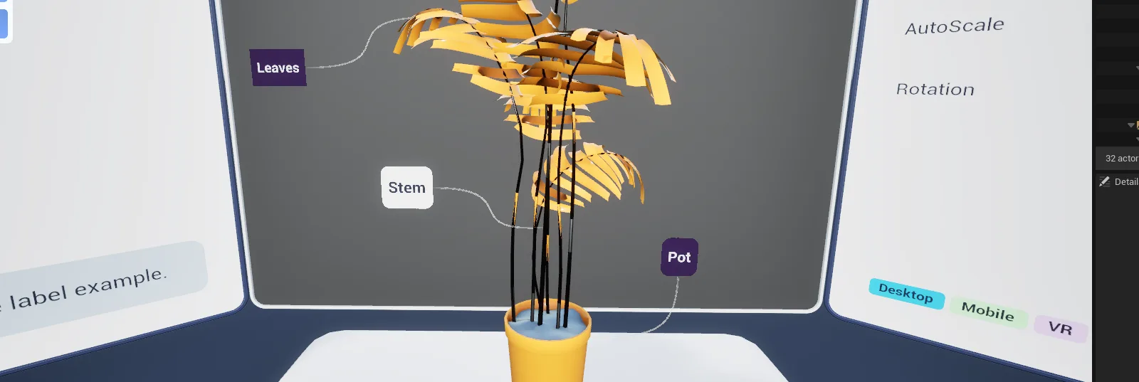
World-space labels attached to actors, in simple and info variants, with a helper that keeps them facing the player.
What it gives you
- Text labels that track objects in world space
- Simple and richer info variants
- Automatic orientation toward the player
Requires
Required by
Description
Labels annotate objects in the world. BPC_Label_Simple shows a single line of text;
BPC_Label_Info supports a richer layout with a title, body and icon. Both use BP_Helper_Label to
stay oriented toward the player and to fade with distance.
Labels are components rather than actors so they move with whatever they annotate, including objects the player is carrying.
Setup
- Enable
AFS_UI_Labels. - Add
BPC_Label_SimpleorBPC_Label_Infoto the actor. - Set the label text and position the component where the label should float.
Usage
Showing and hiding
Labels can be driven from an interaction — show on hover by binding to the interaction's highlight delegate, so annotation appears only when relevant.
Styling
Labels use the active theme, so they restyle with everything else.
Key properties
| Property | When to change |
|---|---|
| Label text | The content shown |
| Frame widget | Swap WBP_LabelFrame for a custom frame |
Extending
Derive from WBP_Label for custom label layouts, or from BPC_Label for new label behaviours.
Performance notes
Each label is a world-space widget. Use distance fade and keep Draw Size modest when labelling many objects.
Example map
Map_Examples_Labels shows both variants on several objects.
Troubleshooting
Labels face the wrong way. The helper orients toward the local player's camera; in multiplayer confirm you are testing on the owning client.
API reference
Every blueprint asset in this plugin. Expand an asset to see its members.
Components
BPC_Label34 members
| Kind | Name | Signature | Description |
|---|---|---|---|
| var | SplineAttachComponentTagAttach|Spline | name | Component tag the label searches its owner for at start-up to decide where the spline is pinned. The first matching scene component becomes the far end of the curve; with no match the spline has nothing to point at and is never drawn. |
| var | SplineAttachSocketAttach|Spline | name | Socket on the tagged attach component that the far end of the spline is pinned to. Leave it as None to use the component's own origin. |
| var | UseSplineAttach|Spline | bool | Whether a curved line is drawn between the label and its attach point. Read when the label is spawned; the spawned label builds the spline mesh and collapses it again when the label is hidden. |
| var | SplineWidthAttach|Spline | float | Radius of the spline mesh in centimetres, 0.12 by default. The spawned label multiplies it by the square root of its own world scale, so the line keeps its thickness on a scaled label. |
| var | SplineColorAttach|Spline | LinearColor | Colour set on the spline material's colour parameter. Change it at runtime through Set Spline Colour, which also repaints a label that is already in the world. |
| var | SplineSourceDirectionAttach|Spline | E_Label_Direction | Which way the spline leaves the attach point: Automatic aims it straight at the label, Source Vector follows the attach component's forward vector, and Up Vector lifts it along world up. Tangent length at that end is scaled by the Spline Tangent Multiplier. |
| var | UseArrowAttach|Arrow | bool | Whether the label frame shows its pointer arrow on the edge given by Direction. Read when the label is spawned, so Set Use Arrows does not change a label that is already up. |
| var | SplineTangentMultiplierAttach|Spline | float | Multiplier on the tangent length at the attach end of the spline, 2.5 by default. Larger values bow the curve further out before it turns back towards the label. |
| var | DirectionAttach | E_UI_Direction_2D | Edge of the label the spline and the arrow leave from, Down by default. It also picks the tangent direction at the label end of the curve, so it decides how the line bends into the frame. |
| var | SplineMaterialAttach|Spline | MaterialInterface | Material the spline mesh is built with, handed to the spawned label along with the rest of the spline settings. The spline colour is set as a parameter on it, so a material with no colour parameter ignores Set Spline Colour. |
| var | CustomThemeTheme | BP_PDA_Theme | Theme override handed to the spawned label's widget component. Leave empty to follow the theme in use across the game. |
| var | ScaleCurveAuto Scale | CurveFloat | Curve driving how the label scales with camera distance, passed to the label as it spawns. Leave empty to keep the label at its authored size; Update Scale Curve swaps it on a label that is already up. |
| var | UseAutomaticDisappearOnDistanceDistance Hide | bool | Whether the label hides itself while the camera sits outside the minimum and maximum disappear distances. The check runs every two seconds while the component is active, and stops entirely when the component is deactivated. |
| var | MaxAutomaticDisappearDistanceDistance Hide | float | Distance in centimetres beyond which the label hides itself, 500 by default. A ten per cent deadzone either side of the boundary stops it flickering on and off as you walk away. |
| var | MinAutomaticDisappearDistanceDistance Hide | float | Distance in centimetres below which the label hides itself again. Leave at zero so it only ever disappears for being too far off. |
| var | RotateToPawnAuto Rotate | E_Label_CameraRotation | How the spawned label turns towards the camera each frame: not at all, yaw only, yaw clamped to the Angle Limitation, or all three axes. Update Rotate changes it on a label that is already in the world. |
| var | RotationInterpolationSpeedAuto Rotate | float | Speed at which the label interpolates round to face the camera, 4 by default. Only read while Rotate To Pawn is set to something other than No Rotation. |
| var | AngleLimitationAuto Rotate | float | Maximum yaw in degrees the label may swing away from its resting orientation, 40 by default. Only applied in the limited rotation mode, where the label follows the camera until it reaches this angle and is then clamped. |
| var | LabelClassClasses | Class<BP_Helper_Label> | Actor class spawned to carry the label in the world, normally the label helper shipped with the plugin. Every style, rotation and distance setting on the component is passed into it on spawn, and nothing appears at all while it is empty. |
| var | LabelWidgetClassClasses | Class<WBP_Label> | Widget class created on the spawned label. The info and simple label components each default this to their own widget, so set it only when you have built a label widget of your own. |
| var | LabelCollisionGeneral | bool | Whether the spawned label's widget surface takes part in pointer traces. Switch it off for a purely decorative label that should never swallow a laser or a touch. |
| var | SocketProtected | ST_Socket | Scene component and socket the far end of the spline is pinned to, normally filled in at start-up from the Spline Attach Component Tag. Set it through Update Attach Socket rather than by hand: a socket already valid at begin play skips the whole start-up path, so no label is spawned. |
| fn | DrawDebugDisappearDistanceDisappear | () | Draws two white debug spheres at the minimum and maximum disappear distances and leaves them up for fifteen seconds. Meant to be pressed in the editor while placing a label, to see where it hides itself. |
| fn | SetSplineColorStyle | (SplineColor: LinearColor) | Recolours the spline, storing the value and pushing it straight to a label that is already in the world. Unlike the other style setters, it takes effect without respawning the label. |
| fn | SetUseArrowsStyle | (UseArrow: bool) | Records whether the label frame should carry its pointer arrow. Only the stored value changes, so a label already in the world keeps the arrow it was spawned with until it is hidden and shown again. |
| fn | SetDirectionStyle | (Direction: E_UI_Direction_2D = "Left") | Sets the edge the spline and arrow leave from and forwards it to a label already in the world, which recomputes its curve. The frame's arrow is placed when the widget is built, so it follows on the next spawn. |
| fn | CheckToSpawnAndSetTickTick | () | Shows the label while the component is active and the camera is inside the disappear window, and hides it otherwise. Internal; it runs after every activation, deactivation and distance check. |
| fn | UpdateAttachSocketAttach | (AttachSceneComponent: ST_Socket) | Repoints the far end of the spline at another scene component and socket, forwarding the change to a label that is already in the world. Use it when the thing being labelled is built at runtime. |
| event | ShowLabel | (Set: bool) | Spawns the label actor and attaches it to this component, or asks an existing one to fade out and destroy itself. Requests matching the current state are ignored, and every style, rotation and distance setting on the component is copied into the label as it spawns. |
| event | OnComponentActivated_Event_0 | (Component: ActorComponent, bReset: bool) | Internal handler that starts the distance check and shows the label when the component is activated. |
| event | OnComponentDeactivated_Event_0 | (Component: ActorComponent) | Internal handler that stops the distance check and hides the label when the component is deactivated. |
| event | CheckForAutomaticDistanceDespawn | (Set: bool) | Starts or stops the two second loop that measures camera distance against the minimum and maximum disappear distances and shows or hides the label as it crosses them. Passing false only stops the loop; the label keeps whatever state the last check left it in. |
| event | UpdateRotate | (RotateToPawn: E_Label_CameraRotation) | Changes how the label turns towards the camera and applies it to a label already in the world, without respawning it. |
| event | UpdateScaleCurve | (ScaleCurve: CurveFloat) | Swaps the curve driving the label's scale with distance, both on the component and on a label already in the world. |
BPC_Label_Info8 members
| Kind | Name | Signature | Description |
|---|---|---|---|
| var | TitleContent | text | Heading line of the label, reading Label until you change it. It sits in the text column that the label's button folds away, and collapses when left empty. |
| var | SubtitleContent | text | Second line, shown under the heading in the same folding column. Leave empty for no subtitle; the block collapses rather than leaving a gap. |
| var | ContentContent | text | Body text of the label, shown under the subtitle in the folding column. Leave empty to collapse the block. |
| var | ButtonContentContent | ST_Button_Content | Text and image shown on the large button that folds the label's text column away. Change it at runtime through Update Button Content. |
| event | UpdateTitle | (Title: text) | Replaces the heading and broadcasts On Content Updated, which makes the label widget re-read all four content values at once. |
| event | UpdateSubtitle | (Subtitle: text) | Replaces the subtitle and broadcasts On Content Updated, which makes the label widget re-read all four content values at once. |
| event | UpdateContent | (TextBody: text) | Replaces the body text and broadcasts On Content Updated, which makes the label widget re-read all four content values at once. |
| event | UpdateButtonContent | (ButtonContent: ST_Button_Content) | Replaces the text and image on the label's button and broadcasts On Content Updated, which makes the label widget re-read all four content values at once. |
BPC_Label_Simple2 members
| Kind | Name | Signature | Description |
|---|---|---|---|
| var | TitleContent | text | Single line of text carried by the simple label, reading Label until you change it. It is the only content this label shows; change it at runtime through Update Title. |
| event | UpdateTitle | (Title: text) | Replaces the title and broadcasts On Content Updated, which makes the simple label widget re-read it. |
Helpers
BP_Helper_Label26 members
| Kind | Name | Signature | Description |
|---|---|---|---|
| var | DirectionAttach | E_UI_Direction_2D | Edge of the label the spline leaves from, Left by default. It sets the tangent direction at the label end of the curve; the label component supplies it on spawn. |
| var | UseSplineSpline | bool | Whether the curved line to the attach point is built. Set Spline creates the spline component and its mesh helper when it is switched on and destroys both when it is switched off. |
| var | SplineMaterialSpline | MaterialInterface | Material the spline meshes are built with, handed to the spline helper as the spline is created. The spline colour is set as a parameter on it. |
| var | SplineSizeSpline | float | Radius of the spline mesh in centimetres, 0.12 by default, multiplied by the square root of the rotate handle's world scale so the line keeps its thickness on a scaled label. |
| var | SplineColorSpline | LinearColor | Colour set on the spline material's colour parameter. Set Spline Colour changes it on a spline that is already built. |
| var | SplineSourceDirectionSpline | E_Label_Direction | Which way the spline leaves the attach point: Automatic aims it at the label, Source Vector follows the attach component's forward vector, and Up Vector lifts it along world up. |
| var | TangentMultiplierSpline | float | Multiplier on the tangent length at the attach end of the spline, 2.5 by default. Larger values bow the curve further out before it turns back towards the label. |
| var | UseArrowArrow | bool | Whether the label widget shows its pointer arrow on the attach edge, on by default. It is carried over from the label component as the helper spawns and read when the widget is built. |
| var | ThemeDesign | BP_PDA_Theme | Colour and font set copied into the label's widget component while the actor is constructed. Leave empty to follow the theme in use across the game. |
| var | RotateToPawnAuto Rotate | E_Label_CameraRotation | How the rotate handle turns towards the camera: not at all, yaw only, yaw clamped to Max Angle, or all three axes. It is read every tick, so it can be changed while the label is up. |
| var | RotationInterpolationSpeedAuto Rotate | float | Speed at which the rotate handle interpolates round towards the camera, 4 by default. Only read while Rotate To Pawn is something other than No Rotation. |
| var | MaxAngleAuto Rotate | float | Largest yaw in degrees the rotate handle may reach relative to its parent, 40 by default. Only applied in the limited rotation mode, where the handle is clamped after each interpolation step. |
| var | DistanceFloatCurveScale | CurveFloat | Curve driving how the label scales with camera distance, supplied by the label component on spawn. Leave empty to keep the label at its authored size. |
| var | LabelComponent | BPC_Label | Label component that spawned this actor. The label widget reads it back through Get Label Component to find the content it should show, so a helper spawned by hand without one stays blank. |
| var | LabelWidgetGeneral | Class<WBP_Label> | Widget class created on the widget component at begin play, taken from the label component's Label Widget Class. Nothing is drawn while it is empty. |
| var | LabelCollisionGeneral | bool | Whether the label's widget surface takes part in pointer traces. It is copied into the widget component during construction, so it has to be set before the actor is spawned. |
| var | SocketAttach | ST_Socket | Scene component and socket the far end of the spline is pinned to. The curve is only recalculated while this holds a valid component; replace it through Update Socket. |
| fn | SetSplineSpline | (Set: bool) | Builds or tears down the spline. Switching it on adds a spline component under the rotate handle, gives it two points, spawns the spline mesh helper and runs the first curve calculation; switching it off destroys both the component and the helper. |
| fn | SetSplineSizeSpline | (SplineSize: float) | Resizes the spline mesh at both ends, scaling the radius by the square root of the rotate handle's world scale. Stores the value but changes nothing visible while the spline is switched off or not yet built. |
| fn | SetSplineColorSpline | (SplineColor: LinearColor) | Recolours the spline by setting the colour parameter on its material. Safe to call before the spline exists, since the stored colour is applied again when it is built. |
| fn | UpdateSplineCalculationSpline | () | Recomputes both ends of the spline: the far point is pinned to the attach socket in world space, the label end sits on the frame edge given by Direction, and the tangents follow Direction and Spline Source Direction before the meshes are rebuilt. Does nothing unless the spline is switched on and the socket holds a valid component. |
| fn | CheckAndSetTickGeneral | () | Enables the actor's tick only while the label has appeared and its widget has not faded out for distance. Internal; the tick is what turns the label towards the camera. |
| fn | SetDirectionAttach | (Direction: E_UI_Direction_2D = "Left") | Sets the edge the spline leaves the label from and recalculates the curve immediately. |
| fn | UpdateSocketAttach | (Socket: ST_Socket) | Stores a new attach component and socket for the far end of the spline. Nothing is recalculated here; the change is picked up by the next Update Spline Calculation. |
| event | Show | (Set: bool) | Fades the label in or out. Showing expands the spline and then reveals the widget; hiding reverses both and destroys the actor a second later, so a hidden label is gone rather than dormant. Calls matching the current state are ignored. |
| event | OnAutomaticDisappearChanged | () | Internal handler bound to the widget component, re-evaluating whether this actor should tick as the widget fades out or back in with distance. |
Widgets
WBP_Label1 members
| Kind | Name | Signature | Description |
|---|---|---|---|
| fn | getLabelComponent | (out LabelComponent: BPC_Label) | Returns the label component behind this widget, reached through the owning actor of the widget component it sits on. Comes back empty whenever the widget is not hosted on a label, as in the designer preview. |
WBP_Label_Info4 members
| Kind | Name | Signature | Description |
|---|---|---|---|
| fn | getLabelFrame | (out LabelFrame: WBP_LabelFrame) | Returns the frame widget wrapping this label's contents, the one carrying the rounded border and the pointer arrow. |
| event | OnClicked | (Button: WBP_Button) | Bound to the label's large button; folds the column holding the heading, subtitle and body text away, and brings it back on the next press. |
| event | WidgetElement_PostInitiate | () | Called by the widget system once the whole tree has been initiated and themed. Left empty on this label, whose text blocks are filled through On Content Updated instead. |
| event | OnContentUpdated_Event | () | Re-reads the title, subtitle, body text and button content from the info label component and pushes each into its widget. Runs whenever that component broadcasts On Content Updated, and text blocks left empty collapse individually. |
WBP_Label_Simple2 members
| Kind | Name | Signature | Description |
|---|---|---|---|
| event | WidgetElement_PostInitiate | () | Called by the widget system once the whole tree has been initiated and themed. Left empty on this label, whose single text block is filled through On Content Updated instead. |
| event | OnContentUpdated_Event | () | Re-reads the title from the simple label component and pushes it into the text block, which collapses when the title is empty. Runs whenever that component broadcasts On Content Updated. |
Widgets/Frame
WBP_LabelFrame4 members
| Kind | Name | Signature | Description |
|---|---|---|---|
| fn | WidgetElement_getNamedSlots | (out Slots: NamedSlot[]) | Returns the frame's single content slot, so that whatever you drop inside the rounded border is initialised and themed with the rest of the tree. |
| event | SetDirection | (UseDirection: bool, Direction: E_UI_Direction_2D) | Moves the arrow to the middle of one of the frame's four edges and turns it to point outwards along that edge. Pass Use Direction as false to collapse the arrow and leave a plain frame. |
| event | WidgetElement_UpdateTheme | (Theme: BP_PDA_Theme, Desktop: bool) | Called on every element when a theme is applied to the widget tree. Left empty here, since the rounded border reads the theme in its own right and the arrow is a fixed texture. |
| event | WidgetElement_PostInitiate | () | Called by the widget system once the whole tree has been initiated and themed. Nothing extra runs for the frame; override it in your own frame for set-up that needs the finished tree. |