AFS_UI_Notifications
Transient notifications shown in a stacking container, with a default styled variant and a one-call library.
What it gives you
- Fire-and-forget notifications from anywhere
- Automatic stacking and expiry
- Themed styling with icon, colour and sound
Requires
Required by
None
Description
Notifications are the framework's answer to "tell the player something happened without interrupting
them". BFL_Notifications.Notification_ShowDefaultNotification takes a pawn, an icon, text, a colour,
a duration and a sound, and handles everything else — creating the notification object, placing it in
the container, stacking it with any others and removing it when it expires.
Because it resolves the container through the pawn, the same call works in VR where notifications appear in spatial UI, and on desktop where they appear on the HUD.
Setup
- Enable
AFS_UI_Notifications. - Confirm the pawn has the spatial UI or HUD ability the container needs.
- Call the library function from anywhere with a pawn reference.
Usage
Showing a notification
Call Notification_ShowDefaultNotification with the pawn, an icon texture, the text, a
PDA_Color and a duration. Six seconds is the default and works for most messages.
Custom notifications
Derive from BP_Notification and WBP_Notification for a different layout, then spawn it through
SpawnInsideNotificationContainer.
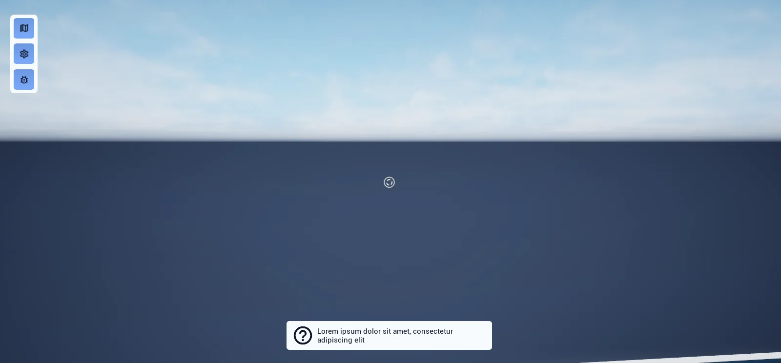
Key properties
| Property | When to change |
|---|---|
Duration | Time on screen; raise for longer messages |
Color | Use the colour data assets so notifications match the theme |
Extending
Derive from BP_Notification and WBP_Notification together — the object holds the data, the widget draws it.
Example map
Map_Examples_Notifications shows several notification types.
Troubleshooting
Nothing appears. The pawn lacks the UI ability that hosts the notification container.
API reference
Every blueprint asset in this plugin. Expand an asset to see its members.
Blueprints
BP_Notification5 members
| Kind | Name | Signature | Description |
|---|---|---|---|
| var | PawnInfo | Pawn | Owning pawn whose HUD this notification is shown on, normally set as the object is created. The notification container is added to that pawn's HUD component, so nothing appears when the pawn is empty or has no such component. |
| var | Widget_ClassInfo | Class<WBP_Notification> | Widget design the container creates for this notification, which is the default notification widget on the shipped subclass. Not exposed on spawn, so set it on the notification object before calling Spawn Inside Notification Container if you have written a design of your own. |
| var | DurationInfo | float | How long the notification is meant to stay on screen, in seconds: six when spawned through Show Default Notification, ten by default on the notification object itself. Neither the container nor the widget reads it, so a notification stays up until Despawn Notification is called for it. |
| var | SoundSound | SoundBase | Cue carried with the notification for its appearance. Leave it empty and Spawn Inside Notification Container writes the shipped notification cue in, rather than passing the widget an unset sound. |
| fn | Spawn Inside Notification Container | (out Witget: WBP_Notification) | Puts this notification on screen and returns the widget created for it. Falls back to the shipped notification cue when no sound is set, adds the notification container to the pawn's HUD at Z-order 10 unless it is already open, then asks that container to spawn the widget. Does nothing at all when the pawn has no HUD component. |
BP_Notification_Default3 members
| Kind | Name | Signature | Description |
|---|---|---|---|
| var | IconContent | Texture2D | Texture the default notification design shows in its icon image, applied when Update Icon is called on the widget with it. The image collapses while no texture is set. |
| var | TextContent | text | Message the default notification design displays, applied when Update Body is called on the widget with it. The text block collapses while the message is empty. |
| var | ColorStyle | PDA_Color | Colour asset the default notification design outlines itself with, applied when Update Colour is called on the widget with it. Leave it empty and the outline falls back to the theme's background colour. |
Libraries
BFL_Notifications1 members
| Kind | Name | Signature | Description |
|---|---|---|---|
| fn | Notification_ShowDefaultNotificationNotifications | (Pawn: Pawn, Icon: Texture2D, Text: text, Color: PDA_Color, Duration: float = 6, Sound: SoundBase, __WorldContext: Object, out Witget: WBP_Notification) | Builds a default notification from the icon, text, colour, duration and sound given, puts it on the pawn's HUD and returns the widget created for it. The pawn needs a HUD component; without one nothing is shown and the widget comes back empty. Duration is six seconds on this pin, where the notification object's own default is ten. |
Widgets
WBP_Notification4 members
| Kind | Name | Signature | Description |
|---|---|---|---|
| var | NotificationContent | BP_Notification | The notification object this widget was spawned for, handed over by the container as it creates the widget. The container matches on it to find the right widget when Despawn Notification is called with an object, and a design of your own takes its content from here. |
| fn | WidgetElement_getNamedSlots | (out Slots: NamedSlot[]) | Returns the single notification slot inside the fixed 1200-unit-wide size box, so that whatever a notification design places there is initiated and themed with the rest of the tree. |
| event | DespawnNotification | () | Fades the notification out and removes it from the screen. Its Z-order drops to zero first, so it passes behind the notifications still standing, and On Despawn is broadcast once the animation finishes, which is what takes it out of the container's list. |
| event | WidgetElement_PostInitiate | () | Called once the whole widget tree has been initiated and themed. Empty on the notification base, which is where a design of your own reads the Notification object and fills itself in. |
WBP_Notification_Default4 members
| Kind | Name | Signature | Description |
|---|---|---|---|
| event | UpdateIcon | (Icon: Texture2D) | Replaces the texture in the notification's icon, which collapses when no texture is passed. Call it once the widget exists; the icon held on the notification object is not read for you. |
| event | UpdateBody | (Text: text) | Replaces the notification's message text, which collapses when the text is empty. Call it once the widget exists, since the text held on the notification object is not read for you. |
| event | UpdateColor | (SideColor: PDA_Color) | Recolours the rounded outline around the notification, wrapping the colour asset given as a custom colour at high intensity. Pass nothing and the outline reverts to the theme's background colour at that same intensity. |
| event | WidgetElement_PostInitiate | () | Called once the whole widget tree has been initiated and themed. Left empty here, so the icon, message and outline colour stay as the designer left them until Update Icon, Update Body and Update Colour are called. |
Widgets/Container
WBP_NotificationContainer3 members
| Kind | Name | Signature | Description |
|---|---|---|---|
| fn | SpawnNotificationNotifications | (Notification: BP_Notification, out Widget: WBP_Notification) | Creates the widget named by the notification's Widget Class, subscribes to its On Despawn and adds it to the canvas, auto-sized and anchored to the bottom centre directly above the notifications already showing, so the stack grows upwards. Called for you by Spawn Inside Notification Container. |
| fn | DespawnNotificationNotifications | (Notification: BP_Notification) | Fades out every widget in this container showing the given notification object, by calling Despawn Notification on each of them. Passing an object the container is not showing does nothing. |
| event | DespawnMessage_Event | (Notification: WBP_Notification) | Internal handler bound to each notification widget's On Despawn delegate. Takes that widget out of the list and closes the container itself once the last notification has gone. |