AFE_Showroom
The demo shell: game mode, game state, player controller, the three showroom pawns, motion controller variants and the navigation menu.
What it gives you
- A working project shell to subclass
- Pawns with the common abilities already attached
- Controller-mesh and hand-mesh motion controller variants
- Level navigation UI
Requires
AFM_Abilities AFM_CameraFade AFM_Panel AFM_Replication AFM_Settings AFM_Spawner AFM_Spectator AFM_State AFM_Visibility AFS_Core_Loading AFS_Core_Pawn AFS_Core_Snapping AFS_Libraries AFS_UI AFS_UISpace_Hand AFS_UISpace_Pawn AFS_UI_Labels AFS_UI_Menu AFS_UX_Gaze AFS_UX_Grip AFS_UX_Laser AFS_UX_Locomotion AFS_UX_Overlap AFS_UX_Select AFS_UX_Teleporter
Required by
Description
The Showroom is the framework assembled into something runnable. It is also the recommended starting
point for a real project: rather than wiring a pawn from the raw base classes, subclass
BP_Pawn_VR_Char_Showroom and remove what you do not need.
It ships four motion controller variants — controller mesh and hand mesh, left and right — so you can switch between controller-based and hand-tracked interaction by changing two class references on the pawn.
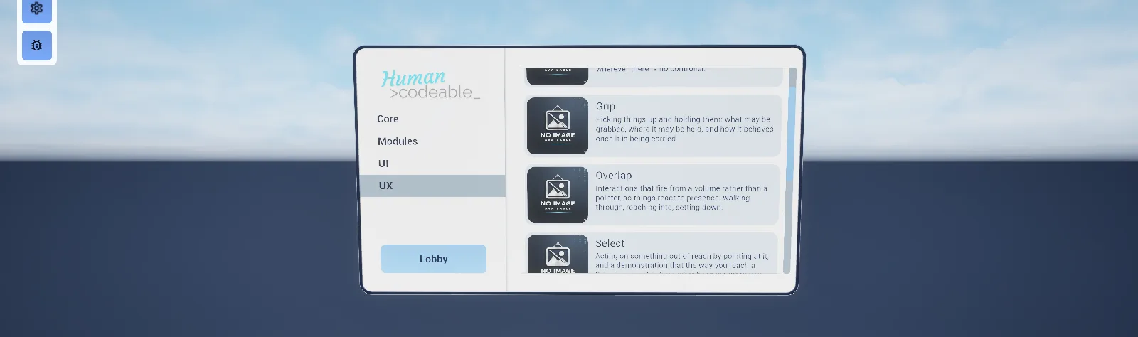
The navigation system demonstrates level switching between the example maps and is a reasonable model for a project's own level select.
Setup
- Enable
AFE_Showroom. - Subclass
BP_GameMode_Showroomand the pawns you need into your own content. - Assign your subclasses in your
PDA_Level.
Subclass rather than edit. Editing the Showroom directly means merging on every framework update.
Usage
Switching between controllers and hands
Change Left Controller and Right Controller on the VR pawn between the
BP_MotionController_Controller_* and BP_MotionController_Hands_* variants.
Building your own navigation
BPC_GameState_Navigation and WBP_Navigation show the pattern: a list of level data assets driving
a menu page.
Key properties
| Property | When to change |
|---|---|
Left Controller / Right Controller | Swap between controller and hand variants |
| Navigation level list | The levels offered in the navigation menu |
Extending
Subclass the game mode, game state, player controller and pawns into your own content. This is the intended entry point — see Intended workflow.
Example map
Map_Examples_Lobby is the Showroom in use.
Troubleshooting
My pawn changes disappeared after an update. The Showroom pawn was edited directly rather than subclassed.
API reference
Every blueprint asset in this plugin. Expand an asset to see its members.
DataAssets
PDA_Level_Showroom0 members
No editor-visible members; this asset configures defaults only.
Elements/Navigation/Blueprints
BP_Navigation2 members
| Kind | Name | Signature | Description |
|---|---|---|---|
| event | SwitchLevel | (Level: PDA_Level_Showroom) | Asks for travel to another showroom level from the kiosk actor itself, handing the data asset straight to the server event. The kiosk's own panel goes through the navigation component on the game state instead, so nothing calls this as it stands; it is here for a level blueprint or a subclass of your own. |
| event | Server_SwitchLevel | (Level: PDA_Level_Showroom) | Server event running the loading module's level switch: every player controller fades to black over half a second, then the server travels the whole session to the map named by the data asset with its game mode appended. In the editor it opens the map locally instead. The actor implements the outside pawn RPC marker, which is what lets a placed actor call a server event. |
Elements/Navigation/Components
BPC_GameState_Navigation2 members
| Kind | Name | Signature | Description |
|---|---|---|---|
| event | SwitchLevel | (Level: PDA_Level_Showroom) | Asks for travel to another showroom level. Called by the navigation panels once a level card or the Lobby button has been confirmed; it does nothing itself beyond handing the data asset to the server event, so a client may raise it freely. |
| event | Server_SwitchLevel | (Level: PDA_Level_Showroom) | Server event running the loading module's level switch: every player controller fades to black over half a second, then the server travels the whole session to the map named by the data asset with its game mode appended. In the editor it opens the map locally instead. The component implements the outside pawn RPC marker, which is what allows a game state component to call a server event at all. |
Elements/Navigation/Widgets
WBP_Navigation4 members
| Kind | Name | Signature | Description |
|---|---|---|---|
| event | WidgetElement_PostInitiate | () | Called once the whole widget tree has been initiated and themed. Empty here; the first page of levels appears instead because the pagination menu selects automatically, which raises On Button Selection Changed as soon as the tree is built. |
| event | OnButtonSelectionChanged | (Group: WBP_Group_Button) | Bound to the vertical pagination menu and called when a different group of levels is chosen. Builds a navigation page in the switcher named after the selected index and hands it that group's levels from the navigation component on the game state, so the page fades in with a card per level. |
| event | OnClicked | (Button: WBP_Button) | Bound to the Lobby button and called when it is pressed. Opens a Go to Lobby confirmation overlay offering Cancel and Go, and listens for the answer on On Button Clicked Confirm rather than travelling straight away. |
| event | OnButtonClicked_Confirm | (Confirm: bool) | Called by the confirmation overlay the Lobby button opened, carrying the reader's answer. Asks the navigation component on the game state to switch to its Lobby level when the answer is yes, and does nothing at all when it is no. |
WBP_Navigation_Menu2 members
| Kind | Name | Signature | Description |
|---|---|---|---|
| event | WidgetElement_PostInitiate | () | Called once the whole widget tree has been initiated and themed. Empty here; the first page of levels appears because the horizontal pagination row selects automatically, which raises On Button Selection Changed once the tree is built. |
| event | OnButtonSelectionChanged | (Group: WBP_Group_Button) | Bound to the horizontal pagination row and called when a different group of levels is chosen. Builds a navigation page in the switcher named after the selected index and hands it that group's levels from the navigation component on the game state. |
WBP_Navigation_Page3 members
| Kind | Name | Signature | Description |
|---|---|---|---|
| event | InitiateWithLevels | (const Levels: PDA_Level_Showroom[]) | Fills the page with one card button per level, taking the name and the 500 by 500 square image from each data asset, and keeps the array so a click can be traced back to a level. Called by the navigation panel that spawned the page; calling it a second time appends another set of cards rather than replacing the first. |
| event | OnButtonClicked | (Group: WBP_Group_Button, Index: int, ID: name) | Bound to the card group and called when a level card is picked. Opens a confirmation overlay on the parent widget reading Go to the level's name, offering Cancel and Go, and listens for the answer on On Button Clicked Confirm. The clicked index is remembered on the page, so only the most recent confirmation resolves to the right level. |
| event | OnButtonClicked_Confirm | (Confirm: bool) | Called by the confirmation overlay a level card opened, carrying the reader's answer. Asks the navigation component on the game state to switch to the level at the remembered index when the answer is yes; a no leaves the page as it was. |
Enviroment/Floor/Blueprints
BP_Floor6 members
| Kind | Name | Signature | Description |
|---|---|---|---|
| var | WidthDimensions | float | Size of the floor in one direction, as a multiple of the centre tile: the construction script scales the centre and pushes the matching side and corner pieces out by 50 cm per unit. Clamped to a minimum of 1, which gives the single-tile floor. |
| var | HeightDimensions | float | Size of the floor at right angles to Width, in the same units and clamped the same way. The centre tile is placed turned through 90 degrees, so which of the two runs along which world axis is easier to read off the viewport than off the names. |
| var | PlayerPosition | BP_PlayerPosition | Player start belonging with this floor, held here so the level's spawn point can be moved with it. The construction script never reads it; pass it to Set Transform Of Relevant Actor to place it relative to the floor. |
| var | Navigation | BP_Navigation | Kiosk actor belonging with this floor, giving the level its way out to the other showroom levels. As with the other two slots the floor never reads it on its own, so place it through Set Transform Of Relevant Actor. |
| var | MapInfo | BP_MapInfo | Marker actor naming the level's own data asset for the loading module, held here so it travels with the floor. Nothing in the graph reads it until you place it through Set Transform Of Relevant Actor. |
| fn | SetTransformOfRelevantActor | (Actor: Actor, NewTransform_Location: Vector, Rotation: Rotator) | Moves an actor to a location and rotation expressed in the floor's own space, so the spawn point, kiosk or map marker can be positioned by offset from the floor rather than in world coordinates. Scale is forced back to one. Nothing calls it, so use it from your own construction script or level blueprint. |
Enviroment/SkySphere/Blueprints
BP_Sky3 members
| Kind | Name | Signature | Description |
|---|---|---|---|
| var | Directional light actor | DirectionalLight | Directional light the sphere takes its sun position from; the light's rotation is written into the sky material's light direction parameter when the construction script runs. Leave it empty and the sky falls back to a fixed direction down positive X, which will not match your lighting. |
| var | Refresh material | bool | Editor button in the shape of a tick box: setting it reruns the construction script, which rebuilds the sky's dynamic material and reapplies the light direction, then clears the box again. Use it after moving or turning the directional light. |
| fn | SetLightDirectionParameter | (Material: MaterialInstanceDynamic) | Writes the assigned directional light's rotation, read as a vector, into the given material's light direction parameter, falling back to positive X when no light is assigned. Called by the construction script on the sky's own material; call it yourself for any other material that needs the same sun direction. |
Enviroment/Tables/Blueprints
BP_DemoTable15 members
| Kind | Name | Signature | Description |
|---|---|---|---|
| var | UseTableStyle|Table | bool | Whether the stand shows its table mesh. With it on, the construction script chooses the mesh from Variant and applies Flip; with it off the table is hidden and the other branch runs instead, the one that spaces the widget faces by Width and applies Show Replacement. Those two settings therefore only take effect on a stand without a table. |
| var | VariantStyle|Table | int | Which of the six exhibition table meshes the stand uses, indexed 0 to 5: V shape, V shape narrow, U shape, U shape narrow, half and half narrow. The default of 3 gives the narrow U shape. Read only while Use Table is on. |
| var | FlipStyle|Table | bool | Whether the table mesh is turned through 180 degrees about its up axis, for a stand approached from the other side. Applied by the construction script only while Use Table is on, and the back panel and its widgets do not turn with it. |
| var | ImageInfo | Texture2D | Picture shown at the head of the stand's display card, above the title. Leave it empty and that slot collapses, closing the gap rather than leaving a blank. |
| var | TitleInfo | text | Heading of the display card, naming the feature the stand demonstrates. Leave it empty for a card that starts straight into the description. |
| var | DescriptionInfo | text | Body text of the display card, shown inside a scroll box so a long explanation still fits the card's fixed height. |
| var | ExampleActorConfigurator | Actor | Actor this stand demonstrates. Its state components are what the configurator and display cards turn into rows, each row chosen from the value interfaces that component implements. Leave it empty and both cards come up with no controls on them. |
| var | HideBackpanelStyle|Panel | bool | Meant to suppress the nine-slice panel behind the widgets, but nothing in the graph reads it, so it has no effect as the blueprint stands. Hide the panel component itself, or wire this into the construction script in a subclass. |
| var | WidthStyle|Panel | float | Spread of the two widget faces, adding 80 cm per unit above 1 to a base offset of 120 cm either side of the back panel. Read only in the branch that runs while Use Table is off, so it does nothing on a stand that still shows its table. |
| var | ShowReplacementReplacement | bool | Whether the replacement card is shown in place of the live example. Applied only while Use Table is off, so switching it on for a stand that still shows its table leaves the card hidden. |
| var | Replacement_ImageReplacement | Texture2D | Background picture of the replacement card, sitting behind its title and description. Leave it empty for a plain card. |
| var | Replacement_TitleReplacement | text | Heading of the replacement card, shown in place of the live example while Show Replacement is on. |
| var | Replacement_DescriptionReplacement | text | Body text of the replacement card, shown in a scroll box beneath its title. |
| var | InstructionInfo | text | One-line prompt at the foot of the display card, beside the action icon, telling the reader what to do with the example. Leave it empty for a card that only describes. |
| var | ExampleFlagsInfo | E_Showroom_Flags[] | Tags recording which framework features the stand is there to demonstrate. Nothing in the shipped blueprints reads them, so treat the list as showroom bookkeeping you are free to repurpose. |
Enviroment/Tables/Widgets
WBP_Example_Configurator3 members
| Kind | Name | Signature | Description |
|---|---|---|---|
| fn | getWidgetFromObject | (InputPin: ActorComponent) → Class<WBP_ConfigItem> | Returns the config row class to build for a state component, by asking in turn which value interface it implements: float gives the slider row, boolean the toggle, integer the selector, name the drop-down, trigger the button and colour the swatch. Returns nothing for a component implementing none of them, which leaves it without a row. |
| event | OnPressed | (Button: WBP_Button) | Bound to the Reset button and called when it is pressed. Calls Value Reset on every state component the panel holds, passing the source info of the widget component the panel is shown on, so each control on the table returns to its default in one press. |
| event | WidgetElement_PostInitiate | () | Called once the whole widget tree has been initiated and themed. Empty here, so nothing yet turns State Components into rows in the scroll box or fills the tag row beneath them; that build is the work the override is left for. |
WBP_Example_Display2 members
| Kind | Name | Signature | Description |
|---|---|---|---|
| fn | getWidgetFromObject | (InputPin: ActorComponent) → Class<WBP_ConfigItem> | Returns the config row class to build for a state component, testing boolean first, then float, integer, name and trigger. Names fall to the selector row rather than the drop-down, and no colour row is offered at all, so a colour-valued component gets nothing on this face of the table. |
| event | WidgetElement_PostInitiate | () | Called once the whole widget tree has been initiated and themed. Empty here, so the image, title, description and instruction keep whatever the designer left in them until the demo table writes over them, and no rows are built for State Components. |
WBP_Example_Replacement2 members
| Kind | Name | Signature | Description |
|---|---|---|---|
| fn | getWidgetFromObject | (InputPin: ActorComponent) → Class<WBP_ConfigItem> | Returns the config row class for a state component in the same order the display card uses: boolean, float, integer, name and trigger, with names falling to the selector row. The replacement card shows no controls of its own, so it is here for a subclass that adds them. |
| event | WidgetElement_PostInitiate | () | Called once the whole widget tree has been initiated and themed. Empty here, so the card's background image, title and description keep the placeholders set in the designer until the demo table fills them from its Replacement settings. |
Enviroment/Tables/Widgets/Config
WBP_ConfigItem3 members
| Kind | Name | Signature | Description |
|---|---|---|---|
| var | AssignedComponent | ActorComponent | State component this row reads and writes, passed in when the demo table spawns the row. Nothing in the base class touches it; each row subclass is expected to bind its own control to it. Leave it unset and the row shows a control that drives nothing. |
| fn | WidgetElement_getNamedSlots | (out Slots: NamedSlot[]) | Returns the single config item slot that sits beside the info row's title and caption, so that the control you place there is initiated and themed with the rest of the tree. |
| event | WidgetElement_PostInitiate | () | Called once the whole widget tree has been initiated and themed. Empty on the base row, which is where a row of your own binds the control in its config slot to Assigned Component. |
WBP_ConfigItem_Color1 members
| Kind | Name | Signature | Description |
|---|---|---|---|
| event | WidgetElement_PostInitiate | () | Called once the whole widget tree has been initiated and themed. Empty on the colour row, so the swatch in the config slot neither shows the colour held by Assigned Component nor writes a new one back to it until you bind it here. |
WBP_ConfigItem_DropDown1 members
| Kind | Name | Signature | Description |
|---|---|---|---|
| event | WidgetElement_PostInitiate | () | Called once the whole widget tree has been initiated and themed. Empty on the drop-down row; this is where the list in the config slot is handed the name value interface on Assigned Component, which supplies the options to offer and the one in force. |
WBP_ConfigItem_Selector1 members
| Kind | Name | Signature | Description |
|---|---|---|---|
| event | WidgetElement_PostInitiate | () | Called once the whole widget tree has been initiated and themed. Empty on the selector row; this is where the stepper in the config slot is bound to Assigned Component, which supplies both the choices and the index currently selected. |
WBP_ConfigItem_Slider1 members
| Kind | Name | Signature | Description |
|---|---|---|---|
| event | WidgetElement_PostInitiate | () | Called once the whole widget tree has been initiated and themed. Empty on the slider row, so the slider in the config slot is not yet driven by the float value on Assigned Component, and a drag is not written back to it. |
WBP_ConfigItem_Toggle1 members
| Kind | Name | Signature | Description |
|---|---|---|---|
| event | WidgetElement_PostInitiate | () | Called once the whole widget tree has been initiated and themed. Empty on the toggle row, so nothing yet ties the switch in its right-aligned config slot to the boolean value on Assigned Component; that binding belongs here. |
WBP_ConfigItem_Trigger1 members
| Kind | Name | Signature | Description |
|---|---|---|---|
| event | WidgetElement_PostInitiate | () | Called once the whole widget tree has been initiated and themed. Empty on the trigger row, so the button in its right-aligned config slot does not yet fire the trigger on Assigned Component; wire that up here. |
Examples/Furniture/Bench
BP_Bench0 members
No editor-visible members; this asset configures defaults only.
Examples/Furniture/Chair
BP_Chair0 members
No editor-visible members; this asset configures defaults only.
Examples/Furniture/CoffeeTable
BP_CoffeeTable0 members
No editor-visible members; this asset configures defaults only.
Examples/Furniture/Couch
BP_Couch0 members
No editor-visible members; this asset configures defaults only.
Examples/Furniture/Door
BP_Door0 members
No editor-visible members; this asset configures defaults only.
Examples/Furniture/Drawer
BP_Cubboard0 members
No editor-visible members; this asset configures defaults only.
Examples/Furniture/Lamps
BP_Lights_Ceiling0 members
No editor-visible members; this asset configures defaults only.
BP_Lights_Wall0 members
No editor-visible members; this asset configures defaults only.
Examples/Furniture/Shelf
BP_Shelf0 members
No editor-visible members; this asset configures defaults only.
Examples/Furniture/SlideDoor
BP_SlidingDoor0 members
No editor-visible members; this asset configures defaults only.
Examples/Furniture/Table
BP_Table0 members
No editor-visible members; this asset configures defaults only.
Examples/Interactables/Button
BP_Button1 members
| Kind | Name | Signature | Description |
|---|---|---|---|
| event | OnDragStateChanged_Section | (SourceInfo: ST_SourceInfo, Section: name, Set: bool) | Bound to the button's drag state and raised as the cap enters or leaves a section. Only the Pushed section is answered: entering plays a 0.2 second timeline lerping the cap's material from orange to green, leaving reverses it. Any other section falls through the default and does nothing. |
Examples/Interactables/Knob
BP_Knob1 members
| Kind | Name | Signature | Description |
|---|---|---|---|
| event | OnDragStateChanged_Constant | (SourceInfo: ST_SourceInfo, Distance: float, Percent: float, Velocity: float) | Bound to the knob's drag state and called on every frame of the turn. Writes the percentage across the -360 to 360 degree range, rounded down to a whole number, into the simple label beside the knob, so a centred knob reads 50%. |
Examples/Interactables/Levers
BP_Lever1 members
| Kind | Name | Signature | Description |
|---|---|---|---|
| event | OnDragStateChanged_Constant | (SourceInfo: ST_SourceInfo, Distance: float, Percent: float, Velocity: float) | Bound to the lever's drag state and called on every frame of the pull. Writes the percentage across the -45 to 45 degree range, rounded down to a whole number, into the label on the lever base. The drag inverts its percentage, so the -45 degree end reads 100%. |
Examples/Interactables/Sliders
BP_Slider2 members
| Kind | Name | Signature | Description |
|---|---|---|---|
| event | DragStateChanged_Constant | (SourceInfo: ST_SourceInfo, Distance: float, Percent: float, Velocity: float) | Bound to the drag state's constant update and raised on every frame of a drag, carrying the handle's position, its percentage across the range and the movement since the last frame. Deliberately empty; this is the hook to fill in once you have copied the slider. |
| event | DragStateChanged_Single | (SourceInfo: ST_SourceInfo, Section: name, Set: bool) | Bound to the drag state's section update and raised as the handle enters or leaves a section, saying which one and whether it is now inside. Empty as shipped, and the drag defines no sections either, so it stays silent until you author some. |
Examples/Interactables/UnrealButton
BP_Trigger_Button_Toggle5 members
| Kind | Name | Signature | Description |
|---|---|---|---|
| var | Toggle | bool | Whether the cap's colour animation is suppressed. The 0.4 second state timeline only tints the cap while this reads false; with it true the cap keeps whatever colour it last had. Nothing in the graph starts that timeline, so as the blueprint stands the colour never moves either way. |
| fn | SetButtonColor | (Alpha: float) | Tints the cap for a given progress, lerping the material's colour parameter from red at 0 to green at 1 and its fresnel exponent from 0.3 to 2.0 across the same range. Called each frame by the state timeline while Toggle is off; call it directly to set the cap yourself. |
| fn | getButtonMaterial | (out Material: MaterialInstanceDynamic) | Returns the cap's dynamic material, creating it from the door logo material on the mesh's first slot the first time it is asked for and caching it. Marked pure, so the colour setter asks for it twice on every call, but the material is only ever made once. |
| event | OnSelect | (SourceInfo: ST_SourceInfo, HitResult: HitResult) | Bound to the select interaction and called when a laser or a click picks the button. Moves the drag state to its Pressed section, so a select from across the room drives the cap down the path a finger would push it along. |
| event | OnDragStateChanged_Single | (SourceInfo: ST_SourceInfo, Section: name, Set: bool) | Bound to the drag state and raised as the cap enters or leaves a section. Checks authority and switches on the section name, but the Pressed branch and the default are both empty, so pressing the button has no effect until you fill them in. The place a toggle's own logic belongs. |
Examples/Interactables/Valve
BP_Valve0 members
No editor-visible members; this asset configures defaults only.
Examples/Objects/Battery
BP_Battery1 members
| Kind | Name | Signature | Description |
|---|---|---|---|
| var | Size | E_BatterySize | Which of the three battery meshes the construction script picks, small, medium or big. It changes the mesh and nothing else, as the prop carries no interaction of its own. |
BP_Battery_Small0 members
No editor-visible members; this asset configures defaults only.
Examples/Objects/Bomb
BP_Bomb1 members
| Kind | Name | Signature | Description |
|---|---|---|---|
| event | OnTrigger | (SourceInfo: ST_SourceInfo) | Bound to the trigger state component and raised each time the trigger fires. Runs the half-second explosion timeline, which swells the mesh to double size, drops it 200 cm out of sight and spawns the explosion effect at the actor's location. Nothing fires the trigger on its own, so drive it from a button, a select interaction or a hand. |
Examples/Objects/Gears
BP_Cog2 members
| Kind | Name | Signature | Description |
|---|---|---|---|
| var | RotationSpeed | float | Multiplier on the gear's turn rate, applied on top of the 40 degrees per second the tick eases towards while the boolean state reads true. Negative values turn the gear the other way; zero holds it still while the machine sound still plays. |
| event | OnValueUpdated | (SourceInfo: ST_SourceInfo, Value: bool) | Bound to the boolean state and called when the value changes. Starts or stops the machine sound and nothing else; the turning is driven by the tick, which reads the same state every frame and eases the rate between rest and full speed. |
BP_CogSystem2 members
| Kind | Name | Signature | Description |
|---|---|---|---|
| var | CogToAttach | BP_Cog | Separate cog actor this machine is meant to drive. The only place it is read is the validity check in the state handler, whose branches are all empty, so filling it in changes nothing as the blueprint stands. |
| event | OnValueUpdated | (SourceInfo: ST_SourceInfo, Value: bool) | Bound to the boolean state and called when the value changes. Checks that Cog To Attach is valid and branches on authority, but every branch is empty, so switching the state has no visible effect and the gears keep turning from the tick regardless. The hook to fill in for anything the machine should do. |
BP_Gear1 members
| Kind | Name | Signature | Description |
|---|---|---|---|
| event | OnValueUpdated_Interpolated | (SourceInfo: ST_SourceInfo, Value: float, Delta: float) | Bound to the float state and called each frame while its eased reading travels to a new value. Turns the mesh about its own up axis by that frame's delta, one degree per unit of change, so the gear tracks the state and comes to rest as soon as the reading settles. |
Examples/Objects/Guitar
BP_Guitar0 members
No editor-visible members; this asset configures defaults only.
Examples/Objects/Gun
Pistol1 members
| Kind | Name | Signature | Description |
|---|---|---|---|
| event | OnButtonForward_Key | (SourceInfo: ST_SourceInfo, Key: E_Controller_Buttons, Set: bool) | Bound to the pickup interaction and called as a button goes down or comes up on the hand holding the pistol. Only the trigger is acted on, and only on the press: it spawns a projectile at the muzzle with the local player pawn as instigator and plays the fire haptic effect. That effect is never assigned, so nothing is felt in the hand until you set it. |
Projectile2 members
| Kind | Name | Signature | Description |
|---|---|---|---|
| event | OnComponentBeginOverlap | (OverlappedComponent: PrimitiveComponent, OtherActor: Actor, OtherComp: PrimitiveComponent, OtherBodyIndex: int, bFromSweep: bool, ref const SweepResult: HitResult) | Bound to the sphere collision and raised when the round overlaps anything. A body that simulates physics is pushed by an impulse equal to the round's velocity, after which the round stops moving, attaches itself to what it struck and snaps to the impact point. Anything not simulating physics is ignored, so the round carries on through static geometry. |
| event | OnProjectileStop | (ref const ImpactResult: HitResult) | Bound to the projectile movement and called once it stops, whether it struck something or ran out of speed. Switches the sphere's collision off so the spent round overlaps nothing further; the ten-second lifespan then clears it away. |
Examples/Objects/Gym
BP_Weight0 members
No editor-visible members; this asset configures defaults only.
Examples/Objects/LED
BP_LED1 members
| Kind | Name | Signature | Description |
|---|---|---|---|
| fn | Update light color | (Newcolor: LinearColor) | Tints the indicator: writes the given colour into the emissive parameter of the two bulb material references, sets the point light to the same colour and takes its intensity from the colour's alpha times 2000. Those two references are never filled in anywhere, so only the light actually responds. Nothing calls it, so drive it from a colour state or your own graph. |
Examples/Objects/Lightbulb
BP_Lightbulb3 members
| Kind | Name | Signature | Description |
|---|---|---|---|
| fn | getLightbulbMaterial | (out DynMaterial: MaterialInstanceDynamic) | Returns the bulb's dynamic material, creating it from the bulb base material on the mesh's second slot the first time it is asked for and caching it. Marked pure, so both timelines ask for it every frame, but the material is only made once. |
| event | SetNewColor | (Color: LinearColor) | Crossfades the bulb to a new colour over half a second, writing the blend into both the material's colour parameter and the point light. The fade starts from the colour the light holds when it is called, so calling it again part way through carries on from wherever the blend has reached. |
| event | SetLight | (Set: bool) | Fades the bulb in or out over half a second, running a timeline that takes the material's brightness parameter from 0 to 50 and the point light's intensity from 0 to 1000. Pass true to light it and false to darken it; the reverse resumes from wherever the fade has reached rather than snapping. |
Examples/Objects/Panel
BP_Panel0 members
No editor-visible members; this asset configures defaults only.
Examples/Objects/Pipes
BP_Pipe0 members
No editor-visible members; this asset configures defaults only.
BP_Pipe_Bend0 members
No editor-visible members; this asset configures defaults only.
BP_Pipe_Junction0 members
No editor-visible members; this asset configures defaults only.
BP_Pipe_Straight0 members
No editor-visible members; this asset configures defaults only.
Examples/Objects/Plant
BP_Plant0 members
No editor-visible members; this asset configures defaults only.
Examples/Objects/Radio
BP_Radio2 members
| Kind | Name | Signature | Description |
|---|---|---|---|
| var | ShouldRotate | bool | Flag exposed on spawn that nothing in the graph reads, so switching it on neither turns the radio nor changes anything else. Ignore it, or give it a meaning in a subclass of your own. |
| event | OnValueUpdated | (SourceInfo: ST_SourceInfo, Value: bool) | Bound to the boolean state and called when the value changes. Plays the example song on the attached audio component while the value reads true and stops it again when it goes false; nothing else on the prop moves. |
Examples/Objects/Screen
BP_Mirror_RenderTarget1 members
| Kind | Name | Signature | Description |
|---|---|---|---|
| event | Capture | () | Renders a single frame from the scene capture into the screen's material. The capture has its every-frame flag off, so the screen stays blank until this is called and then holds that frame until it is called again. Nothing calls it, so pace the calls from your own graph at whatever rate you can afford. |
BP_Recorder6 members
| Kind | Name | Signature | Description |
|---|---|---|---|
| var | Key | Key | Input key that toggles this camera on and off as the live spectator feed. The actor receives input as player zero, so the press is heard wherever the player is standing; leave it unset and the camera can only be switched on through the coordinator by name. |
| var | Name | name | Identifier the spectator component registers under. The construction script copies it into the component's Key and writes it onto the text render above the screen, so the label on the prop and the name the coordinator knows it by always agree. Left at None the component is not registered and logs a warning instead. |
| fn | getSpectatorCamera | (out SpectatorCoordinator: BP_Manager_Spectator) | Returns the level's spectator coordinator and caches it: hands back the cached one if it has already been found, otherwise takes the first in the level and spawns one at the origin if the level has none. Marked pure, so bear in mind that reading it can spawn an actor. |
| event | ActorBeginOverlap | (OtherActor: Actor) | Empty override kept as the hook for reacting to something entering the prop's bounds. Nothing runs as it stands; fill it in to bring the feed up when a player walks over rather than waiting for the key. |
| event | InputKey_AnyKey_Pressed | (Key: Key) | Called for every key pressed while the actor holds player zero's input. Compares it with Key and, on a match, toggles this camera's feed; every other key falls through. A stopped feed leaves the coordinator's record of it in place, so the same key does not bring the camera back until another one has been activated. |
| event | NewSpectatorActivated_Event_0 | (SpectatorComp: Comp_Spectator, SpectatingActor: Actor, RenderTarget: TextureRenderTarget2D) | Bound at begin play to the coordinator's New Spectator Activated delegate. Writes whichever render target has just gone live into the screen's dynamic material, so the screen shows the active feed of the level rather than always its own camera. |
BP_Screen0 members
No editor-visible members; this asset configures defaults only.
Examples/Objects/SignalLight
BP_SignalLight1 members
| Kind | Name | Signature | Description |
|---|---|---|---|
| event | OnValueUpdated | (SourceInfo: ST_SourceInfo, Value: bool) | Bound to the boolean state and called when the value changes. Switching on sets the rotating movement to 200 degrees a second, plays the siren loop and starts the one-second timeline that pulses the spotlight between 5,000 and 50,000 units, which restarts itself while the light is on. Switching off stops the rotation and the sound and lets the pulse under way finish. |
Examples/Objects/Statue
BP_Statue0 members
No editor-visible members; this asset configures defaults only.
Examples/Objects/Vase
BP_Vase0 members
No editor-visible members; this asset configures defaults only.
Examples/Shapes
BP_Shape0 members
No editor-visible members; this asset configures defaults only.
BP_Shape_Ball0 members
No editor-visible members; this asset configures defaults only.
BP_Shape_Block0 members
No editor-visible members; this asset configures defaults only.
BP_Shape_Cube_Large0 members
No editor-visible members; this asset configures defaults only.
BP_Shape_Cube_Small0 members
No editor-visible members; this asset configures defaults only.
BP_Shape_Pyramid0 members
No editor-visible members; this asset configures defaults only.
Game
BP_GameMode_Showroom1 members
| Kind | Name | Signature | Description |
|---|---|---|---|
| var | TestClasses | bool | Unused flag left on the showroom game mode. It is editable and exposed on spawn, but nothing reads it, so setting it has no effect; ignore it or give it a meaning in a subclass. |
BP_GameState_Showroom0 members
No editor-visible members; this asset configures defaults only.
BP_PlayerController_Showroom0 members
No editor-visible members; this asset configures defaults only.
Game/Pawn
BP_Pawn_Desktop_Char_Showroom0 members
No editor-visible members; this asset configures defaults only.
BP_Pawn_Mobile_Char_Showroom0 members
No editor-visible members; this asset configures defaults only.
BP_Pawn_VR_Char_Showroom1 members
| Kind | Name | Signature | Description |
|---|---|---|---|
| fn | ResetTraceTimer | () | Internal handler that marks the cached gaze trace stale so the next request for it traces afresh. Set as a timer by Get Latest Trace for Trace Refresh Timer seconds, a tenth of a second, which is what keeps several systems from tracing the same frame. |
Game/Pawn/MotionControllers
BP_MotionController_Controller_Left_Showroom0 members
No editor-visible members; this asset configures defaults only.
BP_MotionController_Controller_Right_Showroom0 members
No editor-visible members; this asset configures defaults only.
BP_MotionController_Hands_Left_Showroom0 members
No editor-visible members; this asset configures defaults only.
BP_MotionController_Hands_Right_Showroom0 members
No editor-visible members; this asset configures defaults only.
Widgets/IdleScreen
WBP_IdleScreen1 members
| Kind | Name | Signature | Description |
|---|---|---|---|
| event | WidgetElement_PostInitiate | () | Called once the whole widget tree has been initiated and themed. Empty here, so the project and company names and the level name and description all keep the placeholder text set in the designer. Override it to fill them from the level's data asset. |