AFS_UI
The design system: theme data assets, the widget lifecycle, primitives, composed controls, layout scaffolds, HUD, keyboard, overlays and replicated UI. The largest plugin in the framework.
What it gives you
- A themeable widget library covering primitives through to full page scaffolds
- Live theme switching without rebuilding widgets
- World-space and screen-space UI on the same widgets
- A VR keyboard and modal overlay system
Description
AFS_UI is a design system, not a widget grab-bag. Its central idea is that styling and content are
separate concerns with separate lifecycle hooks, which is what makes runtime theme switching cheap
and consistent.
BP_PDA_Theme holds fonts, corner radii, outline widths and six colour ramps keyed by intensity.
BPC_GameState_ThemeManager holds the available themes and broadcasts when the active one changes.
Every widget implements BPI_WidgetElement and puts styling in WidgetElement_UpdateTheme — which
runs at start and again on every theme change — while content goes in WidgetElement_Initiate,
which runs once.
The library layers upward: AF* primitives, then composed controls, then layout scaffolds, then the
feature plugins that build on all of it.
Setup
- Enable
AFS_UI. ItsEngine.inisets the project's UI scaling curve for a 4K design size. - Add
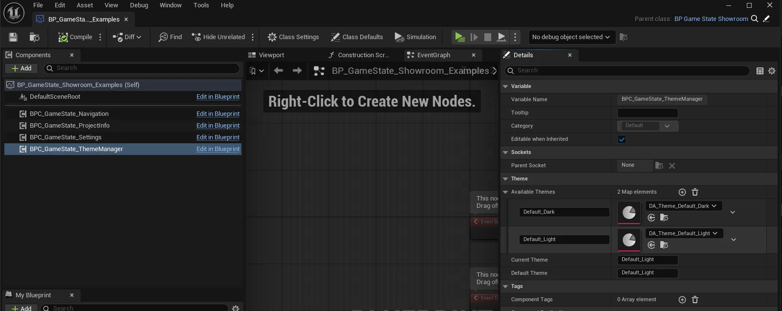
BPC_GameState_ThemeManagerto your game state. - Populate Available Themes with theme data assets and set Default Theme.
- Build your widgets deriving from
WBP_Base.
Usage
Creating a theme
Duplicate a shipped BP_PDA_Theme into your project content and edit the colour ramps and fonts.
Register it with the theme manager and switch with SetThemeType.
Building a widget
Derive from WBP_Base. Put styling in WidgetElement_UpdateTheme, content in
WidgetElement_Initiate, and design-time construction in WidgetElement_InitialConstruct.
Styling written in Construct will not re-run when the theme changes. This is the most common cause of a widget that looks wrong after a theme switch.
Showing a widget in the world
Place a BP_Widget actor, or add BPC_Widget to your own actor. It supports automatic content fade
by distance.
Showing an overlay
Use FL_UI_Overlays for confirm, loading and notification overlays without building your own.
Text entry in VR
Add a BP_KeyboardLocation and the framework shows WBP_Keyboard_Default when a text field is
focused.
Key properties
| Property | On | When to change |
|---|---|---|
Available Themes / Default Theme | BPC_GameState_ThemeManager | To register your own themes |
Auto Blend Threshold | BP_PDA_Theme | Contrast point at which text flips between light and dark |
Gradient | BP_PDA_Theme | Strength of the gradient applied across surfaces |
Use Automatic Content Fade On Distance | BPC_Widget | Turn on for world-space UI so distant widgets stop drawing |
Draw Size | BPC_Widget | Widget render resolution — raise for crisp text, lower for performance |
Extending
Derive from WBP_Base and implement BPI_WidgetElement. For a new primitive, follow the AF*
naming and drive its appearance entirely from theme values so it participates in theme switching.
FL_UI_Material holds the material helpers the primitives use for rounded corners, gradients and
outlines.
Performance notes
Draw Size on world-space widgets is the biggest cost lever — 2000×2000 is the shipped default and
is generous. Turn on distance fade for any world UI the player can walk away from.
Example map
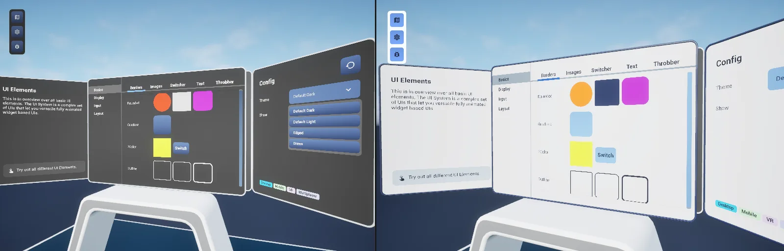
Map_Examples_UI is a full gallery: primitives, controls, layout, HUD anchors and live theme switching.
Troubleshooting
Widgets do not restyle on theme change. Styling is not in WidgetElement_UpdateTheme.
Text is blurry in VR. Raise Draw Size on the widget component, or move the widget closer.
UI scale is wrong. The plugin's Engine.ini sets a scaling curve for a 3840×2160 design size; a
project overriding UI scaling will fight it.
API reference
Every blueprint asset in this plugin. Expand an asset to see its members.
Blueprints
BP_Widget3 members
| Kind | Name | Signature | Description |
|---|---|---|---|
| event | FadeInOut | (Fade: bool) | Fades the hosted widget in or out by handing the visibility change to the widget component, which runs the fade curve, plays the matching fade sound and drops collision while hidden. The actor itself stays alive either way. |
| event | OnFadeComplete_Event_0 | (Visible: bool) | Internal handler bound to the widget component's fade completion only while a close is running. Destroys the actor once the fade has finished hiding the widget; a fade that ends visible leaves the actor alone. |
| event | OnCloseWidgetRequested | () | Called when a widget hosted by this actor asks to be closed. Binds the destroy handler to the fade completion and starts the fade out, so the actor is destroyed once the widget has faded rather than vanishing instantly. |
Components
BPC_GameState_ThemeManager6 members
| Kind | Name | Signature | Description |
|---|---|---|---|
| var | AvailableThemesTheme | Map<name, BP_PDA_Theme> | Themes this game state can switch between, keyed by the identifier passed to Set Theme Type. Fill it in the details panel or add to it at runtime through Add Theme; an identifier that is not in the map sends the current theme back to the default one. |
| var | Current_ThemeTheme | name | Identifier of the theme handed out to every bound widget. It is repaired back to the default identifier whenever it is read and found missing from Available Themes, so change it through Set Theme Type rather than writing to it, otherwise nothing is told to restyle. |
| var | Default_ThemeTheme | name | Identifier fallen back to whenever the current one cannot be found in Available Themes. Exposed on spawn so a game state can be brought up on a theme other than the light default. |
| fn | GetCurrent_ThemeTheme | (out Theme: BP_PDA_Theme) | Returns the theme asset registered under the current identifier, first resetting that identifier to the default one if it is missing from Available Themes. Comes back empty when neither identifier is in the map. |
| fn | AddThemeTheme | (ID: name, Theme: BP_PDA_Theme) | Registers a theme asset under an identifier, replacing whatever was held under that identifier before. Registering does not switch to it; call Set Theme Type for that. |
| fn | SetThemeTypeTheme | (ID: name) | Switches the current theme identifier and broadcasts On Theme Updated so every bound widget component and head-up display re-reads its colours. Ignored when the identifier is already the current one, and the identifier is not checked against Available Themes first. |
BPC_PawnAbility_HUD20 members
| Kind | Name | Signature | Description |
|---|---|---|---|
| var | ThemeTheme | BP_PDA_Theme | Override applied to this head-up display in place of the game-wide theme. While one is set the component ignores the game state's theme manager and unsubscribes from its updates; leave empty to follow the theme in use across the game. |
| var | InitialWidgetsInitial | ST_HUD_Widget[] | Widgets meant to be present on the head-up display from the start, each paired with the frame it should occupy. Nothing in this component's graph reads the list in this build, so widgets have to be put up through Add Widget Class. |
| fn | IsWidgetOpenWidgets | (Widget: WBP_Base, out Open: bool) | Returns whether the given widget is one of the head-up display's top-level widgets. A nested child answers false, since only widgets added to a frame are tracked; the head-up display itself is created on the first call if it does not exist yet. |
| fn | AddWidget_ObjectWidgets | (InWidget: WBP_Base, Frame: ST_HUD_FrameInfo, References: Struct_References) | Resolves the dynamic references handed in, then places an already-created widget into a head-up display frame at the anchor and layer the frame describes. Use it when you need to build the widget yourself; Add Widget Class covers the ordinary case. |
| fn | AddWidget_ClassWidgets | (HUDWidget: Class<WBP_Base>, Frame: ST_HUD_FrameInfo, References: Struct_References, CheckIfAlreadyExists: bool, out Widget: WBP_Base) | Creates a widget of the given class inside a head-up display frame and returns it, resolving the dynamic references first. With Check If Already Exists set, an open widget of that class is returned untouched instead of a second one being built. |
| fn | RemoveWidget_ObjectWidgets | (Widget: WBP_Base) | Removes a widget from the head-up display, walking up from a nested widget to the top-level one owning its frame and closing that frame. The widget's screen control request is dropped at the same time, so the mouse mode falls back to what the remaining widgets ask for. |
| fn | RemoveWidget_ClassWidgets | (Widget: Class<WBP_Base>) | Removes the open widget of the given class from the head-up display and closes its frame. Does nothing when no widget of that class is open. |
| fn | ToggleWidget_ClassWidgets | (WidgetClass: Class<WBP_Base>, Frame: ST_HUD_FrameInfo, ref const Struct_References: Struct_References, out Widget: WBP_Base) | Closes the open widget of the given class, or creates one in the given frame when none is open and returns it. References are only resolved on the pass that creates the widget, and nothing is returned when the call closed one. |
| fn | GetWidgetWidgets | (WidgetClass: Class<WBP_Base>, out Widget: WBP_Base) | Returns the open head-up display widget whose class matches exactly, or nothing when no widget of that class is up. Only top-level widgets are searched, not their children. |
| fn | GetThemeTheme | (out Theme: BP_PDA_Theme) | Returns the theme this head-up display draws with: the override on the component when one is set, otherwise the game state theme manager's current theme, falling back to the default light theme when the game state has no manager. |
| fn | SetHUDVisibilityState | (Set: bool) | Shows or hides the whole head-up display by driving its render opacity to one or zero, leaving the widgets in place rather than removing them. Skipped where cosmetic events cannot run, and ignored when the state asked for is the current one. |
| fn | UpdateCustomThemeTheme | (Theme: BP_PDA_Theme) | Swaps the theme override at runtime, rebinding to or unbinding from the theme manager and restyling the head-up display and everything on it. Does nothing when the asset passed is the one already in use. |
| fn | BindToThemeManagerTheme | () | Subscribes the head-up display to the game state theme manager's update broadcast, or unsubscribes it when a theme override is set on the component. Does nothing when the game state carries no theme manager. |
| fn | OnThemeUpdatedTheme | () | Hands the current theme to the head-up display widget so every element below it restyles, flagged as desktop styling for desktop and mobile pawns and as world styling for a VR pawn. Bound to the theme manager, so it runs again on every game-wide theme change. |
| event | WidgetComp_CloseWidget | (Source: WBP_Base) | Called when a widget on this head-up display asks to close itself. Removes the top-level widget owning it from its frame, so a close request from a nested widget takes the whole frame down. |
| event | WidgetComp_PlayWidgetSound | (SoundLocation: Vector2D, SoundCue: SoundBase) | Called when a widget on this head-up display wants a sound played. Plays it as a 2D sound and ignores the widget coordinates, which only matter for a world-space widget. |
| event | WidgetComp_CloseOverlay | () | Called when a widget asks for the overlays to go. Closes every widget that was opened as an overlay through this head-up display and forgets them; ordinary head-up display widgets are left alone. |
| event | WidgetComp_MouseButtonPressed | (PressLocation: Vector2D) | Called when a widget on this head-up display reports a mouse press. Forwards the press position to the shared mouse event listener, at most once per second. |
| event | WidgetComp_AddAndResolveReferences | (DynamicReferences: Struct_References, DynamicReferences_References_5_E7B6432947A4FEF06494598CC0AD7799: Map<name, ST_DynamicReference>) | Called before widgets are added so the actors they name are ready. Resolves each dynamic reference into an actor found by class, or by class and tag where a tag is given, and stores it under its key for widgets to look up by name. |
| event | OnDestroyed_Event_0 | (DestroyedActor: Actor) | Internal handler that tears the head-up display down when the actor it is bound to is destroyed, unregistering every element from replication and removing it. |
BPC_Widget65 members
| Kind | Name | Signature | Description |
|---|---|---|---|
| var | SoundVolumeMultiplierSound | float | Volume multiplier applied to every sound this widget plays, fade sounds and widget sounds alike. An overlay copies it from the widget component that opened it, so both sound the same. |
| var | SoundAttenuationOverrideSound | SoundAttenuation | Attenuation asset used for the widget's sounds in place of the one picked from its world scale. Leave empty to let the component choose the medium attenuation for a large widget and the near one for a small one. |
| var | FadeCurveFade | CurveFloat | Curve meant to shape the widget's fade over time. The fades in this build run on the shared ease-in-out curve instead, so nothing in the graph reads it. |
| var | WidgetVisibilityFade | bool | Whether the widget is currently shown. It also gates the automatic distance checks, the draw size check and the collision state, so set it through Set Widget Visibility rather than writing to it, or none of those follow-ups run. |
| var | FadeDurationFade | float | Length in seconds of the fade the widget plays as it comes up at Begin Play. The component only counts as initialised, and only takes on collision, once that fade has finished. |
| var | UseAutomaticContentFadeOnDistanceAutomatic|Content Fade | bool | Whether the widget watches its distance to the player camera so its content can fade out once the camera is far enough away. The watch only runs while the widget is visible. |
| var | AutomaticRefreshTimeRangeAutomatic | FloatRange | Bounds in seconds intended to pace the automatic distance checks. Nothing in this component's graph reads it; the content fade and disappear loops carry their own intervals, so changing it alters nothing. |
| var | AutomaticContentFadeDistanceAutomatic|Content Fade | float | Distance in centimetres from the player camera at which the content fade switches over, with a ten per cent deadzone either side so the state does not flicker on the boundary. Only read while Use Automatic Content Fade On Distance is set. |
| var | FadeInSoundSound | SoundBase | Sound played at the centre of the widget when it is switched to visible, placed in the world and attenuated like every other widget sound. Leave empty for a silent appearance. |
| var | FadeOutSoundSound | SoundBase | Sound played at the centre of the widget when it is switched to hidden, placed in the world and attenuated like every other widget sound. Leave empty for a silent disappearance. |
| var | CustomThemeTheme | BP_PDA_Theme | Theme override for this widget. While one is set the component ignores the game state theme manager and unsubscribes from its updates; leave empty to follow the theme in use across the game. |
| var | ReferenceActorsReference | Map<name, Actor> | Actors the widgets on this component can look up by name, seeded in the details panel and added to as dynamic references are resolved. A widget asking for a key that is not present gets nothing back rather than an error. |
| var | AutomaticCheckDrawSizeDraw Size | bool | Whether the component polls its own draw size and broadcasts On Draw Size Updated when it changes. Switched on by itself when a panel is added, since the panel meshes have to be resized to match the widget. |
| var | DrawSizeCheckTimeDraw Size | float | Interval in seconds between draw size checks while the size is holding steady. Straight after a change the check runs at 11 milliseconds instead, so a resize settles quickly and then backs off again. |
| var | UseAutomaticDisappearOnDistanceAutomatic|Disappear | bool | Whether the widget watches its distance to the player camera so it can fade away outside a range. The watch only runs while the widget is visible. |
| var | AutomaticDisappearRangeAutomatic|Disappear | FloatRange | Near and far distance in centimetres between which the widget stays fully present. Outside that band, with a ten per cent deadzone either side, it is flagged as out of range and the redraw mode switches to manual. |
| var | AutomaticDisappearOpacityValueAutomatic|Disappear | float | Opacity of 0 to 1 the widget is meant to settle at while it is outside the disappear range. Nothing in this component's graph reads it in this build. |
| var | DitherTemporalFadeFade | float | Strength of the temporal dither used while the widget material fades, 0 to 1. The head-up display and label helpers set it to zero to stop the dither pattern showing up close; nothing in this component's graph reads it. |
| var | UsePanelFrame | bool | Whether a panel component is spawned behind the widget to give it a solid backing. Read once at Begin Play; use Set Panel afterwards, which builds or tears the panel down and switches the draw size check on as it does. |
| var | UseAutomaticRedrawUpdateRedraw | bool | Whether the redraw loop runs, tuning the widget's redraw rate from its distance to the camera and from whether it is hovered or animating. Read once at Begin Play; use Set Redraw Check to start or stop the loop later. |
| var | WidgetCollisionCollision | bool | Whether the widget may take on query collision so a laser or pointer can hit it. Collision is only switched on once the widget is also visible, initialised and not covered by a blocking overlay, so clearing this makes the widget purely decorative. |
| fn | getWidgetObjectWidget | (out AsWBPBase: WBP_Base) | Returns the user widget this component is displaying, cast to the framework's widget base. Comes back empty when the widget class is a plain user widget, which is also why the theme and reference plumbing does nothing for such a widget. |
| fn | SetReplicationValueReplication | (ReplicationValue: Struct_WidgetReplication) | Stores a replicated value for one registered widget, overwriting the entry that shares its object and replication identifiers or appending a new one. Meant to run on the server; the other clients pick it up through the replication notification. |
| fn | getRelativeLocation_ScaledCoordinates | (WidgetCoordinates: Vector2D, Anchor: Vector2D, out RelativeLocation: Vector) | Returns a point given in widget coordinates as an offset in the component's local space, multiplied by the component's relative scale. Anchor runs 0 to 1 across the widget and says which corner or edge the coordinates are measured from. |
| fn | getRelativeLocation_UnscaledCoordinates | (WidgetCoordinates: Vector2D, Anchor: Vector2D, out RelativeLocation: Vector) | Returns a point given in widget coordinates as an offset in the component's local space, ignoring the component's relative scale. Use the scaled version when the result is going to position something attached to the component. |
| fn | WidgetToWorldCoordinatesCoordinates | (WidgetCoordinates: Vector2D) → Vector | Returns the world position of a point given in widget coordinates, measured from the widget's pivot and pushed through the component's world transform. Used to put sounds and overlays where the user actually pressed. |
| fn | UpdateManuallyRedrawRedraw | () | Switches the component between manual and automatic redraw. Manual is used while the widget is hidden or flagged as beyond the disappear or content fade distance, since a widget nobody can read need not keep redrawing. |
| fn | isWidgetHoveredWidget | (out IsHovered: bool) | Returns whether a pointer is over the widget, as last reported by the interaction system. Reads a cached flag; nothing is traced when you call it. |
| fn | CheckAndUpdateCollisionCollision | () | Re-evaluates the widget's collision. Query collision goes on only while the widget is visible, has collision allowed, has finished its start-up fade and is not covered by a blocking overlay; every other case leaves it with no collision. |
| fn | GetThemeTheme | (out Theme: BP_PDA_Theme) | Returns the theme this widget draws with: the override on the component when one is set, otherwise the game state theme manager's current theme, falling back to the default light theme when the game state has no manager. |
| fn | DetermineSoundAttenuationSound | (out SoundAttenuation: SoundAttenuation) | Returns the attenuation used for this widget's sounds: the override when one is set, otherwise the medium attenuation for a component scaled above 0.025 and the near one for anything smaller. |
| fn | SetCustomOpacityState|Opacity | (Opacity: float) | Sets the custom opacity term, 0 to 1, and recomputes the widget's opacity from it together with the visibility, start-up and distance terms; the smallest of the four wins. The component hides itself outright once the result reaches zero. |
| fn | UpdateDrawSizeCheckState|Draw Size | () | Starts or stops the draw size polling loop according to whether automatic checking is on and the widget is visible. Called whenever visibility changes, so a hidden widget stops polling its size. |
| fn | UpdateCustomThemeTheme | (Theme: BP_PDA_Theme) | Swaps the theme override at runtime, rebinding to or unbinding from the game state theme manager and then restyling the widget material and every element on the widget. Does nothing when the asset passed is the one already in use. |
| fn | BindToThemeManagerTheme | () | Subscribes the component to the game state theme manager's update broadcast, or unsubscribes it when a theme override is set. Runs at Begin Play and again on every override change; does nothing when the game state carries no theme manager. |
| fn | UpdateWidgetMaterialForThemeTheme | () | Pushes the theme's high intensity background colour into the widget material's back colour parameter. Does nothing while the material instance does not yet exist, which is the case for the first moments of play. |
| fn | OnThemeUpdated_EventTheme | () | Re-applies the current theme: refreshes the widget material's colour, hands the theme to the root widget so every element below restyles, and broadcasts On Widget Theme Updated. Bound to the theme manager, so it also runs on a game-wide theme change. |
| fn | ReplicationUpdateReplication | () | Replays every stored replicated value into the widget registered under its identifier, skipping the entries this client sent itself. Runs after the widget class is set and whenever a replicated update arrives; skipped where cosmetic events cannot run. |
| event | SetWidgetVisibility | (Set: bool) | Shows or hides the widget, broadcasting On Widget Visibility Changed and playing the fade in or fade out sound at its centre. Also refreshes the redraw mode, the distance checks and the draw size check, and on hiding drops collision and closes any overlay. Ignored when the state asked for is the current one. |
| event | SetAutomaticContentFade | (Set: bool) | Starts or stops the loop watching the camera distance against Automatic Content Fade Distance, flagging whether the widget is beyond it and refreshing the redraw mode when that answer changes. Driven by the visibility and the content fade setting rather than called directly. |
| event | Server_SetReplicationValue | (ReplicationValue: Struct_WidgetReplication) | Server-side entry point for storing a replicated widget value. Widget elements reach it through Replicate Value rather than calling it themselves; the stored array then replicates down to the other clients, where it is replayed. |
| event | SetInitialVisibility | () | Called once from Begin Play to settle the widget's starting visibility. It branches on the visibility flag but carries no work of its own in this build. |
| event | AddReferenceObject | (ref const Key: name, ref const Reference: Actor) | Stores an actor under a name so the widgets on this component can look it up, replacing anything held under that name before. Use it for references only known at runtime, which cannot be set in the details panel. |
| event | OpenOverlay | () | Called once a blocking overlay has been spawned on this component and its collision has been dropped. Empty here; implement it in a child component to react to the widget being covered. |
| event | OverlayClosed | (Overlay: BP_Overlay) | Internal handler bound to the overlay this component spawned. Broadcasts On Overlay Updated, clears the blocking flag and restores collision, ignoring calls that come from an overlay which is no longer the current one. |
| event | SetSoundSettings | (SoundVolumeMultiplier: float, SoundAttenuation: SoundAttenuation) | Overwrites the volume multiplier and the attenuation override at runtime. Used when an overlay is spawned, so it plays its sounds exactly as the widget that opened it does. |
| event | WidgetComp_UnregisterWidget | (Widget: BPI_WidgetElement) | Called by a widget element as it is torn down. Drops the element and its key from the replication registry, after which any replicated value arriving for that key finds nothing and is discarded. |
| event | WidgetComp_ReplicateValue | (Widget: BPI_WidgetElement, ReplicationIdentifier: name, ref const ReplicationContent: string[]) | Called by a registered widget element to push a value out to the other clients. Sends the element's registered key, the identifier and the string content to the server together with the local player controller, so the sender can skip its own echo. |
| event | WidgetComp_RegisterWidget | (Key: name, Widget: BPI_WidgetElement) | Called by a widget element as it initialises, to claim a key in the replication registry. Only registers while the owning actor replicates, and any element already holding that key is replaced. |
| event | SetWidgetClass | (Widget: Class<WBP_Base>, References: Struct_References) | Creates a widget of the given class, sets it on the component, resolves the dynamic references, initialises the widget with the current theme, replays any replicated values and broadcasts On Widget Class Updated. Does nothing when no class is passed. |
| event | WidgetComp_PlayWidgetSound | (SoundLocation: Vector2D, SoundCue: SoundBase) | Called by a widget on this component when it wants a sound played. Plays it at the world position of the widget coordinates given, with the component's volume multiplier and its chosen attenuation. |
| event | CheckDrawSizeUpdated | (Condition: bool) | Starts or stops the loop comparing the current draw size against the last one and broadcasting On Draw Size Updated when it has moved. Polls at 11 milliseconds while the size keeps changing and at Draw Size Check Time once it settles. |
| event | WidgetComp_WidgetHovered | (Set: bool) | Called by the interaction system as a pointer enters or leaves the widget. Records the hover state and broadcasts On Widget Hovered; the redraw loop reads the same state to keep a hovered widget refreshing every frame. |
| event | WidgetComp_CloseWidget | (Source: WBP_Base) | Called when a widget on this component asks to close itself. Only broadcasts On Close Widget Requested; the component removes nothing by itself, so the owning actor decides whether to hide the widget or destroy itself. |
| event | SetAutomaticDisappear | (Set: bool) | Starts or stops the loop watching the camera distance against the disappear range, flagging whether the widget has left it and refreshing the redraw mode when that answer changes. Driven by the visibility and the disappear setting rather than called directly. |
| event | SetRedrawCheck | (Set: bool) | Starts or stops the loop tuning the widget's redraw time. A hovered or animating widget redraws every frame, an ordinary visible one at a rate scaled by its distance to the camera, and one that has not been rendered recently drops to every three seconds. |
| event | SetPanel | (Set: bool) | Adds or removes the panel backing the widget. Adding spawns a panel component on the owner, attaches it and switches the draw size check on so the panel keeps matching the widget; removing cleans the panel up and destroys it. |
| event | WidgetComp_WidgetAnimating | (Time: float) | Called by a widget on this component while an animation plays, carrying the time it has left to run. Holds the animating flag for that long so the redraw loop keeps refreshing every frame; a further call extends the hold rather than queueing behind it. |
| event | WidgetComp_MouseButtonPressed | (PressLocation: Vector2D) | Called by a widget on this component when it reports a mouse press. Forwards the press position to the shared mouse event listener, at most once per second. |
| event | RemoveReferenceObject | (ref const Key: name) | Drops the actor held under a name, after which widgets asking for that key get nothing back. Removing a key that was never added is harmless. |
| event | WidgetComp_AddAndResolveReferences | (DynamicReferences: Struct_References, DynamicReferences_References_5_E7B6432947A4FEF06494598CC0AD7799: Map<name, ST_DynamicReference>) | Called before a widget is shown so the actors it names are ready. Resolves each dynamic reference into an actor found by class, or by class and tag where a tag is given, and stores it under its key beside the references set in the details panel. |
| event | WidgetComp_CloseOverlay | () | Called when a widget, or the component itself on hiding, asks for the overlay to go. Tells the overlay actor to close, which fades it out; the blocking flag and the collision are restored only once the overlay reports back that it has closed. |
| event | WidgetComp_AddReference | (Key: name, Reference: Actor) | Called by a widget that has resolved an actor it wants remembered. Stores it under the given name in the reference map, replacing anything held there before. |
| event | setSourceInfo | (SourceInfo: ST_SourceInfo) | Called by a laser, hand or pointer ability every time its trace lands on this widget, carrying which pawn, hand and ability is acting. Kept as the last interaction source so the widgets can ask who pressed them. |
| event | Widget_SetWidgetInteractionComponent | (WidgetInteractionComponent: WidgetInteractionComponent) | Called alongside the source information by whichever ability is pointing at this widget, handing over the widget interaction component driving that pointer. Kept so the widgets can reach the component generating their mouse events. |
DataAssets
PDA_WidgetPage0 members
No editor-visible members; this asset configures defaults only.
Helper
BPC_Panel_Widget3 members
| Kind | Name | Signature | Description |
|---|---|---|---|
| var | Widget | BPC_Widget | Owning widget component that this panel frames. Supplied when the widget component builds the panel through Set Panel; the theme, draw size and pivot are all read back from it, so a panel without one never updates its meshes or colour. |
| event | OnThemeUpdated | () | Called when the theme behind the framed widget changes. Swaps in the rounded corner mesh whenever the theme's large corner size is above zero and the straight one otherwise, then paints both the border and the base of the panel in the theme's text colour. |
| event | OnDrawSizeUpdated_Event | () | Called when the framed widget reports a new draw size. Rescales and repositions the panel meshes to that draw size and the widget's pivot, which is what keeps the frame wrapped around a widget that grows or shrinks. |
BP_Helper_HUD0 members
No editor-visible members; this asset configures defaults only.
Interfaces
BPI_WidgetComponent17 members
| Kind | Name | Signature | Description |
|---|---|---|---|
| fn | WidgetComp_CloseWidgetWidget Essentials | (Source: WBP_Base) | Asks the host of a widget to close it, passing the widget that made the request. The widget component answers by broadcasting On Close Widget Requested rather than tearing anything down itself, so whoever spawned the widget decides what closing means. |
| fn | WidgetComp_ReplicateValueWidget Replication | (Widget: BPI_WidgetElement, ReplicationIdentifier: name, const ReplicationContent: string[]) | Sends a named value and its content strings from one registered widget out to the other clients. The widget component looks the widget up in its registry and pushes the entry through the server, so nothing is sent for a widget that was never registered. |
| fn | WidgetComp_OpenOverlayWidget Overlay | (WidgetCoordinates: Vector2D, const Blocking: bool, SourceObject: Object, ContentClass: Class<Object>, DesiredPivot: Vector2D, SizeMultiplier: float, out OverlayWidget: WBP_Base) | Opens an overlay actor in front of the host at the given widget coordinates and returns its root widget. Blocking suppresses interaction with the surface underneath; asking again from the source that already owns the open overlay closes it instead of reopening. |
| fn | WidgetComp_getReferenceActorWidget References | (Key: name, out Reference: Actor) | Looks up an actor previously registered under a key. Returns nothing when the key is unknown, and is how a widget reaches the actor it drives without holding a hard reference to it. |
| fn | WidgetComp_UnregisterWidgetWidget Replication | (Widget: BPI_WidgetElement) | Drops a widget from the replication registry so that replicated updates stop reaching it. Called on every element in turn as a widget tree is cleanly removed. |
| fn | WidgetComp_RegisterWidgetWidget Replication | (Key: name, Widget: BPI_WidgetElement) | Registers a widget under a replication identifier so incoming replicated values can be routed to it. The widget component ignores the call entirely unless its owning actor replicates, and replaces whatever was already held under the same key. |
| fn | WidgetComp_getAllReferenceKeysWidget References | (out Keys: name[]) | Returns every key currently present in the reference registry, in no particular order. |
| fn | WidgetComp_AddAndResolveReferencesWidget References | (DynamicReferences: Struct_References) | Resolves a whole set of dynamic references in one pass and stores each resulting actor under its key. Equivalent to calling Add And Resolve Reference for every entry of the struct. |
| fn | WidgetComp_AddAndResolveReferenceWidget References | (Key: name, DynamicReference: ST_DynamicReference, out Actor: Actor) | Finds the actor a dynamic reference describes, stores it under the key and hands it back. Search is by class alone when the reference carries no actor tag; otherwise the first actor of that class carrying the tag wins and nothing is stored if none does. |
| fn | WidgetComp_PlayWidgetSoundWidget Sound | (SoundLocation: Vector2D, SoundCue: SoundBase) | Plays a sound at a point given in widget coordinates. The widget component converts those coordinates to world space and applies its own volume multiplier and attenuation, so the sound comes from the spot on the widget surface that caused it. |
| fn | WidgetComp_CloseOverlayWidget Overlay | () | Closes the overlay currently open in front of the host. Does nothing when none is open. |
| fn | WidgetComp_WidgetHoveredWidget Essentials | (Set: bool) | Reports that a pointer has entered or left the widget surface. The widget component records the state, broadcasts On Widget Hovered and keeps its redraw rate high while the surface stays hovered. |
| fn | WidgetComp_WidgetAnimatingWidget Essentials | (Time: float) | Declares that an animation of the given length in seconds has started. The widget component holds its animating flag for that long, redrawing every frame meanwhile; the Widget Base Play Animation macro calls it for you. |
| fn | WidgetComp_MouseButtonPressedWidget Essentials | (PressLocation: Vector2D) | Forwards a press at the given screen position to the host's event listener, which broadcasts it to everything bound. The widget component throttles this to one press per second, so rapid repeat presses are swallowed. |
| fn | WidgetComp_getEventListenerWidget Essentials | (out EventListener: BP_WidgetEventListener_Mouse) | Returns the object carrying the host's mouse delegates, creating it on the first call so it is never null. Bind to it when a widget needs to hear about presses that landed anywhere on the surface rather than on itself. |
| fn | WidgetComp_IsKeyboardSupportedWidget Keyboard | (out SupportsKeyboard: bool) | Reports whether a keyboard can be raised for widgets on this host. The interface default is no; the widget component answers yes, and text fields ask before offering to open a keyboard on focus. |
| fn | WidgetComp_AddReferenceWidget References | (Key: name, Reference: Actor) | Stores an already resolved actor under a key in the reference registry, replacing anything held there. Use it when the actor is known up front rather than found by class and tag. |
BPI_WidgetElement15 members
| Kind | Name | Signature | Description |
|---|---|---|---|
| fn | WidgetElement_UpdateThemeStyle | (Theme: BP_PDA_Theme, Desktop: bool) | Called on every element of a widget tree at start-up and again each time a new theme is applied, carrying the theme and the desktop flag. Implement it for anything that reads colours, fonts or metrics; it runs after Initiate, so content already exists by then. |
| fn | WidgetElement_InitiateStyle | (Parent: WBP_Base, ReplicationIndex: name) | Called once per element while the owning widget walks its tree after begin play, handing over the parent widget and the index that makes this element's replication identifier unique among its siblings. Implement it for content set-up; the theme pass follows. |
| fn | WidgetElement_getIsReplicatingReplication | (out Replicating: bool) | Reports whether this element mirrors its value to the other clients. Defaults to false, so an element that does not answer takes no part in replication. |
| fn | WidgetElement_InitialConstructConstruct | () | Called on every element while the owning widget pre-constructs in the editor, immediately before the design-time theme pass. Implement it for preview-only set-up; it never runs in a running game. |
| fn | WidgetElement_getNamedSlotsSlots | (out Slots: NamedSlot[]) | Returns the named slots this element exposes so that the tree walk can descend into their children. Return an empty list and the element is treated as a leaf, which means anything parented into a slot you do not list is never initiated or themed. |
| fn | WidgetElement_getReplicationInfoReplication | (out Suffix: name) | Returns the suffix identifying this element inside its parent's replication identifier. Defaults to None; siblings sharing a suffix are told apart by the index the tree walk counts out and passes to Initiate. |
| fn | WidgetElement_ExecuteReplicationReplication | (ReplicationIdentifier: name, const Content: string[]) | Called on the other clients when a replicated value arrives for this element, carrying the identifier and its content strings. Implement it to reflect a change another player made; it is skipped on the client that sent the value. |
| fn | WidgetElement_UnregisterReplicationReplication | () | Removes this element from the host's replication registry. Called on every element in reverse order as a widget tree is cleanly removed, just before Remove Widget. |
| fn | WidgetElement_RemoveWidgetConstruct | () | Takes this element out of the widget tree. Called on every element during a clean removal, immediately after its replication registration has been dropped. |
| fn | WidgetElement_getCustomChildWidgetsSlots | (out Widgets: Widget[]) | Returns child widgets the tree walk would not otherwise reach, typically ones held in a variable rather than in the slot hierarchy. Listing them here is what gets them initiated, themed and cleaned up along with the rest of the tree. |
| fn | WidgetElement_getWidgetTagTag | (out WidgetTag: name) | Returns the tag this element answers to when a widget is searched for by tag. Defaults to None, which no search ever matches. |
| fn | WidgetElement_getDesiredPaddingSlots | (out Padding: float) | Returns the spacing in slate units this element wants around itself inside one of the framework's boxes. The boxes ask every child that implements the interface and fall back to their own default padding only for children that do not; the default answer here is zero. |
| fn | WidgetElement_PostInitiateStyle | () | Called on every element once the entire tree has been initiated and themed. Implement it for set-up that needs the finished tree, such as measuring or reading the state of a sibling. |
| fn | WidgetElement_RefreshStylingStyle | () | Called on an element's parent after one of its children has been shown or collapsed through the Set Show Collapse macro. Implement it for layout that has to close up around a hidden child, as the boxes do with their paddings. |
| fn | WidgetElement_SwitcherVisibilityStyle | (Switcher: AFSwitcher, Set: bool) | Tells the element that a switcher above it has shown or hidden the branch it lives in. Elements keep a list of the switchers currently hiding them and count themselves visible only once every one of those has released. |
BPI_Widget_Blend2 members
| Kind | Name | Signature | Description |
|---|---|---|---|
| fn | Widget_setBlendValueWidget Blend | (Alpha: float) | Drives the element's blend alpha, 0 to 1. Buttons, text fields, sliders and drop-downs push their hover and press animation curves in through this, and the receiving border, text or icon rebuilds its colour from the new value straight away. |
| fn | Widget_getBlendValueWidget Blend | (out Alpha: float) | Returns the blend alpha last applied to the element, 0 to 1. Answers zero for elements that keep no blend state of their own. |
BPI_Widget_TreeElement1 members
| Kind | Name | Signature | Description |
|---|---|---|---|
| fn | TreeElement_getWidgetClass | (out Class: Class<WBP_TreeElement>) | Returns the tree element widget class that should be built to represent this object in a tree. Returns nothing by default, which leaves the tree with no row to spawn. |
Libraries
FL_UI_Material19 members
| Kind | Name | Signature | Description |
|---|---|---|---|
| fn | CreateMaterial_BorderMaterials|Border | (Theme: BP_PDA_Theme, Color: ST_Color_Definition, __WorldContext: Object, out Material: MaterialInstanceDynamic) | Creates a dynamic instance of the flat border material and paints it with the resolved colour definition. No corner rounding is applied, so it draws a square fill. |
| fn | CreateMaterial_Border_RoundedMaterials|Border | (Theme: BP_PDA_Theme, Desktop: bool, Corners: ST_Corner_Definition, Color: ST_Color_Definition, __WorldContext: Object, out Material: MaterialInstanceDynamic) | Creates a dynamic instance of the rounded border material and applies the fill colour and the corner radii. Set Desktop to take the desktop variant of the material, which is the one meant for widgets drawn on screen rather than in the world. |
| fn | CreateMaterial_Border_Rounded_SidesMaterials|Border | (Theme: BP_PDA_Theme, Desktop: bool, Corners: ST_Corner_Definition, Color: ST_Color_Definition, Sides: Vector4, SideColor: ST_Color_Definition, __WorldContext: Object, out Material: MaterialInstanceDynamic) | Creates a dynamic instance of the rounded border material that can colour individual edges. Applies the fill colour and corner radii, then the side mask and the colour those sides are drawn in. |
| fn | CreateMaterial_Border_Rounded_GradientMaterials|Border | (Theme: BP_PDA_Theme, Desktop: bool, CornerDefinition: ST_Corner_Definition, PrimaryColor: ST_Color_Definition, GradientRotation: float, __WorldContext: Object, out Material: MaterialInstanceDynamic) | Creates a dynamic instance of the rounded gradient border material. The one colour supplied fills one end of the gradient and its theme-shifted partner the other, turned by the given rotation in degrees. |
| fn | CreateMaterial_Border_Rounded_Gradient_2ColorsMaterials|Border | (Theme: BP_PDA_Theme, Desktop: bool, Corners: ST_Corner_Definition, Color: ST_Color_Definition, SecondColor: ST_Color_Definition, GradientRotation: float, __WorldContext: Object, out Material: MaterialInstanceDynamic) | Creates a dynamic instance of the two-colour rounded gradient border material. Both colours are written along with their theme-shifted partners, so the gradient runs between two full tones at the given rotation. |
| fn | CreateMaterial_Border_Rounded_LinearMaterials|Border | (Theme: BP_PDA_Theme, Desktop: bool, LinearColor: LinearColor, Corners: ST_Corner_Definition, __WorldContext: Object, out Material: MaterialInstanceDynamic) | Creates a dynamic instance of the rounded border material and writes a linear colour straight into it, bypassing the theme palette. Use it when the colour has already been resolved or comes from outside the theme; corner radii still come from the definition. |
| fn | CreateMaterial_ImageMaterials|Image | (Theme: BP_PDA_Theme, Texture: Texture, __WorldContext: Object, out Material: MaterialInstanceDynamic) | Creates a dynamic instance of the plain image material carrying the given texture. Nothing else is set, so the image draws unrounded and untinted. |
| fn | CreateMaterial_Image_IconMaterials|Image | (Theme: BP_PDA_Theme, Texture: Texture, Color: ST_Color_Definition, __WorldContext: Object, out Material: MaterialInstanceDynamic) | Creates a dynamic instance of the icon material, which tints the given texture with the resolved colour. Meant for single-tone icons; a full-colour texture is tinted along with everything else. |
| fn | CreateMaterial_OutlineMaterials|Outline | (Theme: BP_PDA_Theme, Desktop: bool, CornerDefinition: ST_Corner_Definition, OutlineCategory: E_UI_Outline = "Thick", BorderColor: ST_Color_Definition, __WorldContext: Object, out Material: MaterialInstanceDynamic) | Creates a dynamic instance of the rounded outline material, applying the corner radii, the border colour and the width the theme registers for the given outline category. |
| fn | CreateMaterial_Image_RoundedMaterials|Image | (Theme: BP_PDA_Theme, Desktop: bool, Texture: Texture, CornerDefinition: ST_Corner_Definition, __WorldContext: Object, out Material: MaterialInstanceDynamic) | Creates a dynamic instance of the rounded image material with the given texture and corner radii. |
| fn | ContrastColorsColor | (ForgroundColor: LinearColor, BackgroundColor: LinearColor, __WorldContext: Object, out ContrastValue: float) | Returns the contrast ratio between two colours from their relative luminance, the lighter plus 0.05 over the darker plus 0.05. Runs from 1 for two identical colours up to 21, and is symmetrical, so swapping the inputs changes nothing. |
| fn | ConvertForgroundColorAccordingToBackgroundColor | (Theme: BP_PDA_Theme, ForgroundColor: ST_Color_Definition, BackgroundColor: ST_Color_Definition, __WorldContext: Object, out AdjustedColor: LinearColor) | Resolves a foreground colour against a background and flips its brightness when the two do not contrast enough, judged against the theme's auto blend threshold. Returns a bright orange when no theme is supplied, which makes the omission obvious on screen. |
| fn | Get Color with Auto BlendColor | (Theme: BP_PDA_Theme, Color: ST_Color_Definition, AutoBlend: ST_AutoBlend, Alpha: float, __WorldContext: Object) → LinearColor | Resolves a colour and, when the auto blend struct switches it on, blends between the versions adjusted for the resting and the blended background using Alpha from 0 to 1. With auto blend off the colour comes straight from the theme and Alpha is ignored. |
| fn | CreateMaterial_HoverMaterials|Hover | (Theme: BP_PDA_Theme, Desktop: bool, Color: ST_Color_Definition, Corners: ST_Corner_Definition, __WorldContext: Object, out Material: MaterialInstanceDynamic) | Creates a dynamic instance of the rounded hover material with the given colour and corner radii. This is the highlight layer that fades in under a hovered element, driven afterwards through Set Blend Value. |
| fn | InvertLinearColorColor | (LinearColor: LinearColor, __WorldContext: Object, out InvertedColor: LinearColor) | Returns the colour with its brightness flipped and its hue, saturation and alpha untouched. Used by the automatic contrast pass rather than as a general-purpose inversion. |
| fn | CreateMaterial_Image_Rounded_BackgroundMaterials|Image | (Theme: BP_PDA_Theme, Desktop: bool, Texture: Texture, Corners: ST_Corner_Definition, Color: ST_Color_Definition, __WorldContext: Object, out Material: MaterialInstanceDynamic) | Creates a dynamic instance of the rounded image material that also fills behind the texture, applying the texture, the corner radii and the background colour. |
| fn | CreateMaterial_Image_Rounded_TranslatedMaterials|Image | (Theme: BP_PDA_Theme, Desktop: bool, Texture: Texture, Corners: ST_Corner_Definition, Translation: ST_Image_Translation, __WorldContext: Object, out Material: MaterialInstanceDynamic) | Creates a dynamic instance of the rounded image material that can pan and zoom its texture, applying the texture, the corner radii and the zoom and offsets from the translation struct. |
| fn | CreateMaterial_Image_Rounded_TransitionMaterials|Image | (Theme: BP_PDA_Theme, Desktop: bool, Texture: Texture, CornerDefinition: ST_Corner_Definition, __WorldContext: Object, out Material: MaterialInstanceDynamic) | Creates a dynamic instance of the rounded transition image material with the given texture and corner radii. Only those two are set here; whatever the material exposes to drive the transition itself is left at its default. |
| fn | CreateMaterial_Border_Rounded_CustomMaterials|Border | (Theme: BP_PDA_Theme, NormalMaterial: MaterialInterface, DesktopMaterial: MaterialInterface, Desktop: bool, Corners: ST_Corner_Definition, __WorldContext: Object, out Material: MaterialInstanceDynamic) | Creates a dynamic instance of a material you supply, choosing between the normal and the desktop version, and applies only the corner radii. Use it to bring a bespoke material into the theme's rounding; colour and everything else stay as the material authored them. |
ML_UserWidget0 members
No editor-visible members; this asset configures defaults only.
ML_WBP_Base0 members
No editor-visible members; this asset configures defaults only.
Objects
BP_UI_Button_Object13 members
| Kind | Name | Signature | Description |
|---|---|---|---|
| var | ParentWidget | WBP_Base | Widget that owns the list this entry appears in. The button initialises itself as a sub-widget of it when the entry is assigned, which is how it inherits the theme and the widget component; leave it empty and the button stays uninitialised. |
| var | UIWidgetComponentWidget | ActorComponent | Widget component behind the list this entry appears in. Nothing in the entry or the standard button reads it, which take their component from Parent instead, so it is carried for list owners that need it earlier. |
| var | ContentInfoItem | ST_Button_Content | Texts, images and identifier the button shows for this entry. Copied into the button when the list assigns the entry, and the identifier travels with the pressed broadcast so listeners know which entry fired. |
| var | Button PaddingStyle | Margin | Margin the entry asks for around its row. Neither the entry nor the standard button reads it, so it only has an effect where the list owner applies it while building the row. |
| var | ButtonVariationStyle | int | Index selecting which visual variation of the button the list should build for this entry. Not read by the standard button, so it means only what the list owner chooses to make it mean. |
| var | UseButtonHeightStyle | bool | Whether the row should take the fixed height given by Button Height Override instead of sizing to its content. Read by the list owner building the row rather than by the standard button. |
| var | ButtonHeightOverrideStyle | float | Height in slate units the row asks for when Use Button Height is set. Read by the list owner building the row rather than by the standard button. |
| var | Content WidgetStyle | Class<WBP_ButtonContent> | Widget class drawn inside the button for this entry. Copied into the button as its content widget class when the entry is assigned; leave empty to keep whatever content class the button already has. |
| var | Not Hoverable when SelectedStyle | bool | Whether the button stops reacting to hover once this entry is selected. Copied into the button when the entry is assigned. |
| var | PresetStyle | E_UI_Hierarchy | Emphasis level the button draws this entry with, primary through quaternary, which decides the theme colours it takes. Copied into the button when the entry is assigned. |
| var | OptionsStyle | string[] | Free-form strings carried along with the entry for the list owner to interpret. Nothing in the entry or the standard button reads them. |
| event | ButtonPressed | () | Broadcasts On Button Pressed with this entry and the identifier from its content. Called by the button it was assigned to when that button is clicked in manual mode, so listeners hear about presses through the entry rather than the widget. |
| event | SetSelected | (Selected: bool) | Records the selected state of this entry and broadcasts On Selection Changed, but only when the value actually differs from the one held. The button it was assigned to listens for that broadcast and restyles itself, so call this rather than writing the state directly. |
BP_Value_Settings_Name_Theme4 members
| Kind | Name | Signature | Description |
|---|---|---|---|
| fn | Value_Name_GetValue | (out SourceInfo: ST_SourceInfo, out Name: name) | Returns the identifier of the theme currently selected on the game state's theme manager. Returns nothing when the game state carries no theme manager, and the source info output is left unset. |
| event | Value_Name_Set | (SourceInfo: ST_SourceInfo, Name: name) | Empty override, so setting a value on this entry changes nothing. The theme is switched through Set Theme Type on the theme manager, and this entry only reports what that manager currently holds. |
| event | Init | () | Empty override; no start-up work is needed because the current theme is read from the theme manager each time the entry is asked for its value. |
| event | OnThemeUpdated_Event | () | Internal handler that re-broadcasts On Value Updated when the theme manager reports a change, so any settings widget showing this entry refreshes to the new theme name. |
BP_WidgetEventListener_Mouse0 members
No editor-visible members; this asset configures defaults only.
Template
WBP_Template_Widget5 members
| Kind | Name | Signature | Description |
|---|---|---|---|
| event | WidgetElement_InitialConstruct | () | Empty override kept as the place for design-time set-up in a copy of this template. It is called on the widget while its owner pre-constructs in the editor and never in a running game. |
| event | WidgetElement_UpdateTheme | (Theme: BP_PDA_Theme, Desktop: bool) | Empty override kept as the place to apply colours, fonts and metrics in a copy of this template, called at start-up and again on every theme change. Work from the theme handed in; the base implementation that caches it is not called from here. |
| event | WidgetElement_Initiate | (Parent: WBP_Base, ReplicationIndex: name) | Empty override kept as the place for content set-up in a copy of this template, called once as the owning widget walks its tree. The base implementation, which caches the parent and registers the widget for replication, is not called from here. |
| event | WidgetElement_ExecuteReplication | (ReplicationIdentifier: name, ref const Content: string[]) | Empty override kept as the place to react to a replicated value arriving from another client, carrying its identifier and content strings. A copy of this template ignores replication until it is filled in. |
| event | WidgetElement_PostInitiate | () | Empty override kept as the place for set-up that needs the finished widget tree. It runs after every element below and beside it has been initiated and themed. |
Theme
BP_PDA_Theme26 members
| Kind | Name | Signature | Description |
|---|---|---|---|
| fn | getPrimaryColorColors | (Intensity: E_UI_Color_Intensity = "Low", out Color: LinearColor) | Returns the primary palette colour registered for an intensity. Falls back to fully transparent black when the theme has no entry at that intensity, so a missing entry shows as nothing rather than as a wrong colour. |
| fn | getSecondaryColorColors | (const Intensity: E_UI_Color_Intensity = "Low", out Color: LinearColor) | Returns the secondary palette colour registered for an intensity. Falls back to fully transparent black when the theme has no entry at that intensity. |
| fn | getActiveColorColors | (const Intensity: E_UI_Color_Intensity = "Low", out Color: LinearColor) | Returns the action palette colour registered for an intensity, the accent used for interactive and selected elements. Falls back to fully transparent black when the theme has no entry at that intensity. |
| fn | getTextColorColors | (const Intens: E_UI_Color_Intensity = "Low", out Color: LinearColor) | Returns the text palette colour registered for an intensity. Falls back to fully transparent black when the theme has no entry at that intensity. |
| fn | getBackgroundColorColors | (const Intensity: E_UI_Color_Intensity = "Low", out Color: LinearColor) | Returns the background palette colour registered for an intensity. Falls back to fully transparent black when the theme has no entry at that intensity. |
| fn | getFontFont | (ref const Typography: E_UI_Typography, out Value: SlateFontInfo) | Returns the font registered for a typography level. Gives back an empty font when the level is missing from the theme, which draws no glyphs at all, so every level a widget uses needs an entry. |
| fn | getTransparentColorColors | (const Intensity: E_UI_Color_Intensity = "Low", out Color: LinearColor) | Returns the transparent palette colour registered for an intensity, used for scrims and washes over other content. Falls back to fully transparent black when the theme has no entry at that intensity. |
| fn | getColorFromDefinitionColors | (ColorDefinition: ST_Color_Definition split, out LinearColor: LinearColor) | Resolves a colour definition into a linear colour by switching on its category and looking the intensity up in the matching palette. A definition marked Custom bypasses the theme entirely and returns the colour from its own asset. |
| fn | getGradientGradient | (out Gradient: float) | Returns the theme's gradient offset, the amount added to a colour's brightness to make its gradient partner. Negative values darken the partner, which is the default. |
| fn | Get Corner SizesCorners | (CornerDefinition: ST_Corner_Definition, out CornerSizes: LinearColor) | Resolves a corner definition into four corner radii packed into a colour, in the layout the rounded materials expect. Named categories are looked up in the theme and Custom takes the definition's own size; either way the result is scaled by the definition's multiplier. |
| fn | getOutlineWidthOutline | (ref const Key: E_UI_Outline, out Width: float) | Returns the outline width registered for a category. A category missing from the theme gives zero, which draws no outline. |
| fn | SetMaterialValue_ColorMaterial|Color | (Material: MaterialInstanceDynamic, ColorDefinition: ST_Color_Definition) | Resolves a colour definition against the theme and writes it into the material's colour parameter. Does nothing when the material is invalid, so it is safe to call before the instance exists. |
| fn | SetMaterialValue_Color_GradientMaterial|Color | (Material: MaterialInstanceDynamic, ColorDefinition: ST_Color_Definition) | Resolves a colour definition, shifts its brightness by the theme's gradient offset and writes the result into the material's colour gradient parameter. Does nothing when the material is invalid. |
| fn | SetMaterialValue_SecondColorMaterial|Color | (Material: MaterialInstanceDynamic, ColorDefinition: ST_Color_Definition) | Resolves a colour definition against the theme and writes it into the material's second colour parameter, the one used for side and two-tone materials. Does nothing when the material is invalid. |
| fn | SetMaterialValue_SecondColor_GradientMaterial|Color | (Material: MaterialInstanceDynamic, ColorDefinition: ST_Color_Definition) | Resolves a colour definition, shifts its brightness by the theme's gradient offset and writes the result into the material's second colour gradient parameter. Does nothing when the material is invalid. |
| fn | SetMaterialValue_BorderWidthMaterial|Border | (Material: MaterialInstanceDynamic, const OutlineCategory: E_UI_Outline = "Thin") | Looks the width of an outline category up in the theme and writes it into the material's border width parameter. Does nothing when the material is invalid. |
| fn | SetMaterialValue_BorderMaterial|Border | (Material: MaterialInstanceDynamic, Set: bool) | Switches the material's border parameter on or off, writing one or zero. Does nothing when the material is invalid. |
| fn | Set Material Value Corner DefinitionMaterial|Corners | (Material: MaterialInstanceDynamic, CornerDefinition: ST_Corner_Definition) | Resolves a corner definition into four radii and writes them into the material's corner sizes parameter. Does nothing when the material is invalid. |
| fn | SetMaterialValue_SidesMaterial|Sides | (Material: MaterialInstanceDynamic, ref const Sides: Vector4) | Writes the four side flags into the material's side orientation parameter, which decides which edges are drawn. Does nothing when the material is invalid. |
| fn | Set Material Value TextureMaterial|Image | (Material: MaterialInstanceDynamic, Texture: Texture) | Writes a texture into the material's texture parameter. Does nothing when the material is invalid. |
| fn | SetMaterialValue_Gradient_RotationMaterial|Gradient | (Material: MaterialInstanceDynamic, Rotation: float) | Writes the gradient angle in degrees into the material's rotation parameter. Does nothing when the material is invalid. |
| fn | SetMaterialValue_Gradient_ColorMaterial|Gradient | (Material: MaterialInstanceDynamic, ColorDefinition: ST_Color_Definition) | Resolves a colour definition against the theme and writes it, unshifted, into the material's gradient colour parameter. Does nothing when the material is invalid. |
| fn | getColorGradientFromDefinitionColors | (ColorDefinition: ST_Color_Definition, out LinearColor: LinearColor) | Resolves a colour definition and returns its gradient partner: the same hue, saturation and alpha with the theme's gradient offset added to the brightness. Gives a flat colour a matching second tone for the gradient materials. |
| fn | Set Material Value TranslationMaterial|Image | (Material: MaterialInstanceDynamic, Translation: ST_Image_Translation) | Writes an image translation into the material, setting its zoom and its two offset parameters together. Does nothing when the material is invalid. |
| fn | SetMaterialValue_BlendMaterial|Blend | (Material: MaterialInstanceDynamic, Value: float) | Writes a blend alpha into the material's blend parameter. Does nothing when the material is invalid. |
| fn | getThemeStyleStyle | (out DarkTheme: bool) | Reports whether the theme counts as dark, judged from the luminance of its high intensity background colour. The threshold is 128 while linear colour luminance runs 0 to 1, so as written every theme answers yes. |
Utils/HUD/Widgets
WBP_HUD9 members
| Kind | Name | Signature | Description |
|---|---|---|---|
| fn | getWidgetWithClassWidgets | (WidgetClass: Class<WBP_Base>, out Widget: WBP_Base) | Returns the open HUD widget of exactly the given class, or nothing when none is open. Matching is on the exact class, so a subclass of what you pass is not found. |
| fn | addWidgetClassToFrameWidgets | (HUDWidget: Class<WBP_Base>, Frame: ST_HUD_FrameInfo, out Widget: WBP_Base) | Creates a widget of the given class for the owning player, adds it to the HUD in the given frame and returns the new instance. Nothing checks for one already being open, so use Toggle Widget or the HUD pawn ability where a single instance matters. |
| fn | AddWidgetObjectToFrameWidgets | (InWidget: WBP_Base, Frame: ST_HUD_FrameInfo) | Wraps an already created widget in a HUD frame and adds that frame to the HUD canvas, stretched over the whole screen and sorted by the frame's Z layer. The frame is what carries the fade animation and the show and hide sounds. |
| fn | RemoveWidgetObjectWidgets | (Widget: WBP_Base) | Removes the HUD entry the given widget belongs to, walking up the parent chain first so that a nested child removes the entry that owns it. Drops any screen control request the entry was holding, refreshes the desired mode and closes the frame through its hide animation. |
| fn | RemoveWidgetByClassWidgets | (Widget: Class<WBP_Base>) | Looks up the open widget of exactly the given class and removes it with its frame, doing nothing when none is open. |
| fn | ToggleWidgetWidgets | (WidgetClass: Class<WBP_Base>, Frame: ST_HUD_FrameInfo, out Widget: WBP_Base) | Removes the widget of the given class when it is already open, and otherwise creates it in the given frame. The returned widget is only filled on the branch that opens one, so an empty return means the widget was just closed. |
| fn | UpdateDesiredScreenControlModeScreen Control | () | Works out which screen control mode the open HUD widgets need, taking the strongest of their requests and falling back to Original Screen Control Mode, then pushes it to the player pawn. Runs on desktop only, so in VR the mode is left untouched. |
| fn | RecursiveSearchForParentWidgetSearch | (Widget: WBP_Base, out MostOuterParentWidget: WBP_Base) | Climbs the parent chain from the given widget and returns the first one registered as a HUD entry, which is how a deeply nested widget is traced back to the entry that owns it. Returns nothing for an invalid widget or one outside the HUD. |
| fn | isWidgetOpenWidgets | (Widget: WBP_Base, out Open: bool) | Returns whether that exact widget instance is currently registered with the HUD. Instances are compared, not classes, so pass the object you were handed when the widget was added. |
WBP_HUD_Frame4 members
| Kind | Name | Signature | Description |
|---|---|---|---|
| var | FrameFrame | ST_HUD_FrameInfo | Placement and sound settings the HUD was given for this entry, supplying the Z layer the frame is sorted at and the sound played as it hides. Filled in as the frame is created and not meant to change afterwards. |
| var | WidgetFrame | WBP_Base | Content widget this frame wraps, handed over when the HUD creates the frame. It is reported as the frame's custom child so the widget system initialises and themes it, and it is cleanly removed when the frame closes. |
| event | Close | () | Plays the hide sound and runs the show animation backwards, then cleanly removes the wrapped widget and takes the frame off the HUD. Guarded so that a second call while it is closing does nothing; the HUD calls it for you when a widget is removed. |
| event | SequenceEvent | () | Called from the fade animation's event track as it plays. Left empty on the stock frame; override it in your own frame to drive extra visuals from Show Animation Progress. |
Utils/Keyboard/Blueprints
BP_KeyboardLocation1 members
| Kind | Name | Signature | Description |
|---|---|---|---|
| fn | CreateKeyboard | (Pawn: Pawn, KeyboardClass: Class<WBP_Keyboard>, ExtensionClass: Class<WBP_Keyboard_Extension>, KeyBoardSizeMultiplier: float, CloseOnEnter: bool, TextBoxWidget: Widget, InputWidget: WBP_TextField, WidgetInteractionComponent: WidgetInteractionComponent, out Keyboard: WBP_Keyboard) | Creates the virtual keyboard for a text field and returns it. Empty on this base asset, which fixes only the contract and the Keyboard Closed delegate; pick one of the supplied locations, or override this, to decide where the keyboard appears. |
BP_KeyboardLocation_Overlay2 members
| Kind | Name | Signature | Description |
|---|---|---|---|
| fn | CreateKeyboard | (Pawn: Pawn, KeyboardClass: Class<WBP_Keyboard>, ExtensionClass: Class<WBP_Keyboard_Extension>, KeyBoardSizeMultiplier: float = 0, CloseOnEnter: bool = false, TextBoxWidget: Widget, InputWidget: WBP_TextField, WidgetInteractionComponent: WidgetInteractionComponent, out Keyboard: WBP_Keyboard) | Opens the keyboard as a non-blocking overlay hanging under the bottom edge of the text field, scaled by the size multiplier, then initialises it with the field, its extension class and the widget interaction component. The overlay window is made non-focusable so the field keeps focus, and On Overlay Closed is subscribed so that Keyboard Closed fires with it. |
| fn | OnOverlayClosed | (Overlay: BP_Overlay) | Internal handler bound to the spawned overlay that broadcasts Keyboard Closed once the overlay actor has finished closing, which is what returns the text field to its unselected state. |
Utils/Keyboard/Interfaces
BPI_KeyboardInput3 members
| Kind | Name | Signature | Description |
|---|---|---|---|
| fn | KeyboardInput_KeyKeyboard | (Key: Key = "None") | Implemented by the widget a virtual keyboard is typing into, and called with the key a pressed button stands for, such as Enter or Backspace. The keyboard also sends the press to the widget interaction component, so implement this only where you need to act on those keys yourself. |
| fn | KeyboardInput_CharacterKeyboard | (Character: string) | Implemented by the widget a virtual keyboard is typing into, and called with the characters a pressed button produces before they are sent on to the widget interaction component. Implement it where the typed text has to go somewhere other than the focused text box. |
| fn | KeyboardInput_CommandKeyboard | (Command: name) | Implemented by the widget a virtual keyboard is typing into, and called with the command name of a button that changes case or layout, or closes the keyboard, instead of typing. The keyboard acts on those commands itself; implement this only to follow along. |
Utils/Keyboard/Widgets
WBP_Keyboard_Default3 members
| Kind | Name | Signature | Description |
|---|---|---|---|
| fn | getKeyboardButtons | (out Buttons: WBP_Button_Normal_Keyboard[]) | Returns every key in the four letter rows, collected by walking the children of those rows, which is the set that follows a change of case or layout. Keys placed outside the four rows are not returned and keep the labels they were built with. |
| fn | getExtensionSlot | (out OverlaySlot: Overlay) | Returns the overlay sitting above the key rows, into which the keyboard adds the extension widget it was created with. |
| event | SetCapsLock | (CapsLock: bool) | Overrides the inherited caps lock handling with an empty body, so this keyboard never latches caps lock. Pressing shift while already upper case therefore leaves the case as it is, and the next character typed still falls back to lower case. |
WBP_Keyboard_Numpad1 members
| Kind | Name | Signature | Description |
|---|---|---|---|
| fn | getKeyboardButtons | (out Buttons: WBP_Button_Normal_Keyboard[]) | Returns the numpad's twelve keys as a fixed list, the ten digits plus the enter and plus keys, rather than searching the widget tree. Keys added to the layout afterwards stay outside case and layout changes unless this is overridden again. |
Utils/Keyboard/Widgets/Parents
WBP_Button_Normal_Keyboard12 members
| Kind | Name | Signature | Description |
|---|---|---|---|
| var | KeyTextContent | Map<E_Keyboard_Case, string> | — |
| var | KeyFunctionKey | Map<E_Keyboard_Case, Key> | — |
| var | KeyIconContent | Map<E_Keyboard_Case, Texture2D> | — |
| var | KeyboardCommandKey | Map<E_Keyboard_Case, name> | — |
| fn | getSound_Pressed | (out Sound: SoundBase) | — |
| fn | getSound_Deactivated | (out Sound: SoundBase) | — |
| fn | getSound_Hover | (out Sound: SoundBase) | — |
| fn | getIconContent | (out Value: Texture2D[]) | — |
| fn | OnClicked_Event | (Button: WBP_Button) | — |
| fn | UpdateCaseContent | (Case: E_Keyboard_Case = "LowerCase") | — |
| event | UpdateButtonContent | (ButtonContent: ST_Button_Content) | — |
| event | WidgetElement_PostInitiate | () | — |
WBP_Keyboard11 members
| Kind | Name | Signature | Description |
|---|---|---|---|
| var | KeyboardCaseState | E_Keyboard_Case | — |
| fn | getKeyboardButtonsGet Elements | (out Buttons: WBP_Button_Normal_Keyboard[]) | — |
| fn | getExtensionSlotGet Elements | (out OverlaySlot: Overlay) | — |
| fn | UndoShiftCase | () | — |
| fn | ExecuteKeyboardStringInput | (Characters: string) | — |
| fn | ExecuteKeyboardKeyInput | (Key: Key = "None") | — |
| fn | ExecuteKeyboardCommandInput | (Command: name) | — |
| fn | SetCapsLockCase | (CapsLock: bool) | — |
| fn | SetKeyboardCaseCase | (KeyboardCase: E_Keyboard_Case = "LowerCase", Force: bool) | — |
| event | InitializeKeyboard | (CloseOnEnter: bool, TextBoxWidget: Widget, InputWidget: WBP_TextField, KeyboardExtension: Class<WBP_Keyboard_Extension>, WidgetInteractionComponent: WidgetInteractionComponent) | — |
| event | WidgetElement_PostInitiate | () | — |
WBP_Keyboard_Extension2 members
| Kind | Name | Signature | Description |
|---|---|---|---|
| var | Text Box Widget | Widget | — |
| var | Input Widget | WBP_TextField | — |
Utils/Overlay/Blueprints
BP_Overlay10 members
| Kind | Name | Signature | Description |
|---|---|---|---|
| var | ContentConstruction | Class<Object> | Widget class displayed by the overlay, created on the overlay's own widget component in Begin Play. A class that is not a widget leaves the overlay empty and invisible; a pop-up frame is the usual outermost widget. |
| var | DesiredPivotConstruction | Vector2D | Point of the widget, both values from 0 to 1, that is placed on the overlay's spawn location. Half and half centres the widget on it; half and zero hangs it below, which is how the keyboard sits under a text field. |
| var | SourceConstruction | Object | Object that asked for the overlay, normally the widget that called Spawn Overlay. The widget component compares it with the next request, so asking again from the same source closes the overlay rather than replacing it. |
| var | WidgetComponentConstruction | BPC_Widget | Owning widget component the overlay was spawned from. Its sound settings, custom theme, geometry mode and cylinder arc angle are copied onto the overlay's own widget component in Begin Play, and its attenuation is used for the open and close sounds. |
| fn | getWidgetObject | (out Widget: WBP_Base) | Returns the widget instance the overlay is displaying, or nothing while it has yet to be created. |
| event | OpenOverlay | () | Runs the appearing animation, sliding the handle 50 centimetres out from the widget component and playing the spawn timeline that scales the overlay up from nothing. Called from Begin Play; the spawn sound follows after three tenths of a second. |
| event | CloseOverlay | () | Plays the despawn sound, slides the handle back onto the widget component and runs the spawn timeline in reverse, which broadcasts On Overlay Closed and destroys the actor once it reaches the end. Called by the widget component when the overlay is dismissed. |
| event | MoveComponentToLocation | (TargetRelativeLocationX: float) | Slides the handle carrying the widget to the given distance in centimetres in front of the widget component, over half a second. Used to lift the overlay off the surface as it opens and to lay it back as it closes. |
| event | OnDrawSizeUpdated | () | Internal handler for the widget component reporting a changed draw size. On a cylindrical widget it re-derives how far the overlay has to stand off the surface from the new width and the arc angle; flat widgets need no correction. |
| event | OnCloseWidgetRequested | () | Internal handler for the displayed widget asking to be closed through Close Widget. Runs the closing animation and hides the overlay's widget afterwards, guarded so that any further request is ignored. |
Utils/Overlay/Library
FL_UI_Overlays4 members
| Kind | Name | Signature | Description |
|---|---|---|---|
| fn | Overlay_SpawnOverlay_DefaultOverlays | (Widget: WBP_Base, Border_Color: PDA_Color, Icon_Color: PDA_Color, Icon: Texture2D, Title_Color: PDA_Color, Title_Text: text, const BodyText: text, ref const Button_Contents: ST_Button_Content[], ref const Button_Presets: E_UI_Hierarchy[], __WorldContext: Object, out OverlayWidget: WBP_Overlay_Default) | Opens the general-purpose overlay centred on the given widget and fills it with icon, title, body text and a row of buttons. Border, icon and title colours are taken from colour assets and may be left empty to keep the theme's own; the presets array is matched to the button contents by index. |
| fn | Overlay_SpawnOverlay_ConfirmationOverlays | (Widget: WBP_Base, Title: text, Icon: Texture2D, Content: text, DenyButtonContent: ST_Button_Content, DenyButtonType: E_UI_Hierarchy = "Secondary", ConfirmButtonContent: ST_Button_Content, ConfirmButtonType: E_UI_Hierarchy = "Secondary", __WorldContext: Object, out OverlayWidget: WBP_Overlay_Confirm) | Opens a two-button confirmation overlay centred on the given widget, with the deny and confirm labels and hierarchies you supply. Bind to the returned overlay's On Button Clicked to hear the answer. |
| fn | Overlay_SpawnOverlay_NotificationOverlays | (Widget: WBP_Base, Title: text, Icon: Texture2D, Content: text, ConfirmButtonContent: ST_Button_Content, __WorldContext: Object, out OverlayWidget: WBP_Overlay_Notification) | Opens a single-button notification overlay centred on the given widget, with icon, title and body text. Pressing the button broadcasts On Button Clicked on the returned overlay and closes it. |
| fn | Overlay_SpawnOverlay_LoadingOverlays | (Widget: WBP_Base, Title: text, Content: text, __WorldContext: Object, out OverlayWidget: WBP_Overlay_Loading) | Opens a loading overlay centred on the given widget, showing a spinner above the title and body text and carrying no buttons. Keep the returned overlay and call Close Widget on it when the work is done, as nothing dismisses it on its own. |
Utils/Overlay/Widgets
WBP_Overlay_Confirm3 members
| Kind | Name | Signature | Description |
|---|---|---|---|
| event | PopulateOverlay | (Title: text, Icon: Texture2D, Content: text, DenyButtonContent: ST_Button_Content, DenyButtonType: E_UI_Hierarchy, ConfirmButtonContent: ST_Button_Content, ConfirmButtonType: E_UI_Hierarchy) | Fills the confirmation overlay with title, icon and body text, and applies the supplied content and hierarchy preset to the deny and the confirm button. Called by Spawn Overlay Confirmation as soon as the overlay has been created. |
| event | OnPressed | (Button: WBP_Button) | Internal handler for the deny button. Broadcasts On Button Clicked, whose confirmed flag is left unset, and then closes the overlay. |
| event | OnPressed_1 | (Button: WBP_Button) | Internal handler bound to the confirm button, with an empty body, so pressing it neither broadcasts nor closes anything. Only the deny button drives On Button Clicked in this widget, which is worth knowing before you rely on a confirming press. |
WBP_Overlay_Default2 members
| Kind | Name | Signature | Description |
|---|---|---|---|
| event | InitOverlay | (Border_Color: PDA_Color, Icon_Color: PDA_Color, Icon: Texture2D, Title_Color: PDA_Color, Title_Text: text, const Body_Text: text, ref const ButtonContents: ST_Button_Content[], ref const ButtonPresets: E_UI_Hierarchy[]) | Fills the general overlay in one pass: colours and sets the icon, colours and sets the title, sets the body text and centres it while it is under fifty characters, builds the button row from the contents array and tints the scaffold outline. Button presets are applied half a second later, once the group has built its buttons. |
| event | OnButtonClicked_1 | (Group: WBP_Group_Button, Index: int, ID: name) | Internal handler bound to the overlay's button group, with an empty body. Nothing is forwarded from here, so On Button Clicked never reports the pressed index; bind to the button group itself if you need the press. |
WBP_Overlay_Loading1 members
| Kind | Name | Signature | Description |
|---|---|---|---|
| event | InitOverlay | (Title: text, Content: text) | Sets the loading overlay's title and body text, centring the body while it is shorter than fifty characters. Called by Spawn Overlay Loading right after the overlay is created; the spinner runs on its own. |
WBP_Overlay_Notification2 members
| Kind | Name | Signature | Description |
|---|---|---|---|
| event | InitOverlay | (Title: text, Icon: Texture2D, Content: text, ConfirmButtonContent: ST_Button_Content) | Fills the notification overlay with title, icon, body text and the confirm button's content, centring the body while it is shorter than fifty characters. Called by Spawn Overlay Notification right after the overlay is created. |
| event | OnPressed | (Button: WBP_Button) | Internal handler for the notification's confirm button. Broadcasts On Button Clicked and closes the overlay, which is the only way this overlay is dismissed. |
Utils/ReplicatedUI/Components
BPC_ReplicatedUI5 members
| Kind | Name | Signature | Description |
|---|---|---|---|
| fn | GatherGhostWidgetStates | (ManagedWidgets: BPC_Widget[], out GhostWidgets: ST_ReplicatedUI[]) | Returns one replication entry per managed widget component, carrying its display name as identity together with draw size, world transform, cylinder arc angle, pivot and visibility. Components that have gone invalid, or whose owner has, are dropped from the managed list as the array is built. |
| fn | EliminateOldGhostWidgets | () | Retires every spawned stand-in whose identity no longer appears in the replicated states. Each one is flagged to destroy itself at the end of its fade, told to fade to zero opacity, and dropped from the map of live stand-ins. |
| event | AddFakeUI | (WidgetComp: BPC_Widget) | Adds a widget component to the list whose pose and size are replicated to the other clients, ignoring duplicates. Reached through Replicated UI Set Replication rather than called directly. |
| event | RemoveFakeUI | (WidgetComp: BPC_Widget) | Removes a widget component from the replicated list, so its stand-in fades out on the other clients with the next state update. Reached through Replicated UI Set Replication rather than called directly. |
| event | Server_SetGhostWidgets | (const GhostWidgetStates: ST_ReplicatedUI[]) | Hands the states gathered on the owning client to the server, which stores them for replication onwards. The replicated array skips the owner, since that player is already drawing the real widgets. |
BPC_Widget_ReplicatedUI4 members
| Kind | Name | Signature | Description |
|---|---|---|---|
| var | MaterialMaterial | MaterialInterface | Surface material applied to the stand-in when it begins play, exposed on spawn so the replicated UI component can pass through the material it was configured with. It is applied unconditionally, so an empty entry leaves the stand-in with no material of its own. |
| event | UpdateGhostOpacity | (DesiredOpacity: float) | Starts fading the stand-in towards the given opacity, 0 to 1, by storing the target and running the opacity tick on a repeating timer. Fading to zero while Destroy When Zero Opacity is set destroys the component once the fade lands. |
| event | UpdateGhostWidgetOpacity_Tick | () | Internal timer step that interpolates the custom opacity towards the stored target and writes it to the component. On reaching the target it pauses the timer and then either destroys the component or hides it in game, depending on Destroy When Zero Opacity. |
| event | IsInRange | (Set: bool) | Hook for reporting that the stand-in has come into or gone out of range of the local player. Carries no implementation and nothing in the framework calls it; stand-in opacity is driven through Update Ghost Opacity instead. |
Utils/ReplicatedUI/Libaries
BFL_ReplicatedUI1 members
| Kind | Name | Signature | Description |
|---|---|---|---|
| fn | ReplicatedUI_SetReplication | (Pawn: Pawn, WidgetComponent: BPC_Widget, Set: bool, __WorldContext: Object) | Registers or unregisters a widget component with the pawn's replicated UI component, so that the other players see a blank stand-in panel where that widget sits. Silently does nothing when the pawn, the widget component or the replicated UI component is missing, so it is safe to call on pawns that do not carry one. |
Utils/ReplicatedUI/Widgets
WBP_ReplicatedUI0 members
No editor-visible members; this asset configures defaults only.
Widget
WBP_Base40 members
| Kind | Name | Signature | Description |
|---|---|---|---|
| var | ParentRequirement | WBP_Base | Widget that owns this one inside the tree. The theme, desktop flag, widget component and the front of the replication identifier are all inherited from it, and setting it on spawn is what makes the widget initiate itself as a sub-widget on construction. Leave it empty for a widget the widget component hosts directly. |
| var | WidgetComponentRequirement | ActorComponent | Host component this widget talks to for overlays, sounds, closing, reference lookups and replication. Copied from the parent during initiation, or handed over by the component itself for a root widget; while it is empty every one of those calls quietly does nothing. |
| var | ThemeTheme | BP_PDA_Theme | Colour, font and metric set the widget and its tree are drawn with. Setting it here only affects the design-time preview, since a root widget is given the widget component's theme at start-up and a sub-widget copies its parent's. |
| var | ShouldReplicateReplication | bool | Whether the widget takes part in replication. With it on the widget registers under its replication identifier with the widget component and Replicate Value forwards its changes; with it off nothing is sent and the widget instead marks itself initiated, which is the flag that guards against a second initiation pass. |
| var | ReplicationIndexRequirement | name | Number distinguishing this widget from siblings that share a replication suffix, appended to the identifier built from the parent's. The initiation pass counts matching elements and hands each one its index, so set it yourself only for a widget you create by hand; None appends nothing. |
| var | WidgetTagTag | name | Tag the widget answers to when a tree is searched by tag. Left as None it matches nothing, and a search never steps inside a sub-widget's own tree unless that widget reports named slots, so the tag has to sit somewhere the searching widget can reach. |
| var | ToolTip_ClassTool Tip | Class<WBP_Tooltip> | Tooltip widget class built the first time the tooltip anchor asks for content, then kept and reused for every later hover. Leave empty and no tooltip is ever created, so the anchor opens on nothing. |
| var | ToolTip_TextTool Tip | text | Text handed to the tooltip widget as it is created. It is read once, at creation, so changing it after the tooltip has been built leaves the old text on screen until you update the tooltip itself. |
| var | ToolTip_PlacementTool Tip | EMenuPlacement | Placement passed to the tooltip widget when it is created, centred below by default. It is stored on the tooltip rather than applied to the anchor, so the menu anchor in the designer keeps whatever placement was set on it there. |
| fn | getOwningActorGet Elements | (out OwningActor: Actor) | Returns the actor hosting the widget, taken from the owner of the widget component. Gives nothing while the widget component is unset, which is the case until the widget has been initiated. |
| fn | getReferenceObjectGet Elements | (const Key: name, out Reference: Object) | Looks an actor up in the host's reference registry under a key and hands it back. Returns nothing when the key was never registered, which is how a widget reaches the actor it drives without holding a hard reference to it. |
| fn | SpawnOverlayOverlay | (WidgetPivot: Vector2D = "(X=0.500000,Y=0.500000)", Widget: Class<WBP_Base>, PopupPivot: Vector2D = "(X=0.500000,Y=0.500000)", const Blocking: bool = true, SizeMultiplier: float = 1, out OverlayWidget: WBP_Base) | Opens an overlay of the given class in front of the host, anchored at a point on this widget expressed as a pivot from 0 to 1, and returns its root widget. Blocking suppresses interaction with everything underneath, and the size multiplier scales the overlay; asking again from the widget that already owns the open overlay closes it instead. |
| fn | DespawnOverlayOverlay | () | Closes the overlay currently open in front of the host, whichever widget opened it. Does nothing when none is open. |
| fn | getWidgetByClassGet Elements | (Widget: Widget, WidgetClass: Class<Widget>, out FoundWidget: Widget) | Searches the widget you pass in and everything under it for the first widget of that class or a subclass of it. The walk descends into sub-widgets' own trees, their custom child widgets, named slots and panel children, so pass the root of the branch you want covered; nothing comes back when there is no match. |
| fn | getWidgetByTagGet Elements | (Widget: Widget, Tag: name, out FoundWidget: Widget) | Searches the widget you pass in and everything under it for the first element reporting the given tag. Returns nothing for a tag of None, and unlike the search by class it does not step inside a sub-widget's own tree, only into its named slots and panel children. |
| fn | getWidgetCoordinatesCoordinates | (Anchor: Vector2D = "(X=0.500000,Y=0.500000)") → Vector2D | Converts a point on this widget, given as an anchor from 0 to 1 with the centre at 0.5, into absolute screen coordinates. Reads the cached geometry, so it answers zero until the widget has been drawn at least once. |
| fn | getParentWidgetGet Elements | (out Widget: WBP_Base) | Returns the widget already stored as this one's parent, without searching for it. Answers nothing until initiation has run or a parent was passed in on spawn. |
| fn | RecursiveSearchForOuterWidgetRecursive WIdget Search | (ref const SearchWidget: WBP_Base, Class: Class<WBP_Base>, out OuterWidget: WBP_Base) | Walks up the parent chain from the widget you pass in until it reaches one of the given class, and returns nothing when the chain runs out first. The comparison is against the exact class, so a widget derived from it is stepped over rather than returned. |
| fn | getTooltipAnchorGet Elements | (out MenuAnchor: MenuAnchor) | Implemented by the owning widget to hand back the menu anchor its tooltip hangs from; the buttons, sliders, text fields and drop-downs each return the anchor built into their designer tree. Answers nothing here, so a widget without such an anchor shows no tooltip. |
| fn | CreateTooltipWidgetTool Tip | () → UserWidget | Builds the tooltip widget from the tooltip class on the first call, keeps it for later, then shows it and returns it. Bound to the menu anchor's content event on the widgets that carry a tooltip, so it runs as the anchor opens rather than being called by hand. |
| fn | OnMouseButtonDown | (MyGeometry: Geometry, ref const MouseEvent: PointerEvent) → EventReply | Called when a mouse button goes down over the widget. A left button fires Mouse Button Pressed and forwards the press position to the widget component, which throttles it to one press per second; any other button does nothing, and the reply is left unhandled either way so the press carries on to the widget beneath. |
| fn | RecursiveWidgetAccumulationRecursive WIdget Search | (Widget: Widget) | Internal walk that collects every element of a widget's subtree into the shared collected widgets list, stepping into sub-widget trees, custom child widgets, named slot children and panel children. Whoever starts the walk iterates that list and clears it afterwards, so two walks must not overlap. |
| fn | SetNewThemeTheme | (Theme: BP_PDA_Theme, Desktop: bool) | Applies a new theme and desktop flag to the widget and pushes them to every element beneath it. Called by the widget component when the theme in use changes; only the theme pass runs, so nothing is initiated, measured or removed. |
| fn | InitializeSubWidgetInitialization | (Parent: WBP_Base, ReplicationIndex: name) | Adopts the given parent's theme, desktop flag and widget component, stores the parent and replication index, then initiates, themes and post-initiates the whole tree beneath this widget. Runs from Construct when a parent was passed in on spawn, and does nothing without a valid parent. |
| fn | InitializeRootWidgetInitialization | (WidgetComponent: ActorComponent, Theme: BP_PDA_Theme, Desktop: bool) | Starts a widget hosted directly by a widget component, storing the component, theme and desktop flag before initiating, theming and post-initiating the entire tree beneath it. Called by the widget component once the widget has been built, and skipped when the widget already counts as initiated. |
| fn | PlayWidgetSoundSound | (SoundCue: SoundBase) | Plays a sound through the widget component at the centre point of this widget, so it comes from the right spot on the widget surface rather than from the actor origin. Nothing is heard while the widget component is unset. |
| fn | CloseWidgetClose | () | Asks the widget component to close this widget. The component broadcasts On Close Widget Requested rather than tearing anything down itself, so whatever spawned the widget decides what closing means. |
| fn | CleanRemoveWidgetClose | () | Takes this widget and everything beneath it out of the tree, working through the collected elements in reverse so each one drops its replication registration before it is removed. Use it in place of Remove From Parent, which would leave stale registrations behind in the widget component. |
| fn | setWidgetSwitcherVisibilityOfAllChildrenSwitcher | (Widget: Widget, Switcher: AFSwitcher, Set: bool) | Tells every element beneath the given widget that a switcher has shown or hidden the branch they sit in. Switchers call it on their parent widget for each of their children as a transition begins, with the flag set only for the child being switched to. |
| event | ReplicateValue | (ReplicationIdentifier: name, ref const ReplicationContent: string[]) | Sends a named value and its content strings out to the other clients through the widget component. Does nothing while Should Replicate is off; the input widgets call it themselves after a change the other players need to see. |
| event | WidgetElement_UpdateTheme | (Theme: BP_PDA_Theme, Desktop: bool) | Called at start-up and again whenever a new theme is applied to the tree. Caches the theme and the desktop flag and nothing else, so override it in your own widget to repaint anything that actually reads from the theme. |
| event | WidgetElement_RemoveWidget | () | Takes the widget out of its parent. Called on every element in turn during a clean removal, immediately after its replication registration has been dropped. |
| event | WidgetElement_UnregisterReplication | () | Drops this widget's registration from the widget component so that replicated values stop reaching it. Called on every element during a clean removal, just before the widget is taken out of the tree. |
| event | WidgetElement_Initiate | (Parent: WBP_Base, ReplicationIndex: name) | Caches the parent widget and its widget component, then builds the replication identifier from the parent's identifier, this widget's own suffix and the index passed in, leaving an identifier that was already set alone. Ends by registering with the widget component when replication is on, or by marking the widget initiated when it is off. |
| event | OnMouseEnter | (MyGeometry: Geometry, ref const MouseEvent: PointerEvent) | Called when the pointer enters the widget's area. Left empty here and safe to override; the framework's own widgets pick up hover from their button and border elements rather than from this event. |
| event | OnMouseLeave | (ref const MouseEvent: PointerEvent) | Called when the pointer leaves the widget's area. Left empty here and safe to override; the framework's own widgets pick up the end of a hover from their button and border elements rather than from this event. |
| event | MouseButtonPressed | () | Called by On Mouse Button Down when the left button goes down anywhere on the widget. Empty here and meant to be overridden, as the drop-down and the colour picker do to toggle their anchor menu open. |
| event | WidgetElement_PostInitiate | () | Called once the entire widget tree has been initiated and themed. Empty here; override it for set-up that needs the finished tree, such as measuring or reading the state of a sibling. |
| event | WidgetElement_SwitcherVisibility | (Switcher: AFSwitcher, Set: bool) | Records that a switcher is hiding this widget, or clears that record when it shows the branch again, then reports the result through Widget Switcher Visibility Changed. Several switchers can hide the same widget at once, and it counts as visible only when every one of them has released it. |
| event | WidgetSwitcherVisibilityChanged | (Visible: bool) | Called with the widget's new visibility whenever the switchers above it change what they show, and directly by a switcher as it gives this widget focus. Stores the flag for anyone who asks; override it to start or stop work that only makes sense while the widget is on screen. |
Widget/Basic/Borders
AFBorder4 members
| Kind | Name | Signature | Description |
|---|---|---|---|
| var | ColorColor | ST_Color_Definition | Theme colour definition the border is filled with, resolved against the palette when the material is built and again on every Update Colour. Set the category to Custom to take the colour from a colour asset instead of the theme. |
| fn | CreateMaterialMaterial | (Theme: BP_PDA_Theme, Desktop: bool, out Material: MaterialInstanceDynamic) | Returns a fresh dynamic instance of the flat border material painted with the current colour definition. The desktop flag is ignored at this level and no corner rounding is applied; child borders override this to produce rounded, gradient, outline or hover materials. |
| event | UpdateColor | (Color: ST_Color_Definition) | Recolours the border at runtime, storing the definition and resolving it against the theme into the live material. The stored value changes either way, but nothing is repainted until a theme has been applied. |
| event | WidgetElement_UpdateTheme | (Theme: BP_PDA_Theme, Desktop: bool) | Called at start-up and whenever the owning widget applies a new theme. Caches the theme, builds the brush through Create Material and sets it on the border, which is why overriding Create Material is all a child border needs to change what is drawn. |
AFBorder_Custom7 members
| Kind | Name | Signature | Description |
|---|---|---|---|
| var | CornersCorner | ST_Corner_Definition | Corner rounding written into whichever material you supply, taken from a theme corner category or from a custom size and scaled by the definition's multiplier. A material without a corner sizes parameter ignores it. |
| var | Material_NormalMaterial | MaterialInterface | Material instanced for the border while the theme pass reports world space rather than desktop. Leave empty and no dynamic instance can be made, so the border draws nothing. |
| var | Material_DesktopMaterial | MaterialInterface | Material instanced instead when the theme pass reports desktop mode, that is when the widget is drawn on screen rather than in the world. Leave empty and the border draws nothing on desktop. |
| event | WidgetElement_UpdateTheme | (Theme: BP_PDA_Theme, Desktop: bool) | Called at start-up and whenever the owning widget applies a new theme. Caches the theme and the desktop flag, then goes through Refresh Material so the matching one of the two materials is instanced. |
| event | UpdateCornerOverride | (Corners: ST_Corner_Definition) | Replaces the corner definition and writes the resulting corner sizes straight into the live material rather than rebuilding it. Does nothing until a theme has been applied. |
| event | UpdateMaterialSet | (Material_Normal: MaterialInterface, Material_Desktop: MaterialInterface) | Swaps both materials at runtime and rebuilds the brush through Refresh Material. Pass the pair together, since the cached desktop flag decides which of the two is actually instanced. |
| event | RefreshMaterial | () | Instances the world or the desktop material according to the cached desktop flag, applies the corner sizes and sets the result as the brush. Skipped entirely while no theme has been applied, so the border stays as the designer left it. |
AFBorder_Linear5 members
| Kind | Name | Signature | Description |
|---|---|---|---|
| var | ColorColor | LinearColor | Raw colour written straight into the border material, bypassing the theme palette entirely. Use this variant where the colour is chosen at runtime, as the colour picker does; the theme has no say in it. |
| var | CornersCorner | ST_Corner_Definition | Corner rounding of the border, resolved through the theme into the material's corner sizes when the material is built and refreshed by Update Corner Override. |
| event | WidgetElement_UpdateTheme | (Theme: BP_PDA_Theme, Desktop: bool) | Called at start-up and whenever the owning widget applies a new theme. Instances the rounded border material, desktop or world variant according to the flag, writes the raw colour and the corner sizes into it and sets it as the brush. |
| event | UpdateCornerOverride | (Corners: ST_Corner_Definition) | Replaces the corner definition and pushes the new corner sizes into the live material rather than rebuilding it. Does nothing until a theme has been applied. |
| event | UpdateColor | (Color: LinearColor) | Recolours the border by writing the raw colour into the material's colour parameter, with no theme lookup on the way. The value is stored even before the theme pass has built a material, though nothing is repainted until it has. |
AFBorder_Rounded3 members
| Kind | Name | Signature | Description |
|---|---|---|---|
| var | CornersCorner | ST_Corner_Definition | Corner rounding of the border, taken from a theme corner category or from a custom size and scaled by the definition's multiplier. Applied when the material is built and refreshed by Update Corners. |
| fn | CreateMaterial | (Theme: BP_PDA_Theme, Desktop: bool = false, out Material: MaterialInstanceDynamic) | Returns a dynamic instance of the rounded border material carrying the corner sizes and the fill colour, choosing the desktop or the world variant from the flag. Replaces the flat, square material the base border would have made. |
| event | UpdateCorners | (Corners: ST_Corner_Definition) | Replaces the corner definition and writes the new corner sizes into the live material rather than rebuilding it. Does nothing until a theme has been applied. |
AFBorder_Rounded_AutoBlend6 members
| Kind | Name | Signature | Description |
|---|---|---|---|
| var | BlendState | float | Mix factor, 0 to 1, between the two backgrounds named in Auto Blend. Normally driven through Widget Set Blend Value by whatever is animating the border, typically a button moving between states. |
| var | AutoBlendAuto Blend | ST_AutoBlend | Pair of background colour definitions the fill colour is adapted to, together with the switch that turns the adaptation on. With it on, the colour is corrected for legibility against each background and the two results mixed by Blend; with it off it comes straight from the theme. |
| event | UpdateColor | (Color: ST_Color_Definition) | Replaces the fill colour definition and repaints it through the auto blend instead of the base border's direct theme lookup, so the legibility correction survives a runtime recolour. Nothing is repainted until a theme and a material exist. |
| event | UpdateAutoBlend | (AutoBlend: ST_AutoBlend) | Replaces the auto blend settings and repaints, letting a caller re-target the border at a different pair of background colours. The colour button uses it to keep the border following the colour it represents. |
| event | WidgetElement_UpdateTheme | (Theme: BP_PDA_Theme, Desktop: bool) | Theme hook overridden here with an empty body. The hover material this border draws with is described by its own Create Material override, and the blend driving it is applied afterwards through Widget Set Blend Value. |
| event | Widget_setBlendValue | (Alpha: float) | Called by the owning button or field as its hover or press animation runs, with an alpha of 0 to 1. Stores the alpha and re-resolves the fill colour between the two auto blend backgrounds rather than writing a blend parameter into the material. |
AFBorder_Rounded_Gradient3 members
| Kind | Name | Signature | Description |
|---|---|---|---|
| var | Gradient RotationGradient | float | Rotation of the gradient sweep, written into the material's rotation parameter as the material is built. Only read at build time, so change it before the theme is applied rather than after. |
| fn | CreateMaterial | (Theme: BP_PDA_Theme, Desktop: bool = false, out Material: MaterialInstanceDynamic) | Returns a dynamic instance of the rounded gradient border material, which runs between the colour definition and a brightness-shifted partner of it, with the corner sizes and Gradient Rotation applied. |
| event | UpdateColor | (Color: ST_Color_Definition) | Colour hook overridden here with no work of its own, which drops the base border's runtime recolouring. Both ends of the gradient are fixed when the material is built, so re-apply the theme rather than expecting a colour change to show. |
AFBorder_Rounded_Gradient_2Color8 members
| Kind | Name | Signature | Description |
|---|---|---|---|
| var | SecondColorColor | ST_Color_Definition | Theme colour definition for the far end of the gradient, written into the material together with its brightness-shifted partner. The near end stays with the inherited colour definition. |
| var | Invert Gradient on BlendGradient | bool | Flag marking that this border's gradient is meant to run the other way as the blend rises, set in the designer on the standard button and drop-down borders. No graph reads it, so it marks the border for the widget that owns it rather than changing the material by itself. |
| var | BlendState | float | Mix factor, 0 to 1, written into the material's blend parameter to move the border between its two gradient colours. Driven through Widget Set Blend Value by the button or field animating it. |
| fn | CreateMaterial | (Theme: BP_PDA_Theme, Desktop: bool = false, out Material: MaterialInstanceDynamic) | Returns a dynamic instance of the two-colour rounded gradient material, carrying both colour definitions with their brightness-shifted partners, the corner sizes and the gradient rotation. |
| event | UpdateSecondColor | (SecondColor: ST_Color_Definition) | Replaces the far colour of the gradient and writes it, with its brightness-shifted partner, into the live material. Does nothing until a theme has been applied. |
| event | UpdateColors | (Color: ST_Color_Definition, SecondColor: ST_Color_Definition) | Sets both gradient colours in one call. Only the second reaches the material: the first is routed to the inherited colour update, which this branch of the family leaves empty, so re-apply the theme when the near colour has to change. |
| event | Widget_setBlendValue | (Alpha: float) | Called by the owning button or field as its hover or press animation runs, with an alpha of 0 to 1. Writes the alpha into the material's blend parameter; the material itself is not rebuilt. |
| event | WidgetElement_UpdateTheme | (Theme: BP_PDA_Theme, Desktop: bool) | Theme hook overridden here with an empty body. The hover material this border draws with is described by its own Create Material override, and the blend driving it is applied afterwards through Widget Set Blend Value. |
AFBorder_Rounded_Hover4 members
| Kind | Name | Signature | Description |
|---|---|---|---|
| var | Blend | float | Strength of the hover layer, 0 to 1, written into the material's blend parameter. Pushed in by the owning button, text field, slider or drop-down as its hover animation plays rather than set by hand. |
| fn | CreateMaterial | (Theme: BP_PDA_Theme, Desktop: bool = false, out Material: MaterialInstanceDynamic) | Returns a dynamic instance of the rounded hover material with the colour definition and corner sizes applied, desktop or world variant according to the flag. The colour defaults to the theme's transparent category, so the layer stays invisible until a blend value is pushed in. |
| event | Widget_setBlendValue | (Alpha: float) | Called by the owning button, text field, slider or drop-down as its hover animation runs, with an alpha of 0 to 1. Writes the alpha into the material's blend parameter so the highlight fades in; ignored until a theme has been applied. |
| event | WidgetElement_UpdateTheme | (Theme: BP_PDA_Theme, Desktop: bool) | Theme hook overridden here with an empty body. The hover material this border draws with is described by its own Create Material override, and the blend driving it is applied afterwards through Widget Set Blend Value. |
AFBorder_Rounded_Outline5 members
| Kind | Name | Signature | Description |
|---|---|---|---|
| var | Outline CategoryOutline | E_UI_Outline | Named outline weight, whose width is looked up in the theme's outline table and written into the material as its border width. Read only while the material is being built, and exposed on spawn so borders created at runtime can be given a weight up front. |
| var | BlendState | float | Strength of the outline's blend parameter, 0 to 1, driven through Widget Set Blend Value by the text field or colour picker whose focus and hover animations own this border. |
| fn | CreateMaterial | (Theme: BP_PDA_Theme, Desktop: bool = false, out Material: MaterialInstanceDynamic) | Returns a dynamic instance of the rounded outline material with the corner sizes, the colour definition and the width the theme registers for the chosen outline category, desktop or world variant according to the flag. |
| event | Widget_setBlendValue | (Alpha: float) | Called by the owning text field or colour picker as its focus or hover animation runs, with an alpha of 0 to 1. Writes the alpha into the material's blend parameter; the material is not rebuilt. |
| event | WidgetElement_UpdateTheme | (Theme: BP_PDA_Theme, Desktop: bool) | Theme hook overridden here with an empty body. The hover material this border draws with is described by its own Create Material override, and the blend driving it is applied afterwards through Widget Set Blend Value. |
AFBorder_Rounded_Separator0 members
No editor-visible members; this asset configures defaults only.
AFBorder_Rounded_SideColor5 members
| Kind | Name | Signature | Description |
|---|---|---|---|
| var | SidesSide | Vector4 | Mask deciding which edges of the border are drawn in the side colour, handed to the material as four channels, one per edge. The default scaffold forwards its own setting on to this border. |
| var | SideColorSide | ST_Color_Definition | Theme colour definition the masked edges are drawn in, written into the material as its second colour. The body of the border keeps the inherited fill colour. |
| fn | CreateMaterial | (Theme: BP_PDA_Theme, Desktop: bool = false, out Material: MaterialInstanceDynamic) | Returns a dynamic instance of the rounded side-colour material, applying the fill colour, the corner sizes, the edge mask and the colour those edges are drawn in. |
| event | UpdateSideColor | (SideColor: ST_Color_Definition) | Replaces the edge colour and writes it into the live material's second colour rather than rebuilding it. Does nothing until a theme has been applied. |
| event | UpdateSides | (Sides: Vector4) | Replaces the edge mask and pushes it into the live material. Called by the default scaffold when its own sides change, so a layout can move the accent from one edge to another at runtime. |
Widget/Basic/HorizontalBox
AFHorizontalBox6 members
| Kind | Name | Signature | Description |
|---|---|---|---|
| var | DefaultPaddingStyle | float | Spacing in slate units placed between children whenever the paddings are refreshed. The outer edge of the first visible child and of the last are left at zero, so the box separates its children without padding its own ends. |
| fn | FindLastNotCollapsedIndex | (out Index: int) | Returns the index of the last child that is not collapsed, walking the children in reverse. Falls back to 0 when every child is collapsed. |
| fn | UpdatePaddings | () | Rewrites the left and right padding of every child slot so that Default Padding sits between neighbours and zero sits on the outer edges of the first and last visible children. Each slot keeps its own top and bottom padding. |
| fn | FindFirstNotCollapsedIndex | (out Index: int) | Returns the index of the first child that is not collapsed. Falls back to the index of the final child when every child is collapsed. |
| event | WidgetElement_UpdateTheme | (Theme: BP_PDA_Theme, Desktop: bool) | Called at start-up and whenever the owning widget applies a new theme. Only re-runs the padding pass; no colour, font or metric is taken from the theme here. |
| event | WidgetElement_RefreshStyling | () | Called by the widget system after one of the children has been shown or collapsed. Re-runs the padding pass so the spacing closes up around the hidden child. |
Widget/Basic/Images
AFGradient5 members
| Kind | Name | Signature | Description |
|---|---|---|---|
| var | ColorGradient | ST_Color_Definition | Theme colour definition the gradient is tinted with. It is applied as the brush tint rather than written into the material, so it multiplies the gradient the material draws; before a theme has been applied it resolves to nothing and the widget stays invisible. |
| var | RotationGradient | float | Angle the gradient sweeps through, written straight into the gradient material's rotation parameter and counted in turns rather than degrees, so 0.5 is a half turn. Reapplied on every theme pass. |
| event | WidgetElement_UpdateTheme | (Theme: BP_PDA_Theme, Desktop: bool) | Called at start-up and whenever the owning widget applies a new theme. Caches the theme, creates a fresh dynamic instance of the gradient material and sets it as the brush, then reapplies the colour and the rotation on top of it. |
| event | UpdateColor | (Color: ST_Color_Definition) | Recolours the gradient at runtime, storing the definition and resolving it against the theme into the brush tint. Until a theme has been applied the tint resolves to fully transparent. |
| event | UpdateRotation | (Rotation: float) | Turns the gradient at runtime, storing the value and writing it into the material's rotation parameter. Only has an effect once the theme pass has built that material. |
AFImage10 members
| Kind | Name | Signature | Description |
|---|---|---|---|
| var | CollapseIfEmptyBehavior | bool | Whether the widget collapses itself when it has no texture, giving the space back to its parent box. The test only runs when the texture is changed through Update Image, so a texture set in the designer or written directly leaves the visibility as it was. |
| var | TextureImage | Texture | Picture drawn by this widget, written into the image material each time the material is built. Change it through Update Image rather than directly, so that the collapse check and the sizing rule run with it. |
| var | LimitToDimensionsDimensions | E_UI_Image_AutoSize | Sizing rule: Custom leaves the brush size set in the designer alone, Take Size From Image overrides the desired size with the texture's own pixel size, and Fit To Dimensions scales that size evenly into Max Dimensions. Applied on every theme pass and on every image change. |
| var | Max DimensionsDimensions | Vector2D | Box in slate units the image is scaled to fit inside while the sizing rule is Fit To Dimensions, keeping the aspect ratio of the texture. A negative component leaves that axis unconstrained; the value is ignored under the other two rules. |
| fn | CreateMaterialMaterial | (Theme: BP_PDA_Theme, Desktop: bool, out Material: MaterialInstanceDynamic) | Returns a fresh dynamic instance of the plain image material with the current texture written into it. Called by the theme pass to build the brush; the Desktop flag is ignored here, and the child classes override it to swap in the icon, rounded and transition materials. |
| fn | getTextureSize | (out SizeX: int, out SizeY: int) | Returns the pixel width and height of the current texture, read from a 2D texture or from a render target. Any other kind of texture, and an empty one, comes back as zero, which is then what the sizing rules work from. |
| event | WidgetElement_UpdateTheme | (Theme: BP_PDA_Theme, Desktop: bool) | Called at start-up and whenever the owning widget applies a new theme. Caches the theme, builds the brush material through Create Material and sets it, then reapplies the sizing rule and its dimensions. The collapse check is not part of this pass. |
| event | UpdateImage | (Texture: Texture) | Swaps the displayed texture, re-runs the collapse check and, once a theme has been applied, writes the texture into the live material and reapplies the sizing rule. Before the theme pass only the stored texture and the visibility change. |
| event | UpdateLimitToDimensions | (SizeRule: E_UI_Image_AutoSize, IdealDimensions: Vector2D) | Applies a sizing rule together with its dimensions, overriding the widget's desired size either with the texture's pixel size or with an even scale into the given box. Under the Custom rule the desired size is left exactly as the designer set it. |
| event | CheckCollapse | () | Collapses the widget while it has no texture and shows it again once it has one, but only while Collapse If Empty is set; otherwise it does nothing at all. Run for you by Update Image. |
AFImage_Icon11 members
| Kind | Name | Signature | Description |
|---|---|---|---|
| var | ColorStyle | ST_Color_Definition | Theme colour definition the icon is tinted with, written into the icon material when it is built and again whenever the colour or the blend changes. With auto blend on it is first corrected for legibility against the backgrounds named there. |
| var | BlendBlend | float | Mix factor, 0 to 1, between the two backgrounds named in Auto Blend. Normally driven through Widget Set Blend Value by whatever is animating the icon, typically a button moving between states; ignored while auto blend is off. |
| var | AutoBlendBlend | ST_AutoBlend | Pair of background colour definitions the icon colour is adapted to, together with the switch that turns the adaptation on. With it on, the colour is corrected for legibility against each background and the two results mixed by Blend; with it off it comes straight from the theme. |
| fn | CreateMaterial | (Theme: BP_PDA_Theme, Desktop: bool = false, out Material: MaterialInstanceDynamic) | Returns a fresh dynamic instance of the icon material with the texture and the resolved colour written into it, in place of the plain image material the base class builds. The Desktop flag is ignored, as this material has no separate desktop variant. |
| fn | UpdateMaterialColorValuesColor | () | Writes the currently desired tint into the material, resolving the colour definition through the theme and through the auto blend settings. Does nothing while no material has been built yet. |
| fn | WidgetElement_getDesiredPadding | (out Padding: float) | Returns a fixed spacing of 10 slate units for the framework's boxes to leave around the icon, in place of the zero the plain image reports. |
| event | WidgetElement_UpdateTheme | (Theme: BP_PDA_Theme, Desktop: bool) | Called at start-up and whenever the owning widget applies a new theme. Carries no work of its own here, since the icon is themed by the Create Material override, which writes both the texture and the resolved colour into the icon material as it builds it. |
| event | UpdateColor | (Color: ST_Color_Definition) | Recolours the icon at runtime, storing the definition and repainting the material through the auto blend. Nothing changes on screen until a material has been built. |
| event | UpdateAutoBlendInfo | (AutoBlendDefinition: ST_AutoBlend) | Replaces the auto blend settings and repaints, letting a caller re-target the icon at a different pair of background colours as its surroundings change. |
| event | Widget_setBlendValue | (Alpha: float) | Called by an owning widget that is animating between two states, typically a button, to move this icon along its auto blend. Stores the alpha and repaints immediately. |
| event | OverrideWithCustomColor | (Custom: PDA_Color) | Forces the icon onto a specific colour asset, wrapping it in a custom definition at medium intensity and repainting. Ignored when no colour asset is passed. |
AFImage_Rounded4 members
| Kind | Name | Signature | Description |
|---|---|---|---|
| var | CornersCorners | ST_Corner_Definition | Corner rounding of the image, resolved by the theme into the four corner sizes written into the material. Applied when the material is built and again by Update Corner Override. |
| fn | CreateMaterial | (Theme: BP_PDA_Theme, Desktop: bool = false, out Material: MaterialInstanceDynamic) | Returns a fresh dynamic instance of the rounded image material with the texture and the corner sizes written into it, picking the desktop variant of that material when the Desktop flag is set and the standard one otherwise. |
| fn | WidgetElement_getDesiredPadding | (out Padding: float) | Returns a fixed spacing of 20 slate units for the framework's boxes to leave around the image, in place of the zero the plain image reports. |
| event | UpdateCornerOverride | (Corners: ST_Corner_Definition) | Rounds the corners differently at runtime, storing the definition and writing the resolved corner sizes into the live material. Does nothing until a theme has been applied. |
AFImage_Rounded_Background3 members
| Kind | Name | Signature | Description |
|---|---|---|---|
| var | ColorColor | ST_Color_Definition | Theme colour definition filling the rounded shape behind the image, written into the material when it is built and by Update Colour. Use it to give a transparent or partly transparent texture a themed backdrop. |
| fn | CreateMaterial | (Theme: BP_PDA_Theme, Desktop: bool = false, out Material: MaterialInstanceDynamic) | Returns a fresh dynamic instance of the rounded background image material, with the texture, the corner sizes and the backdrop colour written into it. Picks the desktop or the standard variant according to the Desktop flag. |
| event | UpdateColor | (Color: ST_Color_Definition) | Repaints the backdrop behind the image at runtime, storing the definition and resolving it into the material. Does nothing until a theme has been applied. |
AFImage_Rounded_Transition10 members
| Kind | Name | Signature | Description |
|---|---|---|---|
| var | ImageListContent | Texture[] | Textures this widget can cross-fade between, addressed by position through Switch To Index and stepped through by the auto scroll. Exposed on spawn; leave it empty and neither has anything to fade to. |
| var | CurrentIndexState | int | Position in the image list currently shown, recorded by every switch. Starts at -1, meaning nothing has been faded to yet and the widget still shows whatever texture the designer left on it. |
| var | FadeDurationSettings | float | Length of a cross-fade in seconds, half a second by default. The blend is stepped every 11 milliseconds by that fraction of the duration, so at zero it never advances and the fade never finishes. |
| var | AutoScrollTimeAutoScroll | float | Seconds between automatic switches while auto scroll is running, three by default. It is read once as Set Auto Scroll arms the timer, so changing it afterwards takes effect only when auto scroll is switched off and on again. |
| fn | CreateMaterial | (Theme: BP_PDA_Theme, Desktop: bool = false, out Material: MaterialInstanceDynamic) | Returns a fresh dynamic instance of the transition image material, which holds a second texture alongside the first and blends between them, with the texture and the corner sizes written in. Picks the desktop or the standard variant according to the Desktop flag. |
| event | SwitchToIndex | (CurrentIndex: int) | Cross-fades to the entry of the image list at the given position and records it as the current index. Nothing bounds-checks the position, so one outside the list fades to an empty texture. |
| event | FadeToTexture | (Texture: Texture) | Cross-fades to any texture, in or out of the image list, by writing it into the material's second slot and running a timer that raises the blend every 11 milliseconds until it arrives. The texture then becomes the widget's own and the blend resets, ready for the next fade. Does nothing while no material has been built. |
| event | UpdateImageList | (const ImageList: Texture[]) | Replaces the set of textures available to switching and to the auto scroll. Nothing on screen changes until the next switch, and the current index is left pointing where it was, which may no longer be the same picture. |
| event | SetAutoScroll | (Set: bool) | Starts or stops the automatic walk through the image list, arming a repeating timer at Auto Scroll Time seconds that cross-fades onwards each time it fires. Switching it off pauses that timer rather than clearing it. |
| event | ExecAutoScroll | () | Internal timer callback that moves the widget on to another entry of the image list through Switch To Index. Arm and disarm it through Set Auto Scroll rather than calling it yourself. |
AFImage_Rounded_Translated2 members
| Kind | Name | Signature | Description |
|---|---|---|---|
| var | TranslationTransform | ST_Image_Translation | Zoom factor and two-axis offset applied to the texture inside the rounded frame, written into the material as its zoom and its two translate parameters. Use it to crop into a picture whose shape does not match the widget. |
| fn | CreateMaterial | (Theme: BP_PDA_Theme, Desktop: bool = false, out Material: MaterialInstanceDynamic) | Returns a fresh dynamic instance of the rounded translated image material, with the texture, the corner sizes and the zoom and offset written into it. Picks the desktop or the standard variant according to the Desktop flag. |
AFLogo11 members
| Kind | Name | Signature | Description |
|---|---|---|---|
| var | LogoAppearance | ST_Logo | Pair of artworks, one meant for light themes and one for dark. Update Content picks between them by asking the theme which it is, and as that reading always answers dark, the dark artwork is the one shown. |
| var | SecondaryBlendState | float | Mix factor intended to move the logo towards a second state. Nothing in the graph reads it, so it stands as a marker for widgets built on top of the logo rather than changing anything here. |
| var | UseAutoColorBlendAuto Color | bool | Switch meant to adapt the logo colour to the background it sits on. Update Auto Colour Blend stores it, but nothing reads it back, so the logo is drawn the same either way. |
| var | BackgroundColor_NormalAuto Color | ST_Color_Definition | Background colour definition the logo would adapt to at rest. Stored by Update Auto Colour Blend and otherwise unread, as the automatic adaptation is not wired up on this widget. |
| var | BackgroundColor_SecondaryAuto Color | ST_Color_Definition | Background colour definition the logo would adapt to in its second state, to be mixed against the resting one by Secondary Blend. Stored by Update Auto Colour Blend and otherwise unread. |
| var | ColorStyle | ST_Color_Definition | Theme colour definition offered for tinting the logo. The artwork is drawn through the plain image material, which carries no colour parameter, so nothing reads this; supply an already coloured texture instead. |
| fn | WidgetElement_getDesiredPadding | (out Padding: float) | Returns a fixed spacing of 10 slate units for the framework's boxes to leave around the logo, in place of the zero the plain image reports. |
| event | WidgetElement_UpdateTheme | (Theme: BP_PDA_Theme, Desktop: bool) | Called at start-up and whenever the owning widget applies a new theme. Carries no work of its own, and in particular does not choose the artwork again, so call Update Logo after a theme change if the light or dark version should follow it. |
| event | UpdateLogo | (Logo: ST_Logo) | Replaces the pair of light and dark artworks and immediately puts the one matching the theme on screen. This is the call that gives a logo its picture at runtime. |
| event | UpdateAutoColorBlend | (UseAutoColorBlend: bool, BackgroundColor_Normal: ST_Color_Definition, BackgroundColor_Secondary: ST_Color_Definition) | Stores the three automatic colour settings and refreshes the artwork. Since nothing reads those settings back, the refresh is the only visible effect. |
| event | UpdateContent | () | Chooses the light or the dark artwork by what the theme reports about itself and hands it to Update Image, which brings the collapse check and the sizing rule with it. Run for you by Update Logo and by Update Auto Colour Blend. |
Widget/Basic/ScrollBox
AFScrollbox18 members
| Kind | Name | Signature | Description |
|---|---|---|---|
| var | ScrollSpeedScroll | float | Interpolation speed of the smooth scroll motion, stepped every 11 milliseconds until the target offset is reached. Higher values arrive sooner; scrolling the content by hand is unaffected. |
| var | SoundScrollSound | SoundBase | Sound played through the widget component while the user drags the content, throttled to one play per tenth of a second and only once the offset has moved more than 15 units since the last one. Leave empty for silent scrolling. |
| var | ShouldReplicateReplication | bool | Whether the scroll offset is mirrored to the other clients through the widget component, which registers this scroll box under a replication identifier. Turning it off instead binds the local scroll handler, which is what drives the scroll sound and the automatic scrollbar fade. |
| var | BackgroundColorColor | ST_Color_Definition | Theme colour definition for the scrollbar track, resolved into a rounded border material each time the theme is applied. |
| var | BarColor_DefaultColor | ST_Color_Definition | Theme colour definition for the scrollbar thumb at rest, drawn as a rounded gradient material with a quarter-strength falloff. |
| var | BarColor_HoveredColor | ST_Color_Definition | Theme colour definition for the scrollbar thumb while the pointer is over it, drawn as a rounded gradient material with a quarter-strength falloff. |
| var | BarColor_DraggedColor | ST_Color_Definition | Theme colour definition for the scrollbar thumb while it is being dragged, drawn as a rounded gradient material with a quarter-strength falloff. |
| event | StopScrollMovement | () | Pauses the timer driving the smooth scroll interpolation, leaving the offset wherever it had reached. Called when the user scrolls by hand so that manual input takes over from an in-flight Scroll To Offset. |
| event | AddScrollOffset | (Offset: float) | Scrolls smoothly by the given amount relative to the current position, clamped between the top of the content and its end. Replicates the resulting absolute offset to the other clients when replication is on. |
| event | IterateScrollMotion | () | Internal timer callback that steps the offset towards its target and broadcasts On Scroll Offset Updated after each step. Skips its work while an incoming replicated update is blocked, and pauses its own timer once the target is reached. |
| event | OnUserScrolled_Event | (CurrentOffset: float) | Internal handler bound to the scroll box's own user scroll delegate. Broadcasts On Scroll Offset Updated, plays the scroll sound once the offset has moved more than 15 units, cancels any smooth scroll in progress, and pushes the new offset out while blocking incoming updates for a second. |
| event | WidgetElement_Initiate | (Parent: WBP_Base, ReplicationIndex: name) | Called once by the owning widget as it walks its tree at start-up. Caches the parent and its widget component and derives the replication identifier from the parent's, then either registers for replication or, when replication is off, binds the user scroll handler and starts the scrollbar visibility loop. |
| event | WidgetElement_UpdateTheme | (Theme: BP_PDA_Theme, Desktop: bool) | Called at start-up and whenever the owning widget applies a new theme. Rebuilds the track and the resting, hovered and dragged thumb brushes as rounded materials from the four colour definitions. |
| event | ScrollToOffset | (TargetScrollOffset: float) | Animates the content towards an absolute scroll offset by storing it as the target and starting the repeating interpolation timer. Use it in place of setting the offset directly whenever the movement should be smoothed. |
| event | WidgetElement_ExecuteReplication | (ReplicationIdentifier: name, ref const Content: string[]) | Called on the other clients when a replicated value arrives for this scroll box. Handles the Scroll Value entry by animating to the offset parsed out of the first content string; any other identifier is ignored. |
| event | UpdateOpacity | (NewOpacity: float) | Applies an opacity of 0 to 1 to every brush of the scrollbar style, track and thumbs alike, and records it as the current opacity. Used by the fade that hides the scrollbar while there is nothing to scroll. |
| event | ContinousScrollbarVisibilityCheck | () | Hides the scrollbar, waits a second, then loops watching whether the content is long enough to scroll. Each time that answer changes it restarts the fade timer and waits two seconds before testing again. Started at initiation only when replication is off. |
| event | ShowScrollBar_Tick | () | Internal timer target for the scrollbar fade, registered on a 16 millisecond repeat whenever scrollbar visibility changes. It carries no work of its own in this build. |
AFScrollbox_Horizontal0 members
No editor-visible members; this asset configures defaults only.
AFScrollbox_Vertical3 members
| Kind | Name | Signature | Description |
|---|---|---|---|
| var | BoxedDesign | bool | Design flag marking this scroll box as one sitting inside a boxed panel. Nothing in the graph reads it, so it serves as a marker for the widget that owns the scroll box rather than changing the styling itself. |
| var | SmallDesign | bool | Design flag marking the compact variant of the vertical scroll box. Nothing in the graph reads it, so it serves as a marker for the owning widget rather than changing the styling itself. |
| event | WidgetElement_UpdateTheme | (Theme: BP_PDA_Theme, Desktop: bool) | Deliberately empty override that stops the base scroll box rebuilding its scrollbar materials on a theme change. The vertical variant keeps the track and thumb brushes set up in the designer, along with its permanently visible scrollbar. |
Widget/Basic/Switcher
AFSwitcher28 members
| Kind | Name | Signature | Description |
|---|---|---|---|
| var | InitialIndexContent | int | Index of the child shown before anything switches. Applied when the switcher formats its children, which happens in the designer preview and again at initiation when replication is off. |
| var | TransitionSpeedTransition | float | Constant interpolation speed of the cross-fade between children, stepped every 11 milliseconds until each one has reached full or zero opacity. Raise it for a snappier switch. |
| var | ShouldReplicateReplication | bool | Whether switching is mirrored to the other clients through the widget component. With it on the switcher registers under a replication identifier instead of formatting its children at initiation, and every switch is sent out as an index or an identifier. |
| var | HorizontalAlignmentDesign | EHorizontalAlignment | Horizontal placement given to every child's overlay slot, both for children present in the designer and for those added later through Add Widget To Switcher. |
| var | VerticalAlignmentDesign | EVerticalAlignment | Vertical placement given to every child's overlay slot, both for children present in the designer and for those added later through Add Widget To Switcher. |
| var | WidgetTagTag | name | Tag reported to the widget system when it asks this element to identify itself, letting other code find the switcher by name. Leave as None when nothing needs to look it up. |
| var | MovetransformTransition | WidgetTransform | Render transform a child is displaced by while it is out of view, interpolated away to nothing as the child fades in. The angle is mirrored according to whether you moved forwards or backwards through the children, unless Force Direction is set. |
| var | SwitchSoundSound | SoundBase | Sound played through the widget component at the centre of the switcher when a transition begins. Nothing is played for a switch made with the transition turned off; leave empty for a silent switch. |
| var | ForceDirectionTransition | bool | When set, transitions always lean the same way instead of mirroring the move transform's angle according to the direction of travel. Useful where the children have no meaningful order. |
| var | WidgetsContent | Map<name, Class<WBP_Base>> | Named widget classes this switcher can produce on demand, keyed by the identifier passed to Switch To ID. The same map is read back to report the current identifier, so children placed by hand in the designer have none. |
| var | RemoveWidgetsAfterFadeOutContent | bool | Whether a child is removed from the switcher once it has faded out rather than kept collapsed for reuse. With it set, Create Widget builds a fresh instance every time; leave it clear to keep the state of a widget between switches. |
| fn | setWidgetTransitionProgressTransition | (Widget: Widget, Progress: float, Direction: bool) | Places a widget at a point along the transition, setting its render opacity to the progress value and interpolating its render transform from the configured move transform towards none. Progress runs 0 to 1, from fully out to fully shown. |
| fn | AddWidgetToSwitcherWidget | (Widget: Widget, Focus: bool, Transition: bool, out NewIndex: int) | Adds an already-created widget as a child, aligns its slot, parks it collapsed at zero progress and reports back the index it landed on. Ask for focus to switch to it straight away, with or without the fade. |
| fn | CreateWidgetWidget | (WidgetClass: Class<WBP_Base>, ReplicationIndex: name, Focus: bool = true, Transition: bool = true, out Widget: WBP_Base) | Creates a widget of the given class, hands it the switcher's owning widget as parent along with a replication index derived from the switcher's own, and adds it as a child. Unless Remove Widgets After Fade Out is set an existing child of that class is reused instead. Does nothing when no class is supplied. |
| fn | SwitchToIndexSwitch | (Index: int, Transition: bool = true) → Widget | Switches to the child at the given index and returns it, doing nothing when that child already has focus. Records whether the move was forwards or backwards so the transition leans the right way, and sends the new index to the other clients when replication is on. |
| fn | SwitchToIDSwitch | (ID: name, Transition: bool = true, out NewWidget: WBP_Base) | Looks the identifier up in the Widgets map and switches to a widget of that class, creating it if it does not exist yet. Returns without doing anything when the focussed widget is already of that class; sends the identifier out when replication is on. |
| fn | getWidgetByClassWidget | (WidgetClass: Class<WBP_Base>, out Widget: Widget) | Returns the first child whose class matches exactly. Comes back empty when no widget of that class has been created yet, so check the result before using it. |
| fn | getCurrentIDState | (out ID: name) | Returns the identifier the focussed widget was created from by matching its class against the Widgets map. Comes back as None for children placed in the designer rather than created from the map. |
| fn | getCurrentIndexState | (out CurrentIndex: int) | Returns the child index of the currently focussed widget, or -1 while nothing is focussed. |
| fn | SwitchToWidgetSwitch | (NewFocussedWidget: Widget, Transition: bool = true) | Makes the given child the focussed one, tells the owning widget which nested elements are now hidden behind the switcher and broadcasts New Widget Focussed. With the transition on it starts the cross-fade timer and plays the switch sound; otherwise every child snaps straight to its final state. |
| fn | PreviousWidgetSwitch | () | Steps the switcher back one child. Goes through Switch To Index, so the transition, the switch sound and any replication happen exactly as they would for a direct switch. |
| fn | NextWidgetSwitch | () | Steps the switcher on one child. Goes through Switch To Index, so the transition, the switch sound and any replication happen exactly as they would for a direct switch. |
| fn | TickTranstionTransition | () | Internal timer callback that advances the cross-fade, moving each child's opacity towards one for the focussed widget and zero for the rest. Once every child has arrived it applies the final states and clears its own timer. |
| fn | ApplyWidgetPostTransitionStateTransition | (Widget: Widget) | Settles a child once the fade has finished: visible and fully shown if it is the focussed one, collapsed and transparent otherwise, and removed from the switcher altogether when Remove Widgets After Fade Out is set. |
| fn | ApplyWidgetPreTransitionStateTransition | (Widget: Widget) | Tells the owning widget that this child, and everything nested inside it, is about to be hidden or revealed by the switcher, so those elements can react before the fade starts. Does nothing until the switcher has been given a parent. |
| event | WidgetElement_InitialConstruct | () | Called in the editor while the owning widget pre-constructs. Formats the children so that the one at Initial Index is visible and the rest are collapsed and aligned, giving an accurate preview in the designer. |
| event | WidgetElement_Initiate | (Parent: WBP_Base, ReplicationIndex: name) | Called once by the owning widget as it walks its tree at start-up. Caches the parent and its widget component and builds the replication identifier; when replication is off it also formats the children and tells the first one that it has become visible. |
| event | WidgetElement_ExecuteReplication | (ReplicationIdentifier: name, ref const Content: string[]) | Called on the other clients when a replicated value arrives for this switcher. Switches to the index or to the named identifier carried in the first content string; any other identifier is ignored. |
Widget/Basic/Text
AFText15 members
| Kind | Name | Signature | Description |
|---|---|---|---|
| var | TypographyStyle | E_UI_Typography | Theme typography level, which selects the font and, unless the colour rule says otherwise, the emphasis of the text colour. It also fixes the padding this text asks its parent box for, from 30 units at the largest level down to 3 at the smallest. |
| var | ColorRuleStyle | E_UI_Text_ColorRule | Which colour the text takes: the one implied by its typography, or the custom colour definition below. Override With Custom Colour moves this onto the custom setting for you. |
| var | CustomColorDefinitionStyle | ST_Color_Definition | Theme colour definition used while the colour rule is set to the custom definition. Ignored as long as the rule follows the typography. |
| var | BlendAuto Blend | float | Mix factor, 0 to 1, between the two backgrounds named in Auto Blend. Normally driven through Widget Set Blend Value by whatever is animating the text, typically a button moving between states. |
| var | CollapseIfEmptyBehavior | bool | Whether the text collapses itself when it has nothing to show, giving the space back to its parent box. Checked on every theme update and on every Update Text; leave clear to keep the empty line reserved. |
| var | AutoBlendAuto Blend | ST_AutoBlend | Pair of background colour definitions the text colour is adapted to, together with the switch that turns the adaptation on. With it on, the colour is corrected for legibility against each background and the two results mixed by Blend; with it off it comes straight from the theme. |
| event | WidgetElement_UpdateTheme | (Theme: BP_PDA_Theme, Desktop: bool) | Called at start-up and whenever the owning widget applies a new theme. Caches the theme, re-runs the empty check and reapplies the typography, which pulls a fresh font and colour out of the new theme. |
| event | WidgetElement_Initiate | (Parent: WBP_Base, ReplicationIndex: name) | Called once by the owning widget as it walks its tree at start-up. Only caches the owning widget; this text takes no part in replication. |
| event | UpdateTypography | (Typography: E_UI_Typography) | Moves the text onto another typography level at runtime, refreshing both the resolved colour and the font taken from the theme. Nothing visible changes until a theme has been applied. |
| event | UpdateCustomColor | (ColorDefinition: ST_Color_Definition) | Replaces the custom colour definition and repaints. Has no visible effect while the colour rule still follows the typography. |
| event | UpdateAutoColorBlend | (UseAutoColorBlend: ST_AutoBlend) | Replaces the auto blend settings and repaints, letting a caller re-target the text at a different pair of background colours as its surroundings change. |
| event | UpdateText | (InText: text) | Sets the displayed text and re-runs the empty check, collapsing or restoring the widget when Collapse If Empty is set. Prefer it to setting the text directly so that the collapse stays in step. |
| event | Widget_setBlendValue | (Alpha: float) | Called by an owning widget that is animating between two states to move this text along its auto blend. Stores the alpha and repaints immediately. |
| event | UpdateColorRule | (ColorRule: E_UI_Text_ColorRule) | Switches between taking the colour from the typography and taking it from the custom definition, then repaints. |
| event | OverrideWithCustomColor | (Custom: PDA_Color) | Forces the text onto a specific colour asset, moving the colour rule onto the custom definition and wrapping the asset in a medium-intensity definition. Ignored when no colour asset is passed. |
Widget/Basic/Throbber
AFThrobber_Circular3 members
| Kind | Name | Signature | Description |
|---|---|---|---|
| var | ColorColor | ST_Color_Definition | Theme colour definition of the spinner, resolved against the theme and written into the round throbber material each time the theme is applied. |
| event | WidgetElement_UpdateTheme | (Theme: BP_PDA_Theme, Desktop: bool) | Called at start-up and whenever the owning widget applies a new theme. Creates a fresh dynamic instance of the round throbber material, sets it as the brush and reapplies the colour; the same material is used on desktop and in VR. |
| event | UpdateColor | (Color: ST_Color_Definition) | Recolours the spinner at runtime, storing the definition and resolving it against the theme into the material. Does nothing until a theme has been applied. |
AFThrobber_Linear5 members
| Kind | Name | Signature | Description |
|---|---|---|---|
| var | Color_ForegroundColor | ST_Color_Definition | Theme colour definition of the moving bar, written into the throbber material as its primary colour each time the theme is applied. |
| var | Color_BackgroundColor | ST_Color_Definition | Theme colour definition of the track behind the moving bar, written into the throbber material as its second colour each time the theme is applied. |
| event | WidgetElement_UpdateTheme | (Theme: BP_PDA_Theme, Desktop: bool) | Called at start-up and whenever the owning widget applies a new theme. Creates a dynamic instance of the desktop or the standard linear throbber material according to the Desktop flag, sets it as the brush, applies the corner definition and reapplies both colours. |
| event | UpdateColor | (Color: ST_Color_Definition) | Recolours the moving bar at runtime, storing the definition and resolving it against the theme into the material. Does nothing until a theme has been applied. |
| event | UpdateBackgroundColor | (Color: ST_Color_Definition) | Recolours the track behind the bar at runtime, writing the resolved colour into the material's second colour slot. Does nothing until a theme has been applied. |
Widget/Basic/VerticalBox
AFVerticalBox5 members
| Kind | Name | Signature | Description |
|---|---|---|---|
| var | DefaultPaddingStyle | float | Fallback spacing in slate units for children that do not declare a preferred padding of their own. It is also what this box reports as its own desired padding when its last visible child is a plain widget. |
| var | CustomPaddingForFirstItemStyle | bool | Design flag asking for the first child to keep a padding of its own rather than sitting flush with the top of the box. The current padding pass never reads it, so widgets that set it rely on their own layout instead. |
| var | LastElementAsFooterStyle | bool | Design flag marking the last child as a footer that should be spaced away from the rest. As with the first-item flag, the current padding pass never reads it. |
| event | WidgetElement_UpdateTheme | (Theme: BP_PDA_Theme, Desktop: bool) | Called at start-up and whenever the owning widget applies a new theme. Only runs the padding pass; nothing from the theme itself is read here. |
| event | WidgetElement_RefreshStyling | () | Called by the widget system after one of the children has been shown or collapsed. Re-runs the padding pass so the layout can close up around the hidden child. |
Widget/Display/AnchorMenu
WBP_AnchorMenu12 members
| Kind | Name | Signature | Description |
|---|---|---|---|
| var | PlacementStyle | EMenuPlacement | Intended placement of the pop-out menu relative to the anchor. Nothing in the anchor menu reads it, so what actually decides the position is the placement set on the menu anchor widget in the designer. |
| var | Height OverideStyle | ST_SizeOverride | Height override handed on to the drop-down menu this anchor creates. Leave the override flag off to let the menu size itself to its content. |
| var | Width OverrideStyle | ST_SizeOverride | Width override handed on to the drop-down menu this anchor creates. Leave the override flag off to let the menu size itself to its content. |
| var | FitInWindowStyle | bool | Flag deciding whether the open menu is pushed back inside the window when it would overflow an edge. It only reaches the menu anchor through Set Fit In Window, so editing it in the details panel alone has no effect. |
| fn | getMenuAnchorGet Elements | (out MenuAnchor: MenuAnchor) | Returns the menu anchor the menu pops out of. Empty on the base class; every anchor menu overrides it, and opening, closing and Set Fit In Window all act on whatever it returns. |
| fn | MainMenuAnchor_GetUserMenuContentAnchor | () → UserWidget | Builds the widget the anchor shows: creates a menu through Create Drop Down Menu, keeps it as the current menu and subscribes Close Menu Anchor to its On Selected Outside so a press elsewhere shuts it. Bind it to the anchor's Get User Menu Content event. |
| fn | createDropDownMenuAnchor | (out NewMenu: WBP_DropDownMenu) | Creates the menu widget that pops out of this anchor. Empty on the base class; override it to spawn your own menu, passing the height and width overrides on and binding whatever delegates it offers. |
| fn | OpenMenuAnchorAnchor | () | Opens the menu anchor without giving the menu focus, which builds its content through Get User Menu Content when nothing is open yet. |
| fn | SetFitInWindowSettings | (Fit: bool) | Records the fit-in-window flag and pushes it straight to the menu anchor. This is the only route by which the flag reaches the anchor. |
| fn | OnMenuOpenChangedState | (bIsOpen: bool) | Broadcasts On Menu Open or On Menu Closed according to the flag handed in. Bind it to the menu anchor's own open-changed event so listeners also hear about a menu the player closed by pressing outside it. |
| event | CloseMenuAnchor | () | Hides the open menu and closes the anchor 0.15 seconds later, which leaves the menu's appear animation time to run backwards before the widget is torn down. Does nothing when no menu has been created. |
| event | ToggleMenuAnchor | () | Closes the anchor when its menu is open and opens it otherwise. This is what a drop-down or a colour picker calls when its button is pressed. |
WBP_DropDownMenu9 members
| Kind | Name | Signature | Description |
|---|---|---|---|
| var | OpenSoundSound | SoundBase | Sound meant to accompany the menu appearing, handed in when the anchor menu spawns it. Nothing in the shipped menus plays it; only Close Sound is played, by Hide. |
| var | CloseSoundSound | SoundBase | Sound played as the menu is hidden, at the menu's own position on the widget surface. Leave empty for a silent close. |
| var | Height OverideStyle | ST_SizeOverride | Height override passed in when the anchor menu spawns the menu. The menu never applies it itself, so a design that wants a fixed height has to push it onto the box returned by Get Size Box. |
| var | Width OverrideStyle | ST_SizeOverride | Width override passed in when the anchor menu spawns the menu. As with the height, nothing applies it to the size box for you. |
| fn | getSizeBoxGet Elements | (out SizeBox: SizeBox) | Returns the size box wrapping the menu's content. Empty on the base class; each design overrides it with its own, and it is the box any height or width override belongs on. |
| fn | getAnimation_AppearGet Animations | (out AppearAnim: WidgetAnimation) | Returns the animation that brings the menu in. Empty on the base class; each design overrides it with its own, and Hide plays whatever comes back in reverse. |
| fn | OnMouseButtonPressedState | (Location: Vector2D) | Broadcasts On Selected Outside when a press lands anywhere but on the menu's own geometry, which is what makes the anchor close on a press elsewhere. Presses inside the menu are ignored; Hide unbinds it from the host's press listener again. |
| event | Hide | () | Plays the appear animation backwards, unbinds the menu from the host's press listener and plays Close Sound, then removes the whole menu tree cleanly once the animation has finished. Called by the anchor menu as it closes. |
| event | WidgetElement_PostInitiate | () | Called once the whole widget tree has been initiated and themed. Left empty here, which is where a menu design would bind itself to the host's press listener and apply its size overrides. |
Widget/Display/BulletPoint
WBP_BulletPoints7 members
| Kind | Name | Signature | Description |
|---|---|---|---|
| var | TextsContent | text[] | Lines the list is built from, one bullet point per entry. Nothing is built while the widget is constructed; the entries only become widgets when Populate Bulletpoints runs, which also replaces the list with the one you hand it. |
| var | IconStyle | Texture2D | Marker texture handed to every bullet point Populate Bulletpoints creates. Leave empty and each bullet point keeps the default marker it ships with. |
| fn | getPanelWidget | (out PanelWidget: PanelWidget) | Returns the vertical box the bullet points are added to, so the group stacks them top to bottom inside it. |
| fn | PopulateBulletpointsContent | (ref out BulletPoints: text[]) | Rebuilds the list from the texts handed in, clearing every bullet point already in the group first and recording the texts as the widget's own. Hands back the bullet point widgets it created, in order. |
| fn | AddBulletpointContent | (Icon: Texture2D, Text: text, out BulletPoint: WBP_BulletPoint) | Creates one bullet point with the given marker texture and text and appends it to the group, padded by the spacing the bullet point asks for. Returns the new widget, which the group also keeps in its widget list. |
| event | WidgetElement_InitialConstruct | () | Called on the widget while its owner pre-constructs in the editor. Left empty, so the designer shows an empty list however many texts are typed into the details panel. |
| event | WidgetElement_PostInitiate | () | Called once the whole widget tree has been initiated and themed. Left empty here, so the list stays empty until something calls Populate Bulletpoints. |
Widget/Display/BulletPoint/Helper
WBP_BulletPoint4 members
| Kind | Name | Signature | Description |
|---|---|---|---|
| var | BulletIconContent | Texture2D | Marker texture drawn to the left of the line. Nothing applies it as the widget is built, so a point created by the bullet list keeps the default marker from the designer until Set Icon is called. |
| var | TextContent | text | Line written beside the marker. Nothing applies it as the widget is built, so a point created with this set on spawn still shows the designer's placeholder until Set Text is called. |
| event | SetText | (InText: text) | Records the text and writes it into the label beside the marker. This is the only route by which the wording reaches the screen, since the value handed in on spawn is never applied by itself. |
| event | SetIcon | (BulletIcon: Texture2D) | Records the texture and swaps it into the marker image, which re-runs its own collapse check and writes it into its material. Handing in nothing leaves the marker blank rather than restoring the designer's bullet. |
Widget/Display/Enumerator
WBP_Enumerator7 members
| Kind | Name | Signature | Description |
|---|---|---|---|
| var | ContentContent | Struct_UI_Enumerator[] | Entries the list is built from, each carrying a marker such as a number and the line of text that follows it. Nothing is built while the widget is constructed; the entries only become widgets when Populate Texted Points runs. |
| var | SpacingDesign | float | Gap in slate units between an item's marker and its text, handed to every item Add Enumerator creates. It reaches items built from then on, not ones already in the group. |
| fn | getPanelWidget | (out PanelWidget: PanelWidget) | Returns the vertical box the items are added to, so the group stacks them top to bottom inside it. |
| fn | PopulateTextedPointsContent | (ref out BulletPoints: Struct_UI_Enumerator[]) | Rebuilds the list from the entries handed in, clearing everything already in the group first and recording the entries as the widget's own content. Hands back the item widgets it created, in order. |
| fn | AddEnumeratorContent | (Enumerator: Struct_UI_Enumerator, out TextedPoint: WBP_EnumeratorItem) | Creates one item from the entry, giving it the group's spacing, and appends it to the group padded by the spacing the item asks for. Returns the new widget, which the group also keeps in its widget list. |
| event | WidgetElement_InitialConstruct | () | Called on the widget while its owner pre-constructs in the editor. Left empty, so the designer shows an empty list however many entries are typed into the details panel. |
| event | WidgetElement_PostInitiate | () | Called once the whole widget tree has been initiated and themed. Left empty here, so the list stays empty until something calls Populate Texted Points. |
Widget/Display/Enumerator/Helper
WBP_EnumeratorItem4 members
| Kind | Name | Signature | Description |
|---|---|---|---|
| var | EnumeratorContent | Struct_UI_Enumerator | Entry the item shows, carrying the marker written on the left and the line of text that follows it. The enumerator list hands it in on spawn without applying it, so the item shows the designer's placeholder until Update Content runs. |
| var | SpacingStyle | float | Gap in slate units between the marker and the text, applied as left padding on the text laid over it. It only reaches the layout through Update Spacing; until then the item keeps the eighty units set in the designer. |
| fn | UpdateContentContent | (Enumerator: Struct_UI_Enumerator) | Records the entry and writes its two halves out: the marker into the left-hand label and the line of text into the one laid over it. Nothing in the list calls it for you, so call it after creating an item. |
| fn | UpdateSpacingStyle | (Spacing: float) | Records the gap and applies it as left padding on the text, moving the line further from or closer to its marker. Call it yourself after creating an item; the value handed in on spawn is never applied by itself. |
Widget/Display/Error
WBP_Error4 members
| Kind | Name | Signature | Description |
|---|---|---|---|
| var | ErrorTextTitle | text | Message currently carried by the widget. Show Error compares against it and does nothing when the text is unchanged, so the default reads as an already shown message until it is replaced. |
| fn | WidgetElement_getNamedSlots | (out Slots: NamedSlot[]) | Returns the single slot holding the content the message belongs to, so that the tree walk descends into whatever you parent there. |
| event | ShowError | (Text: text) | Shows a message under the slot content, or clears it when the text is empty: the appear animation runs forwards for a message and backwards for none, and the label is written 0.15 seconds later so the text changes out of sight. Repeating the text already shown does nothing. |
| event | WidgetElement_ExecuteReplication | (ReplicationIdentifier: name, ref const Content: string[]) | Called on the other clients when a replicated value arrives for this widget. Only the Error identifier is answered, feeding the first content string back through Show Error so the same message and animation appear there. |
Widget/Display/Fallback
WBP_Fallback5 members
| Kind | Name | Signature | Description |
|---|---|---|---|
| var | ShowReplacementDemo | bool | Preview flag for the designer, deciding which of the two states you want to look at. Nothing reads it at runtime, where the choice is made by Show Replacement Text. |
| var | ReplacementTextContent | text | Message shown in place of the slot content once the widget has switched over. It reaches the label only through Update Replacement Text, so a value typed here alone never appears. |
| fn | WidgetElement_getNamedSlots | (out Slots: NamedSlot[]) | Returns the single slot holding the content the replacement stands in for, so that the tree walk descends into whatever you parent there. |
| fn | ShowReplacementTextContent | (Show: bool) | Switches between the slot content and the replacement message. The change is immediate, with no fade between the two. |
| fn | UpdateReplacementTextContent | (Text: text) | Records the replacement message and writes it straight into the label. The label is not re-measured for emptiness, so an empty text leaves an empty line rather than collapsing. |
Widget/Display/Indicator
WBP_Indicator10 members
| Kind | Name | Signature | Description |
|---|---|---|---|
| var | ColorContent | ST_Color_Definition | Theme colour definition the badge and its number take. It is applied by Update Colour, so setting it alone repaints nothing and the badge keeps the colour set in the designer. |
| var | NumberContent | int | Count shown in the badge. Update Number writes it and ignores a repeat of the value already held, so the pop animation only plays on a real change. |
| var | AnchorsCanvas | Anchors | Anchor box the badge takes inside the indicator's canvas. Exposed on spawn together with Position and Alignment, though the indicator does not push any of the three onto the canvas slot itself. |
| var | PositionCanvas | Vector2D | Offset in slate units of the badge from its anchor. Exposed on spawn together with Anchors and Alignment, and likewise not applied to the canvas slot by the indicator itself. |
| var | AlignmentCanvas | Vector2D | Pivot of the badge within its own bounds, 0 to 1 on each axis, where one and one pins its bottom right corner to the anchor. Exposed on spawn alongside Anchors and Position and, like them, not applied by the indicator itself. |
| fn | WidgetElement_getNamedSlots | (out Slots: NamedSlot[]) | Returns the single slot holding the content the badge sits over, so that the tree walk descends into whatever you parent there. |
| fn | UpdateColorContent | (BackgroundColor_Normal: ST_Color_Definition) | Recolours the badge, painting the rounded border and driving the number's automatic blend from the same definition so the digits stay legible against it. |
| fn | UpdateNumberContent | (Number: int) | Writes a new number into the badge and plays the pop animation that scales it briefly up and back. A repeat of the number already shown is dropped, so nothing flashes. |
| event | Show | (Value: bool) | Fades the badge in or out, running the show animation forwards or backwards. Repeating the state it is already in does nothing. |
| event | WidgetElement_PostInitiate | () | Called once the whole widget tree has been initiated and themed. Left empty here, so the badge starts with the number and colour set in the designer until something updates them. |
Widget/Display/Loader
WBP_LoadingSwitcher8 members
| Kind | Name | Signature | Description |
|---|---|---|---|
| var | LoadingState | bool | Whether the throbber rather than the slot content is currently showing. Set Loading compares against it and only cross-fades on a real change, so drive it through that rather than writing it directly. |
| var | ShowLoadingDemo | bool | Preview flag for the designer, deciding which of the two states you want to look at. Nothing reads it at runtime, where the choice is made by Set Loading. |
| var | ReplacementTextContent | text | Message shown over the content, typically an empty-result line such as no items found. It reaches the label only through Update Replacement Text. |
| fn | WidgetElement_getNamedSlots | (out Slots: NamedSlot[]) | Returns the single slot holding the content the loader covers, so that the tree walk descends into whatever you parent there. |
| fn | UpdateReplacementTextContent | (Text: text) | Records the replacement message and writes it into the label, which collapses itself when the text is empty so nothing is left holding space. |
| fn | ShowLoadingVisualsState | (Loading: bool) | Snaps between throbber and content by setting the two overlays' opacities outright. Use it to arrive in a state without the cross-fade Set Loading plays. |
| fn | ShowReplacementTextState | (Show: bool) | Fades the replacement message in or out by its opacity alone. The label keeps its place in the layout either way, so the content below does not move. |
| event | SetLoading | (Value: bool) | Cross-fades between the slot content and the throbber, forwards into the loading state and backwards out of it. Repeating the state it is already in does nothing. |
Widget/Display/Progressbar
AFProgressbar_Circular1 members
| Kind | Name | Signature | Description |
|---|---|---|---|
| fn | CreateMaterial | (Theme: BP_PDA_Theme, Desktop: bool = false, out Material: MaterialInstanceDynamic) | Returns a fresh dynamic instance of the round progress material for the bar's brush, built by the base progress bar during its theme pass. The Desktop flag is ignored, so the same material is used on screen and on a widget in the world. |
AFProgressbar_Horizontal3 members
| Kind | Name | Signature | Description |
|---|---|---|---|
| var | CornersStyle | ST_Corner_Definition | Corner rounding for the ends of the bar, either a category the theme sizes or a custom size. Nothing in the horizontal bar passes it to its material, so setting it on its own changes nothing on screen. |
| fn | CreateMaterial | (Theme: BP_PDA_Theme, Desktop: bool = false, out Material: MaterialInstanceDynamic) | Returns a dynamic instance of the horizontal linear progress material, taking the desktop variant when Desktop is set and the standard one otherwise. The base progress bar would call it from its theme pass, which this bar suppresses, so call it yourself if you need the material. |
| event | WidgetElement_UpdateTheme | (Theme: BP_PDA_Theme, Desktop: bool) | Deliberately empty override that stops the base progress bar rebuilding itself when a theme is applied. The bar keeps the brush and colours set in the designer, and neither Create Material nor the colour and percentage pass is reached through the theme. |
AFProgressbar_Vertical3 members
| Kind | Name | Signature | Description |
|---|---|---|---|
| var | CornersStyle | ST_Corner_Definition | Corner rounding for the ends of the bar, either a category the theme sizes or a custom size. Nothing in the vertical bar passes it to its material, so setting it on its own changes nothing on screen. |
| fn | CreateMaterial | (Theme: BP_PDA_Theme, Desktop: bool = false, out Material: MaterialInstanceDynamic) | Returns a dynamic instance of the vertical linear progress material, taking the desktop variant when Desktop is set and the standard one otherwise. The base progress bar would call it from its theme pass, which this bar suppresses, so call it yourself if you need the material. |
| event | WidgetElement_UpdateTheme | (Theme: BP_PDA_Theme, Desktop: bool) | Deliberately empty override that stops the base progress bar rebuilding itself when a theme is applied. The bar keeps the brush and colours set in the designer, and neither Create Material nor the colour and percentage pass is reached through the theme. |
Widget/Display/Progressbar/Parents
AFProgressbar11 members
| Kind | Name | Signature | Description |
|---|---|---|---|
| var | PercentState | float | Target fill of the bar, 0 for empty and 1 for full. Drive it through Update Percent; written on its own it moves nothing until the theme pass or Update Visuals pushes it into the material. |
| var | Interp SpeedStyle | float | Rate at which the drawn fill catches up with the target when Update Percent is asked to interpolate. The step runs every 11 milliseconds and stops once the two values are within a thousandth of each other. |
| var | ColorColor | ST_Color_Definition | Colour definition of the filled part of the bar, resolved against the theme and written into the material's colour parameter. Reapplied on every theme change, and changing it takes effect only through Update Colour. |
| var | Color_BackgroundColor | ST_Color_Definition | Colour definition of the unfilled part behind the bar, resolved against the theme and written into the material's second colour parameter. It reaches the material only through Update Background Colour or the theme pass. |
| fn | CreateMaterialMaterial | (Theme: BP_PDA_Theme, Desktop: bool, out Material: MaterialInstanceDynamic) | Returns the dynamic material instance the bar is drawn with, given the theme and the desktop flag to choose between variants. Empty here; each bar shape overrides it, and without an override the theme pass sets an empty brush. |
| fn | UpdateColorColor | (Color: ST_Color_Definition) | Records the colour definition and resolves it into the material's colour parameter, repainting the filled part of the bar. The material is only touched once a theme has been handed in, so it is safe to call early. |
| fn | UpdateBackgroundColorColor | (Color: ST_Color_Definition) | Records the colour definition and resolves it into the material's second colour parameter, repainting the part of the bar that is not filled. Nothing reaches the material before a theme has been handed in. |
| fn | UpdateVisualsVisuals | (Percent: float) | Writes the fill handed in straight into the material's percentage parameter and records it as the value currently drawn. This is the step that actually moves the bar, so calling it directly jumps rather than eases. |
| event | WidgetElement_UpdateTheme | (Theme: BP_PDA_Theme, Desktop: bool) | Called at start-up and whenever the owning widget applies a new theme. Caches the theme, builds a fresh material through Create Material and sets it as the brush, then reapplies both colours and the current fill on top of it. |
| event | UpdatePercent | (NewValue: float, Interpolate: bool) | Sets the target fill and either moves the bar there at once or starts the interpolation timer that eases it across at Interp Speed. The way in from outside; the bar stays where it is until this is called. |
| event | InterpolationTick | () | Internal timer step that eases the drawn fill towards the target at Interp Speed, running every 11 milliseconds while an interpolated Update Percent is in flight. Clears its own timer once the target is reached. |
Widget/Display/Tag
WBP_Tag6 members
| Kind | Name | Signature | Description |
|---|---|---|---|
| var | TextContent | text | Label carried by the tag. Update Text writes it into the text block; setting it alone leaves the tag showing whatever the designer put there. |
| var | ColorContent | PDA_Color | Colour asset the tag is filled with, applied as a custom colour at medium intensity rather than through the theme palette. Update Colour is what pushes it to the border and the label. |
| fn | getTooltipAnchor | (out MenuAnchor: MenuAnchor) | Returns the menu anchor the tag is built inside, out of which its tooltip is popped centred below the tag. |
| fn | UpdateTextContent | (Text: text) | Records the label and writes it into the tag's text block. |
| fn | UpdateColorStyle | (ManualColor: PDA_Color) | Repaints the tag in a colour asset, filling the rounded border with it and blending the label to match so the text stays readable on the fill. |
| event | WidgetElement_UpdateTheme | (Theme: BP_PDA_Theme, Desktop: bool) | Deliberately empty override, so the tag follows no theme change and does not even record the theme asset and desktop flag the base widget would keep. Its border and label are themed in their own right as separate elements. |
Widget/Display/Tooltip
WBP_Tooltip_Default4 members
| Kind | Name | Signature | Description |
|---|---|---|---|
| fn | getShowAnimationAnimations | (out Animation: WidgetAnimation) | Returns the appear animation matching the placement the tooltip was spawned with, rising for the three below placements and falling for the three above ones. The combo box, centre and side placements return nothing, so a tooltip placed that way has no animation to play. |
| event | ShowTooltip | () | Called by the owning widget as its anchor pops the tooltip. Left empty in this design, so not even the base widget's shown flag is set; hook it up if your tooltip has to play its appear animation. |
| event | HideTooltip | () | Called by the owning widget when the tooltip is dismissed. Left empty in this design, so the shown flag the base widget keeps is never cleared either. |
| event | UpdateText | (Text: text) | Called to change the tooltip's wording while it is up. Left empty in this design, so the text handed in is dropped and the label keeps what it was given in the designer. |
Widget/Display/Tooltip/Parents
WBP_Tooltip5 members
| Kind | Name | Signature | Description |
|---|---|---|---|
| var | TextContent | text | Wording the tooltip is created with, taken from the owning widget's Tool Tip Text as the anchor builds it. Held here only; each tooltip design decides what to write it into, and Update Text is the way to change it later. |
| var | PlacementStyle | EMenuPlacement | Where the tooltip is meant to sit against the widget it belongs to, centred below by default. Nothing on this parent acts on it; the default tooltip reads it to pick between its rising and falling appear animations. |
| event | ShowTooltip | () | Called by the owning widget as its anchor pops the tooltip open. Raises the shown flag and does nothing else, so a design that has to play an appear animation overrides it. |
| event | HideTooltip | () | Clears the shown flag again. Nothing in the framework calls it, so dismissing a tooltip is left to whatever opened it, and no design here plays a disappear animation. |
| event | UpdateText | (Text: text) | Replaces the stored wording while the tooltip is up. It records the text and no more; nothing writes it into a label, so a design has to override this for the change to show. |
Widget/Display/Tree/Elements
WBP_TreeElement2 members
| Kind | Name | Signature | Description |
|---|---|---|---|
| var | TreeObject | Object | Object this element stands for, handed in as the tree creates it. The base element carries no logic at all, so what is read out of the object is entirely up to the design you build on top of it. |
| var | ReferenceObject | Object | Object the tree was drawn against, handed to every element so a row knows the context it appears in as well as the object it stands for. Empty unless the tree was drawn with one. |
Widget/Display/Tree/ExpandTree
WBP_ExpandTree2 members
| Kind | Name | Signature | Description |
|---|---|---|---|
| var | TreeItemClass | Class<WBP_Expandable_TreeItem> | Row class Draw Tree builds one of for every object it is given, expected to be an expandable tree item so that the object, the tree and the reference object can be handed to it on spawn. Leave it empty and Draw Tree clears the tree and builds nothing. |
| event | DrawTree | (ReferenceObject: Object, const TreeObjects: Object[]) | Empties the vertical widget group and rebuilds it with one row per object handed in, each spawned with the object it stands for, a reference back to this tree and the shared reference object. Only this one level is built; a row fills its own group for the level below. |
Widget/Display/Tree/ExpandTree/Elements
WBP_Expandable_TreeItem6 members
| Kind | Name | Signature | Description |
|---|---|---|---|
| var | TreeObjectReferences | Object | Object this row stands for, handed in by the tree as the row is created. Nothing in the framework reads it; it is there for your row design to draw the object's own header and children from. |
| var | TreeReferences | WBP_ExpandTree | Reference back to the tree that created this row, set on spawn. Nothing in the framework reads it afterwards, so it is there for a row that has to ask its tree to redraw or to reach a sibling. |
| var | ReferenceObjectReferences | Object | Object the tree was drawn against, passed unchanged to every row, so a row knows the context it is being shown in as well as the object it stands for. Empty unless the tree was drawn with one. |
| fn | getGroupWidgetget Elements | (out WidgetGroup: WBP_Group_Widget) | Returns the group the rows of the level below are added to. Empty on this parent; the default row overrides it with the vertical widget group inside its content slot, and a row that answers nothing has nowhere to put children. |
| fn | getHeaderSlotGet Elements | (out HeaderSlot: NamedSlot) | Returns the slot the row's header content is placed in, beside the expand arrow. Empty on this parent; each row design overrides it with the slot from its own designer tree. |
| event | WidgetElement_PostInitiate | () | Called once the whole widget tree has been initiated and themed. Left empty here, so a row shows nothing of the object it stands for until your own design fills the header slot and the group. |
WBP_Expandable_TreeItem_Default10 members
| Kind | Name | Signature | Description |
|---|---|---|---|
| fn | WidgetElement_getCustomChildWidgets | (out Widgets: Widget[]) | Returns the header row carrying the arrow button and the header slot, which hangs off the expandable area's header rather than its content and would otherwise be missed. Reporting it here is what gets the arrow initiated and themed with the rest of the tree. |
| fn | WidgetElement_getNamedSlots | (out Slots: NamedSlot[]) | Returns the content slot and the header slot, in that order, so that whatever you place in them is initiated and themed with the rest of the tree. |
| fn | getExpandableWidget | (out Expandable: ExpandableArea) | Returns the expandable area the row wraps, which Set Expanded opens and shuts with its animated roll-out. It starts open and draws none of the engine's own header arrows, that being the button's job. |
| fn | getAnimation | (out Animation: WidgetAnimation) | Returns the expand animation played alongside the area's roll-out. It carries no tracks in this row, so the roll-out itself is the only movement you see. |
| fn | getButton | (out Button: WBP_Button) | Returns the arrow button at the left of the header, whose selected state Set Expanded keeps in step with the expansion. |
| fn | getHeaderSlot | (out HeaderSlot: NamedSlot) | Returns the slot to the right of the arrow that the row's header content goes into, which fills the remaining width of the header row. |
| fn | getGroupWidget | (out WidgetGroup: WBP_Group_Widget) | Returns the vertical widget group inside the content slot, which is where the rows of the level below belong so that they stack under the header and are hidden with it. |
| event | OnPressed | (Button: WBP_Button) | Called when the arrow button in the header is pressed, and flips the expansion. The roll-out, the animation, the cue, the replication and the arrow's own selected state all follow from Set Expanded. |
| event | Deactivate | (Set: bool) | Deliberately empty override, so this row cannot be switched off: the deactivated flag its parent would record stays false and the header arrow carries on responding. |
| event | WidgetElement_PostInitiate | () | Called once the whole widget tree has been initiated and themed. Left empty here, so the row comes up expanded and holding only what was placed in its header and content slots. |
Widget/Display/Tree/PageTree
WBP_PageTree2 members
| Kind | Name | Signature | Description |
|---|---|---|---|
| var | PageClass | Class<WBP_PageTree_Page> | Page class a page tree is meant to build each level from. Nothing reads it as the widget stands, since Draw Tree is empty, so it is a hook for your own page tree rather than a setting that changes anything. |
| event | DrawTree | () | Entry point where a page tree would build its first page and push it into the switcher. Empty as it stands, so the switcher shows only what the designer placed in it until you fill this in. |
Widget/Display/Tree/PageTree/Elements
WBP_PageTree_Page3 members
| Kind | Name | Signature | Description |
|---|---|---|---|
| var | TreeItemClass | Class<WBP_Expandable_TreeItem> | Row class a page is meant to build its entries from, expected to be an expandable tree item. Nothing in the page reads it, so it stands as a hook for your own page design rather than a setting that builds anything. |
| fn | getWidgetGroupgetElements | (out OutputPin: WBP_Group) | Returns the group a page's rows are added to. Answers nothing on this parent, so override it with the group from your own page's designer tree before anything can be placed in it. |
| event | WidgetElement_PostInitiate | () | Called once the whole widget tree has been initiated and themed. Left empty here, so a page comes up holding only what the designer placed in it. |
Widget/Input/Buttons
WBP_Button62 members
| Kind | Name | Signature | Description |
|---|---|---|---|
| var | SelectedState | bool | Whether the button currently reads as selected. Drive it through Set Button Selected so the action animation and the blended label follow; a bound value object is written to on a press only, so setting the selection in code does not push it out. |
| var | DeactivatedState | bool | Whether the button refuses input. While set, hover, press, release and click are all dropped and a press plays the blocked sound instead; switch it through Deactivate Button, which also runs the deactivate animation. |
| var | PresetDesign | E_UI_Hierarchy | Emphasis level the design draws itself at, primary through quaternary. It selects the theme colours and, on most designs, the press sound; change it through Set Preset or Update Button Preset so the theme is re-applied. |
| var | CustomStateState | bool | Second, design-defined state that is independent of selection and deactivation. It drives the custom animation and broadcasts On Custom State Changed; set it through Set Custom State. |
| var | ManualSetManual Set | bool | Whether a click is handed to the owner instead of acted on locally. Left on, a click only tells the owning list item's button object that it was pressed and the owner decides what gets selected; switch it off to let the button toggle its own selection. |
| var | NotHoverableWhenSelectedManual Set | bool | Whether a selected button stops responding to hover. It also gates the selection broadcast: On Selection Changed and the replicated button state are only sent when this is set and the button has just become selected. |
| var | SoundPress_OverrideSound | SoundBase | Sound played instead of the design's own press cue. Leave empty to use the cue the button design supplies for the current preset. |
| var | SoundHover_OverrideSound | SoundBase | Sound played instead of the design's own hover cue when the cursor first enters. Leave empty to use the cue the button design supplies. |
| var | SoundBlocked_OverrideSound | SoundBase | Sound played instead of the design's own blocked cue when a deactivated button is pressed. Leave empty to use the cue the button design supplies. |
| var | ButtonRepressTimeSettings | float | Lockout in seconds after a press or a click, during which further input of that kind is dropped. Press and click are gated separately, each with its own timer. |
| var | ContentWidgetClassContent | Class<WBP_ButtonContent> | Content widget spawned into the button's slot for designs that carry more than a single label and icon. Leave empty to let the button draw its content into its own text and image elements. |
| var | ContentContent | ST_Button_Content | Identifier, texts and images the button shows. Entry 0 is the resting label and entry 1 the label shown once selected; push changes in through Update Button Content, since writing here does not refresh the elements. |
| var | MaxTextLengthContent | int | Character limit for the blended label, past which the text is cut and an ellipsis appended. Leave at 0 for no limit; it only bites on designs that blend between two labels. |
| var | WidthOverrideDimension | ST_SizeOverride | Fixed width applied to the frame's size box by Style Button Frame. Leave the override switched off to take the width from the button design and the surrounding layout. |
| var | HeightOverrideDimension | ST_SizeOverride | Fixed height applied to the frame's size box by Style Button Frame. Leave the override switched off to take the height from the button design and the surrounding layout. |
| fn | getButtonFrameGet Elements | (out ButtonFrame: WBP_ButtonFrame) | Returns the frame widget wrapping this button's content and holding its size box. Empty on the base class; each button design overrides it, and Style Button Frame needs it to apply the width and height overrides. |
| fn | getSound_PressedSound | (out Sound: SoundBase) | Returns the cue played when the button is pressed. Empty on the base class; designs override it, usually with a different cue per preset, and the Sound Press Override wins over it when set. |
| fn | getSound_HoverSound | (out Sound: SoundBase) | Returns the cue played when the cursor first enters the button. Empty on the base class; designs override it, and the Sound Hover Override wins over it when set. |
| fn | getSound_DeactivatedSound | (out Sound: SoundBase) | Returns the cue played when a deactivated button is pressed. Empty on the base class; designs override it, and the Sound Blocked Override wins over it when set. |
| fn | SetPresetDesign | (Preset: E_UI_Hierarchy = "Primary") | Sets the emphasis level and immediately re-applies the theme, so the design repaints in the new preset's colours. Does the same work as Update Button Preset, which is the event form button groups use. |
| fn | getButtonAnimation_HoverGet Animations | (out HoverAnimation: WidgetAnimation) | Returns the animation run forwards as the cursor enters and reversed as it leaves. Empty on the base class; each button design overrides it with its own. |
| fn | getButtonAnimation_ClickGet Animations | (out ClickAnimation: WidgetAnimation) | Returns the animation run forwards while the button is held down and reversed on release. Empty on the base class; each button design overrides it with its own. |
| fn | getButtonAnimation_ActionGet Animations | (out ActionAnimation: WidgetAnimation) | Returns the animation carrying the selected look, run forwards when the button becomes selected and reversed when the selection is cleared. Empty on the base class; each button design overrides it with its own. |
| fn | getButtonAnimation_CustomGet Animations | (out CustomStateAnimation: WidgetAnimation) | Returns the animation run forwards when the custom state is switched on and reversed when it is switched off. Empty on the base class; each button design overrides it with its own. |
| fn | getButtonAnimation_DeactivateGet Animations | (out DeactivateAnimation: WidgetAnimation) | Returns the animation run forwards when the button is deactivated and reversed when it is activated again. Empty on the base class; each button design overrides it with its own. |
| fn | WidgetElement_getCustomChildWidgets | (out Widgets: Widget[]) | Returns the spawned content widget as this button's single custom child, or an empty list when no content widget exists. It is how the content widget joins the tree walk that initiates, themes and removes widgets. |
| fn | getButtonTextGet Elements | (out ButtonText: AFText) | Returns the text element the label is written into. Empty on the base class; designs override it, and Update Button Content stops before touching anything else when there is none. |
| fn | getButtonImageGet Elements | (out ButtonImage: AFImage) | Returns the image element the icon is written into. Empty on the base class; designs override it, and Update Button Content stops before forwarding content to the content widget when there is none. |
| fn | getButtonSlotGet Elements | (out Slot: NamedSlot) | Returns the named slot the content widget is placed into. Empty on the base class; only designs built around a content widget override it. |
| fn | UpdateButtonContentContent | (ButtonContent: ST_Button_Content) | Replaces the button's content and refreshes the label, the icon and the content widget from it. The chain runs through the text element first and the image element second, so a design missing either updates nothing beyond that point. |
| fn | CheckBlendableTextContent | () | Swaps the label between content entry 0 and entry 1 as the action animation crosses its halfway point, trimming the result to Max Text Length. Does nothing unless the design has blendable text switched on and a second entry exists. |
| fn | UpdateAnimation_ActionAnimation | () | Pushes the current action blend value into every blendable element of the design and into the content widget, then re-checks the blended label. Called from the action animation's event track rather than by hand. |
| fn | UpdateAnimation_HoverAnimation | () | Pushes the current hover blend value into every blendable element of the design and into the content widget. Called from the hover animation's event track rather than by hand. |
| fn | UpdateAnimation_CustomAnimation | () | Pushes the current custom state blend value into every blendable element of the design and into the content widget. Called from the custom animation's event track rather than by hand. |
| fn | getImageWithIndexContent | (Index: int, out Texture: Texture) | Returns the image held at the given position in the button's content, or nothing when that position does not exist. |
| fn | getTextWithIndexContent | (Index: int, out Text: text) | Returns the text held at the given position in the button's content, or empty text when that position does not exist. |
| fn | getBlendableElements_HoverGet Elements | (out Blendable: BPI_Widget_Blend[]) | Returns the elements whose blend value follows the hover animation, typically the hover outline. Empty on the base class; each button design overrides it. |
| fn | getBlendableElements_ActionGet Elements | (out Blendable: BPI_Widget_Blend[]) | Returns the elements whose blend value follows the action animation, typically the background, icon and label that shift as the button is selected. Empty on the base class; each button design overrides it. |
| fn | getBlendableElements_CustomGet Elements | (out Blendable: BPI_Widget_Blend[]) | Returns the elements whose blend value follows the custom state animation. Empty on the base class, and most designs leave it that way. |
| fn | getButtonIDContent | (out ID: name) | Returns the identifier carried by the button's content. Button groups use it to track selection by name rather than by index, and it stays None unless the content was given one. |
| event | On_Pressed | () | Called when the underlying button reports a press. Reports the press position to the widget component, then either plays the blocked cue while deactivated or, once the repress lockout allows, marks the button down, plays the press cue, broadcasts On Pressed and runs the click animation. Nothing runs without a widget component. |
| event | OnHovered_Event_0 | () | Called when the cursor enters the button. Runs the hover animation, records the hover, broadcasts On Hovered and plays the hover cue; skipped while the button is deactivated, already hovered, or selected with Not Hoverable When Selected set. |
| event | OnUnhovered_Event_0 | () | Called when the cursor leaves the button. Reverses the hover animation, clears the hover and broadcasts On Unhovered; skipped while the button is deactivated or was never hovered. |
| event | SetButtonSelected | (Set: bool) | Sets the selected state and drives the action animation towards it. Nothing happens when the value is unchanged, and note that forcing the hover off, On Selection Changed and the replicated button state only follow when the button has just become selected and Not Hoverable When Selected is set. |
| event | DeactivateButton | (Set: bool) | Switches the button between deactivated and active and drives the deactivate animation towards the new state. Forces any hover off, then broadcasts On Deactivated or On Activated; ignored when the value is unchanged. |
| event | ToggleButtonSelection | () | Flips the selected state through Set Button Selected. A click reaches it when Manual Set is off, and it is safe to call from your own logic. |
| event | ForceUnhover | () | Drops the hover without waiting for the cursor to leave, reversing the hover animation and broadcasting On Unhovered. Used when a button is deactivated, or becomes selected and is not hoverable, while the cursor still rests on it. |
| event | SetCustomState | (Set: bool) | Sets the design-defined custom state, drives the custom animation towards it and broadcasts On Custom State Changed. Ignored when the value is unchanged. |
| event | WidgetElement_ExecuteReplication | (ReplicationIdentifier: name, ref const Content: string[]) | Applies a replicated message on the receiving side. Only the Button State message is understood; its first entry is read as a string and fed back in through Set Button Selected. |
| event | ToggleCustomState | () | Flips the custom state through Set Custom State, so the design's custom animation runs in the opposite direction. |
| event | On_Released | () | Called when the underlying button reports a release. Clears the down state, broadcasts On Released and reverses the click animation; skipped while the button is deactivated or when no press ever registered. |
| event | AssignBooleanObject | (Target: Object, UseContent: bool, ApplyValue: bool) | Binds the button to a boolean value object so the two follow each other from then on. Set Apply Value to push the button's current selection into the object; leave it off to adopt the object's value instead. Use Content takes the object's false and true labels as content entries 0 and 1. |
| event | OnValueUpdated_Event | () | Internal handler that pulls the bound value object's boolean back into the button's selection whenever that object reports a change. |
| event | OnPressed_Event | (Button: WBP_Button) | Internal handler bound by Assign Boolean Object that toggles the bound object's boolean on every press, tagged with the widget's Source Info. |
| event | OnPressed_Event_0 | (Button: WBP_Button) | Internal handler bound by Assign Trigger Object. It toggles the target's boolean rather than firing its trigger, so the assigned target has to answer the boolean value contract as well. |
| event | AssignTriggerObject | (Target: Object, UseContent: bool) | Binds the button to a trigger value object and forwards presses to it. Use Content takes the object's trigger text as the button's only content entry; be aware that the handler it binds toggles the target's boolean rather than calling its trigger. |
| event | On_Clicked | () | Called when the underlying button reports a full click. Once the repress lockout allows, broadcasts On Clicked and then either tells the owning list item's button object it was pressed, when Manual Set is on, or toggles the button's own selection. Skipped while the button is deactivated. |
| event | StyleButtonFrame | () | Applies the width and height overrides to the button frame. Runs when a list entry takes its settings from a button object; call it yourself after changing either override at runtime. |
| event | OnListItemObjectSet | (ListItemObject: Object) | Called by the list view when this entry is handed its button object. Copies the object's content, hover rule, preset and content widget class onto the button, styles the frame, initialises the button under the object's parent widget, then mirrors the object's selection and keeps following it. |
| event | OnSelectionChanged_Event | () | Internal handler that mirrors the owning button object's selected state onto the button whenever that object reports a change. |
| event | WidgetElement_UpdateTheme | (Theme: BP_PDA_Theme, Desktop: bool) | Called on every element when a theme is applied to the widget tree. Left empty on the base button, since it is each design that reads the theme and the current preset to colour its borders, label and icon. |
| event | UpdateButtonPreset | (Preset: E_UI_Hierarchy) | Sets the emphasis level and re-applies the theme, so the design repaints in the new preset's colours. Does the same work as Set Preset; button groups use this form to restyle their buttons in bulk. |
WBP_ButtonContent18 members
| Kind | Name | Signature | Description |
|---|---|---|---|
| var | ButtonContentContent | ST_Button_Content | Identifier, texts and images this content widget draws from. The owning button fills it through Update Button Content, so there is rarely any need to edit it once the button has content. |
| var | OwningButtonReferences | WBP_Button | Button this content widget belongs to. The state handlers read the selection, hover and custom state straight off it, so none of the animations move while it is empty. |
| fn | getAnimation_ActionAnimations | (out Action: WidgetAnimation) | Returns the animation played while the owning button is selected. Empty on the base content widget; each content design overrides it with its own. |
| fn | getTextWithIndexContent | (Index: int, out Text: text) | Returns the text held at the given position in this widget's content, or empty text when that position does not exist. |
| fn | getImageWithIndexContent | (Index: int, out Texture: Texture) | Returns the image held at the given position in this widget's content, or nothing when that position does not exist. |
| fn | OnSelectionChangedState | (Button: WBP_Button) | Called when the owning button's selection changes. Drives the action animation towards the button's new selected state. |
| fn | OnHoveredState | (Button: WBP_Button) | Called when the owning button is hovered or unhovered. Drives the hover animation towards the button's current hover state, so the one handler serves both directions. |
| fn | OnCustomStateChangedState | (Button: WBP_Button) | Called when the owning button's custom state changes. Drives the custom animation towards the button's new state. |
| fn | getAnimation_HoverAnimations | (out Hover: WidgetAnimation) | Returns the animation played while the owning button is hovered. Empty on the base content widget; each content design overrides it with its own. |
| fn | getAnimation_CustomAnimations | (out Custom: WidgetAnimation) | Returns the animation played while the owning button's custom state is on. Empty on the base content widget; each content design overrides it with its own. |
| event | UpdateButtonContent | (ButtonContent: ST_Button_Content) | Called by the owning button when its content changes, to store that content here. Override it in a content design to also write the texts and images into your own elements. |
| event | UpdateHoverBlend | (Percent: float) | Called by the owning button whenever its hover blend value moves, in the range 0 to 1. Empty here; implement it in a content design to drive your own elements from that blend. |
| event | UpdateActionBlend | (Percent: float) | Called by the owning button whenever its selection blend value moves, in the range 0 to 1. Empty here; implement it in a content design to drive your own elements from that blend. |
| event | UpdateHoverAnim | (Set: bool) | Runs this widget's hover animation forwards or reverses it. Driven by the owning button's hover handler rather than called directly. |
| event | UpdateActionAnim | (Set: bool) | Runs this widget's action animation forwards or reverses it. Driven by the owning button's selection handler rather than called directly. |
| event | UpdateCustomAnim | (Set: bool) | Runs this widget's custom animation forwards or reverses it. Driven by the owning button's custom state handler rather than called directly. |
| event | UpdateCustomBlend | (Percent: float) | Called by the owning button whenever its custom state blend value moves, in the range 0 to 1. Empty here; implement it in a content design to drive your own elements from that blend. |
| event | WidgetElement_PostInitiate | () | Called on every element once the whole widget tree has been initiated and themed. Empty here; override it in a content design for set-up that needs the finished button. |
WBP_ButtonFrame2 members
| Kind | Name | Signature | Description |
|---|---|---|---|
| fn | SetWidthOverrideDimensions | (WidthOverride: ST_SizeOverride) | Applies a fixed width to the frame's size box, or releases the width again when the override is switched off. The button calls it from Style Button Frame with its own Width Override. |
| fn | SetHeightOverrideDimensions | (HeightOverride: ST_SizeOverride) | Applies a fixed height to the frame's size box, or releases the height again when the override is switched off. The button calls it from Style Button Frame with its own Height Override. |
Widget/Input/Buttons/Content
WBP_ButtonContent_Card_Default3 members
| Kind | Name | Signature | Description |
|---|---|---|---|
| event | UpdateButtonContent | (ButtonContent: ST_Button_Content) | — |
| event | UpdateActionBlend | (Percent: float) | — |
| event | UpdateHoverBlend | (Percent: float) | — |
Widget/Input/Buttons/Main
WBP_Button_Arrow11 members
| Kind | Name | Signature | Description |
|---|---|---|---|
| var | AngleDesign | float | — |
| var | SizeDesign | float | — |
| fn | getButtonFrame | (out ButtonFrame: WBP_ButtonFrame) | — |
| fn | getSound_Pressed | (out Sound: SoundBase) | — |
| fn | getSound_Deactivated | (out Sound: SoundBase) | — |
| fn | getSound_Hover | (out Sound: SoundBase) | — |
| fn | getButtonAnimation_Click | (out ClickAnimation: WidgetAnimation) | — |
| fn | getButtonAnimation_Deactivate | (out DeactivateAnimation: WidgetAnimation) | — |
| fn | getButtonAnimation_Hover | (out HoverAnimation: WidgetAnimation) | — |
| fn | getButtonAnimation_Action | (out ActionAnimation: WidgetAnimation) | — |
| event | WidgetElement_UpdateTheme | (Theme: BP_PDA_Theme, Desktop: bool) | — |
WBP_Button_Card_Left19 members
| Kind | Name | Signature | Description |
|---|---|---|---|
| fn | getButtonFrame | (out ButtonFrame: WBP_ButtonFrame) | — |
| fn | WidgetElement_getNamedSlots | (out Slots: NamedSlot[]) | — |
| fn | getSound_Deactivated | (out Sound: SoundBase) | — |
| fn | getSound_Hover | (out Sound: SoundBase) | — |
| fn | getSound_Pressed | (out Sound: SoundBase) | — |
| fn | getButtonSlot | (out Slot: NamedSlot) | — |
| fn | getButtonImage | (out ButtonImage: AFImage) | — |
| fn | getBlendableElements_Action | (out Blendable: BPI_Widget_Blend[]) | — |
| fn | getBlendableElements_Hover | (out Blendable: BPI_Widget_Blend[]) | — |
| fn | getButtonAnimation_Click | (out ClickAnimation: WidgetAnimation) | — |
| fn | getButtonAnimation_Custom | (out CustomStateAnimation: WidgetAnimation) | — |
| fn | getButtonAnimation_Deactivate | (out DeactivateAnimation: WidgetAnimation) | — |
| fn | getButtonAnimation_Hover | (out HoverAnimation: WidgetAnimation) | — |
| fn | getButtonAnimation_Action | (out ActionAnimation: WidgetAnimation) | — |
| fn | getTooltipAnchor | (out MenuAnchor: MenuAnchor) | — |
| event | WidgetElement_UpdateTheme | (Theme: BP_PDA_Theme, Desktop: bool) | — |
| event | SequenceEvent_Action | () | — |
| event | SequenceEvent_Hover | () | — |
| event | SequenceEvent_Custom | () | — |
WBP_Button_Card_Top16 members
| Kind | Name | Signature | Description |
|---|---|---|---|
| fn | getButtonFrame | (out ButtonFrame: WBP_ButtonFrame) | — |
| fn | WidgetElement_getNamedSlots | (out Slots: NamedSlot[]) | — |
| fn | getSound_Deactivated | (out Sound: SoundBase) | — |
| fn | getSound_Pressed | (out Sound: SoundBase) | — |
| fn | getSound_Hover | (out Sound: SoundBase) | — |
| fn | getBlendableElements_Action | (out Blendable: BPI_Widget_Blend[]) | — |
| fn | getBlendableElements_Hover | (out Blendable: BPI_Widget_Blend[]) | — |
| fn | getButtonSlot | (out Slot: NamedSlot) | — |
| fn | getButtonAnimation_Click | (out ClickAnimation: WidgetAnimation) | — |
| fn | getButtonAnimation_Hover | (out HoverAnimation: WidgetAnimation) | — |
| fn | getButtonAnimation_Deactivate | (out DeactivateAnimation: WidgetAnimation) | — |
| fn | getButtonAnimation_Action | (out ActionAnimation: WidgetAnimation) | — |
| fn | getButtonImage | (out ButtonImage: AFImage) | — |
| fn | getTooltipAnchor | (out MenuAnchor: MenuAnchor) | — |
| event | SequenceEvent_Action | () | — |
| event | SequenceEvent_Hover | () | — |
WBP_Button_Checkbox15 members
| Kind | Name | Signature | Description |
|---|---|---|---|
| fn | getButtonFrame | (out ButtonFrame: WBP_ButtonFrame) | Returns the frame the tick box and its label are built inside, the one Style Button Frame applies the size overrides to. The design already fixes the height at 120, so normally only the width is worth overriding. |
| fn | getSound_Deactivated | (out Sound: SoundBase) | Returns the checkbox family's blocked cue, played when a deactivated checkbox is pressed. The Sound Blocked Override wins over it when one is set. |
| fn | getSound_Hover | (out Sound: SoundBase) | Returns the checkbox family's hover cue, played as the cursor first enters. The Sound Hover Override wins over it when one is set. |
| fn | getSound_Pressed | (out Sound: SoundBase) | Returns the tick or the untick cue according to the selection as it stands at the moment of the press, so an already selected checkbox plays the off cue because the press is about to clear it. The Sound Press Override wins over it when one is set. |
| fn | getButtonAnimation_Click | (out ClickAnimation: WidgetAnimation) | Returns the animation that dims the label to half opacity while the checkbox is held down, reversed on release. |
| fn | getButtonAnimation_Deactivate | (out DeactivateAnimation: WidgetAnimation) | Returns the animation that fades the checkbox to half opacity while it is deactivated, reversed when it is activated again. |
| fn | getButtonAnimation_Hover | (out HoverAnimation: WidgetAnimation) | Returns the animation that grows the tick box by five per cent, slides the label a little to the right and drives the hover blend, run forwards as the cursor enters and reversed as it leaves. |
| fn | getButtonAnimation_Action | (out ActionAnimation: WidgetAnimation) | Returns the animation that pops the tick icon in with a slight overshoot and drives the action blend, run forwards when the checkbox becomes selected and reversed when it is cleared. |
| fn | getButtonText | (out ButtonText: AFText) | Returns the label sitting to the right of the tick box, which Update Button Content writes content entry 0 into. |
| fn | getBlendableElements_Action | (out Blendable: BPI_Widget_Blend[]) | Returns the two-colour gradient border, the tick icon and the label as the elements whose blend value follows the action animation, which is what recolours the box as it is ticked. |
| fn | getBlendableElements_Hover | (out Blendable: BPI_Widget_Blend[]) | Returns the rounded hover border as the one element whose blend value follows the hover animation. |
| fn | getTooltipAnchor | (out MenuAnchor: MenuAnchor) | Returns the menu anchor wrapping the whole checkbox, out of which the tooltip is popped centred below it. |
| event | WidgetElement_UpdateTheme | (Theme: BP_PDA_Theme, Desktop: bool) | Called on every element when a theme is applied to the widget tree. Left empty in this design, since the gradient border, the tick icon and the label each read the theme for themselves. |
| event | SequenceEvent_Action | () | Called from the action animation's event track as it plays. Pushes the current action blend value into the gradient border, the tick icon and the label so they recolour in step with the tick. |
| event | SequenceEvent_Hover | () | Called from the hover animation's event track as it plays. Pushes the current hover blend value into the rounded hover border. |
WBP_Button_Color16 members
| Kind | Name | Signature | Description |
|---|---|---|---|
| var | ColorContent | ST_Color_Definition | Swatch colour the button shows, given as a theme colour definition. Push changes in through Update Colour, since writing here on its own repaints neither the swatch nor its selection ring. |
| fn | getButtonFrame | (out ButtonFrame: WBP_ButtonFrame) | Returns the frame the swatch is built inside, the one Style Button Frame applies the size overrides to. The design fixes both width and height at 120, which is what makes the swatch round. |
| fn | getSound_Deactivated | (out Sound: SoundBase) | Returns the colour button's blocked cue, played when a deactivated swatch is pressed. The Sound Blocked Override wins over it when one is set. |
| fn | getSound_Hover | (out Sound: SoundBase) | Returns the colour button's hover cue, played as the cursor first enters. The Sound Hover Override wins over it when one is set. |
| fn | getSound_Pressed | (out Sound: SoundBase) | Returns the colour button's press cue, the same one whether the swatch is being picked or cleared. The Sound Press Override wins over it when one is set. |
| fn | getButtonAnimation_Hover | (out HoverAnimation: WidgetAnimation) | Returns the animation that scales the swatch up by five per cent and drives the hover blend, run forwards as the cursor enters and reversed as it leaves. |
| fn | getButtonAnimation_Click | (out ClickAnimation: WidgetAnimation) | Returns the animation that dips the whole swatch darker for a frame and lets it come straight back while the button is held. |
| fn | getButtonAnimation_Deactivate | (out DeactivateAnimation: WidgetAnimation) | Returns the animation that fades the swatch down to a tenth of its opacity while it is deactivated, reversed when it is activated again. |
| fn | getButtonAnimation_Action | (out ActionAnimation: WidgetAnimation) | Returns the animation that fades the inner ring in and drives the action blend, run forwards when the swatch becomes selected and reversed when the selection is cleared. |
| fn | getBlendableElements_Hover | (out Blendable: BPI_Widget_Blend[]) | Returns the rounded hover border as the one element whose blend value follows the hover animation. |
| fn | getTooltipAnchor | (out MenuAnchor: MenuAnchor) | Returns the menu anchor wrapping the swatch, out of which the tooltip is popped centred below it. |
| event | UpdateColor | (Color: ST_Color_Definition) | Stores the given colour and repaints the swatch with it: the outer rounded border is recoloured directly, and the inner selection ring has both ends of its auto blend set to that same colour so it keeps it right through the selection blend. This is the only way to change what the swatch shows. |
| event | UpdateButtonContent | (ButtonContent: ST_Button_Content) | Overridden here with an empty graph, so texts and images pushed at the swatch are dropped and not even stored. A colour button carries no label or icon; what it shows comes from Update Colour instead. |
| event | WidgetElement_UpdateTheme | (Theme: BP_PDA_Theme, Desktop: bool) | Called on every element when a theme is applied to the widget tree. Left empty in this design, since the swatch is painted from its own colour and its borders read the theme for themselves. |
| event | SequenceEvent_Action | () | Called from the action animation's event track as it plays. Pushes the current action blend value out to the design's action elements, of which this one registers none, so the selection ring is carried by its own opacity track rather than by the blend. |
| event | SequenceEvent_Hover | () | Called from the hover animation's event track as it plays. Pushes the current hover blend value into the rounded hover border. |
WBP_Button_Image19 members
| Kind | Name | Signature | Description |
|---|---|---|---|
| fn | getButtonFrame | (out ButtonFrame: WBP_ButtonFrame) | Returns the frame the picture and its caption are built inside, the one Style Button Frame applies the size overrides to. The design fixes the width at 300 and leaves the height to grow with the content. |
| fn | getSound_Deactivated | (out Sound: SoundBase) | Returns the image card's blocked cue, played when a deactivated card is pressed. The Sound Blocked Override wins over it when one is set. |
| fn | getSound_Hover | (out Sound: SoundBase) | Returns the image card's hover cue, played as the cursor first enters. The Sound Hover Override wins over it when one is set. |
| fn | getSound_Pressed | (out Sound: SoundBase) | Returns the image card's press cue, the same one at every preset. The Sound Press Override wins over it when one is set. |
| fn | getButtonImage | (out ButtonImage: AFImage) | Returns the rounded background image the card's picture is drawn into. Since Update Button Content is overridden here to do nothing, set the picture on the element yourself rather than expecting content to reach it. |
| fn | getButtonText | (out ButtonText: AFText) | Returns the caption below the picture, which collapses when its text is empty. As with the picture, content pushed in through Update Button Content never reaches it in this design. |
| fn | getBlendableElements_Action | (out Blendable: BPI_Widget_Blend[]) | Returns the rounded outline border as the one element whose blend value follows the action animation, which is what draws the selected frame around the card. |
| fn | getBlendableElements_Hover | (out Blendable: BPI_Widget_Blend[]) | Returns the rounded hover border as the one element whose blend value follows the hover animation. |
| fn | getButtonSlot | (out Slot: NamedSlot) | Returns the named slot laid over the card's picture, into which the button spawns the widget named by Content Widget Class. It is exposed on instances, so you can also drop a widget straight into it in the designer. |
| fn | getButtonAnimation_Click | (out ClickAnimation: WidgetAnimation) | Returns the animation that darkens the whole card to about seven tenths brightness while it is held down, reversed on release. |
| fn | getButtonAnimation_Deactivate | (out DeactivateAnimation: WidgetAnimation) | Returns the animation that fades the card to a fifth of its opacity while it is deactivated, reversed when it is activated again. |
| fn | getButtonAnimation_Hover | (out HoverAnimation: WidgetAnimation) | Returns the animation that scales the picture up by five per cent and drives the hover blend, run forwards as the cursor enters and reversed as it leaves. |
| fn | getButtonAnimation_Action | (out ActionAnimation: WidgetAnimation) | Returns the animation that drives the action blend from 0 to 1, which is all it carries; the selected look itself comes from the outline border following that blend. |
| fn | getTooltipAnchor | (out MenuAnchor: MenuAnchor) | Returns the menu anchor wrapping the whole card, out of which the tooltip is popped centred below it. |
| event | UpdateButtonContent | (ButtonContent: ST_Button_Content) | Overridden here with an empty graph, so the card ignores content pushed at it: the caption and the picture are left alone and the content is not even stored. Fill the card through its named slot or by setting the elements directly. |
| event | SequenceEvent_Action | () | Called from the action animation's event track as it plays. Pushes the current action blend value into the outline border, which is what marks the card as selected. |
| event | SequenceEvent_Hover | () | Called from the hover animation's event track as it plays. Pushes the current hover blend value into the rounded hover border. |
| event | SequenceEvent_Custom | () | Called from the custom animation's event track as it plays. Pushes the current custom state blend value out to the design's custom elements, of which this one registers none; note also that the card's custom animation is never handed back to the button, so nothing plays it unless you do. |
| event | SequenceEvent | () | Called from an animation event track and doing exactly what Sequence Event Hover does, pushing the current hover blend value into the hover border. A leftover second entry point; wire new tracks to the named one. |
WBP_Button_Large18 members
| Kind | Name | Signature | Description |
|---|---|---|---|
| fn | getButtonFrame | (out ButtonFrame: WBP_ButtonFrame) | Returns the frame the icon and label are built inside, the one Style Button Frame applies the size overrides to. The design fixes both width and height at 250, giving the square tile its shape. |
| fn | getSound_Deactivated | (out Sound: SoundBase) | Returns the squared button family's blocked cue, played when a deactivated tile is pressed. The Sound Blocked Override wins over it when one is set. |
| fn | getSound_Hover | (out Sound: SoundBase) | Returns the squared button family's hover cue, played as the cursor first enters. The Sound Hover Override wins over it when one is set. |
| fn | getSound_Pressed | (out Sound: SoundBase) | Returns the press cue matching the button's preset, with a separate squared cue for primary, secondary and tertiary. The Sound Press Override wins over it when one is set. |
| fn | getButtonAnimation_Click | (out ClickAnimation: WidgetAnimation) | Returns the animation that dims the whole tile while it is held down, reversed on release. |
| fn | getButtonAnimation_Deactivate | (out DeactivateAnimation: WidgetAnimation) | Returns the animation that fades the tile to a fifth of its opacity while it is deactivated, reversed when it is activated again. |
| fn | getButtonAnimation_Action | (out ActionAnimation: WidgetAnimation) | Returns the animation that drives the action blend from 0 to 1 over four frames; the selected look itself comes from the gradient border, icon and label following that blend. |
| fn | getButtonAnimation_Hover | (out HoverAnimation: WidgetAnimation) | Returns the animation that scales the tile's contents up by two per cent and drives the hover blend, run forwards as the cursor enters and reversed as it leaves. |
| fn | getButtonImage | (out ButtonImage: AFImage) | Returns the icon element centred above the label, which Update Button Content writes the first image of the content into. |
| fn | getNormalAndActionColorColors | (out Main: ST_Color_Definition, out Action: ST_Color_Definition) | Returns the pair of theme colours the tile is meant to be drawn in: a main colour following the preset, primary, secondary or transparent, and the active colour at high intensity for the selected state. Nothing in the stock design calls it, as its elements carry their own colour settings, so it is there for your own overrides. |
| fn | getTextColorColors | (out Color: ST_Color_Definition) | Returns the label colour for the current preset: the theme's text colour at high intensity for the first two presets and the active colour at low intensity for the third. Left uncalled by the stock design, in the same way as Get Normal And Action Colour. |
| fn | getButtonText | (out ButtonText: AFText) | Returns the label under the icon. Blendable text is switched on by default here, so with a second content entry present the label swaps across as the selection blend passes halfway. |
| fn | getBlendableElements_Action | (out Blendable: BPI_Widget_Blend[]) | Returns the two-colour gradient border, the icon and the label as the elements whose blend value follows the action animation, which is what repaints the tile as it is selected. |
| fn | getBlendableElements_Hover | (out Blendable: BPI_Widget_Blend[]) | Returns the rounded hover border as the one element whose blend value follows the hover animation. |
| fn | getTooltipAnchor | (out MenuAnchor: MenuAnchor) | Returns the menu anchor wrapping the whole tile, out of which the tooltip is popped centred below it. |
| event | WidgetElement_UpdateTheme | (Theme: BP_PDA_Theme, Desktop: bool) | Called on every element when a theme is applied to the widget tree. Left empty in this design, since the gradient border, the icon and the label each read the theme and their own colour settings for themselves. |
| event | SequenceEvent_Action | () | Called from the action animation's event track as it plays. Pushes the current action blend value into the gradient border, the icon and the label, and re-checks the blended label along the way. |
| event | SequenceEvent_Hover | () | Called from the hover animation's event track as it plays. Pushes the current hover blend value into the rounded hover border. |
WBP_Button_Normal18 members
| Kind | Name | Signature | Description |
|---|---|---|---|
| fn | getButtonFrame | (out ButtonFrame: WBP_ButtonFrame) | Returns the frame the icon and label row is built inside, the one Style Button Frame applies the size overrides to. The design fixes the height at 120 and lets the width follow the label. |
| fn | getSound_Deactivated | (out Sound: SoundBase) | Returns the rectangle button family's blocked cue, played when a deactivated button is pressed. The Sound Blocked Override wins over it when one is set. |
| fn | getSound_Hover | (out Sound: SoundBase) | Returns the rectangle button family's hover cue, played as the cursor first enters. The Sound Hover Override wins over it when one is set. |
| fn | getSound_Pressed | (out Sound: SoundBase) | Returns the press cue matching the button's preset, with a separate rectangle cue for primary, secondary and tertiary. The Sound Press Override wins over it when one is set. |
| fn | getBlendableElements_Action | (out Blendable: BPI_Widget_Blend[]) | Returns the two-colour gradient border, the icon and the label as the elements whose blend value follows the action animation, which is what repaints the button as it is selected. |
| fn | getBlendableElements_Hover | (out Blendable: BPI_Widget_Blend[]) | Returns the rounded hover border as the one element whose blend value follows the hover animation. |
| fn | getButtonAnimation_Deactivate | (out DeactivateAnimation: WidgetAnimation) | Returns the animation that fades the button to a fifth of its opacity over half a second while it is deactivated, reversed when it is activated again. |
| fn | getButtonAnimation_Hover | (out HoverAnimation: WidgetAnimation) | Returns the animation that scales the button up by three per cent and drives the hover blend, run forwards as the cursor enters and reversed as it leaves. |
| fn | getButtonAnimation_Action | (out ActionAnimation: WidgetAnimation) | Returns the animation that drives the action blend from 0 to 1; the selected look itself comes from the gradient border, icon and label following that blend. |
| fn | getButtonImage | (out ButtonImage: AFImage) | Returns the icon element to the left of the label. It collapses when no image is set and is capped at 64 by 64, so a large texture is scaled down rather than stretching the row. |
| fn | getButtonAnimation_Click | (out ClickAnimation: WidgetAnimation) | Returns the animation that squeezes the icon and label row to 95 per cent, darkens the button and drives the click blend while it is held down, reversed on release. |
| fn | getNormalAndActionColorColors | (out Main: ST_Color_Definition, out Action: ST_Color_Definition) | Returns the pair of theme colours the button is meant to be drawn in: a main colour following the preset, primary, secondary or transparent, and the active colour at high intensity for the selected state. Nothing in the stock design calls it, as its elements carry their own colour settings, so it is there for your own overrides. |
| fn | getTextColorColors | (out Color: ST_Color_Definition) | Returns the label colour for the current preset: the theme's text colour at high intensity for the first two presets and the active colour at low intensity for the third. Left uncalled by the stock design, in the same way as Get Normal And Action Colour. |
| fn | getButtonText | (out ButtonText: AFText) | Returns the label beside the icon. Blendable text is switched on by default here, so with a second content entry present the label swaps across as the selection blend passes halfway. |
| fn | getTooltipAnchor | (out MenuAnchor: MenuAnchor) | Returns the menu anchor wrapping the whole button, out of which the tooltip is popped centred below it. |
| event | WidgetElement_UpdateTheme | (Theme: BP_PDA_Theme, Desktop: bool) | Called on every element when a theme is applied to the widget tree. Left empty in this design, since the gradient border, the icon and the label each read the theme and their own colour settings for themselves. |
| event | SequenceEvent_Action | () | Called from the action animation's event track as it plays. Pushes the current action blend value into the gradient border, the icon and the label, and re-checks the blended label along the way. |
| event | SequenceEvent_Hover | () | Called from the hover animation's event track as it plays. Pushes the current hover blend value into the rounded hover border. |
WBP_Button_Radio14 members
| Kind | Name | Signature | Description |
|---|---|---|---|
| fn | getButtonFrame | (out ButtonFrame: WBP_ButtonFrame) | Returns the frame the ring and its label are built inside, the one Style Button Frame applies the size overrides to. The design already fixes the height at 120, so normally only the width is worth overriding. |
| fn | getSound_Deactivated | (out Sound: SoundBase) | Returns the radio button family's blocked cue, played when a deactivated radio button is pressed. The Sound Blocked Override wins over it when one is set. |
| fn | getSound_Hover | (out Sound: SoundBase) | Returns the radio button family's hover cue, played as the cursor first enters. The Sound Hover Override wins over it when one is set. |
| fn | getSound_Pressed | (out Sound: SoundBase) | Returns the on or the off cue according to the selection as it stands at the moment of the press, so an already selected radio button plays the off cue because the press is about to clear it. The Sound Press Override wins over it when one is set. |
| fn | getBlendableElements_Action | (out Blendable: BPI_Widget_Blend[]) | Returns the two-colour gradient ring and the inner dot as the elements whose blend value follows the action animation, which is what recolours both as the option is chosen. |
| fn | getButtonAnimation_Hover | (out HoverAnimation: WidgetAnimation) | Returns the animation that grows the ring by five per cent, slides the label a little to the right and drives the hover blend, run forwards as the cursor enters and reversed as it leaves. |
| fn | getBlendableElements_Hover | (out Blendable: BPI_Widget_Blend[]) | Returns the rounded hover border as the one element whose blend value follows the hover animation. |
| fn | getButtonAnimation_Click | (out ClickAnimation: WidgetAnimation) | Returns the animation that dims the label to half opacity while the radio button is held down, reversed on release. |
| fn | getButtonAnimation_Deactivate | (out DeactivateAnimation: WidgetAnimation) | Returns the animation that fades the radio button to half opacity while it is deactivated, reversed when it is activated again. |
| fn | getButtonAnimation_Action | (out ActionAnimation: WidgetAnimation) | Returns the animation that pops the inner dot in with a slight overshoot and drives the action blend, run forwards when the option becomes selected and reversed when the selection is cleared. |
| fn | getButtonText | (out ButtonText: AFText) | Returns the label sitting to the right of the ring, which Update Button Content writes content entry 0 into and which collapses when that text is empty. |
| fn | getTooltipAnchor | (out MenuAnchor: MenuAnchor) | Returns the menu anchor wrapping the whole radio button, out of which the tooltip is popped centred below it. |
| event | SequenceEvent_Action | () | Called from the action animation's event track as it plays. Pushes the current action blend value into the gradient ring and the inner dot so both recolour as the option is chosen. |
| event | SequenceEvent_Hover | () | Called from the hover animation's event track as it plays. Pushes the current hover blend value into the rounded hover border. |
WBP_Button_Small18 members
| Kind | Name | Signature | Description |
|---|---|---|---|
| fn | getButtonFrame | (out ButtonFrame: WBP_ButtonFrame) | Returns the frame the icon is built inside, the one Style Button Frame applies the size overrides to. The design fixes both width and height at 120, which is what makes the button round. |
| fn | getSound_Deactivated | (out Sound: SoundBase) | Returns the round button family's blocked cue, played when a deactivated button is pressed. The Sound Blocked Override wins over it when one is set. |
| fn | getSound_Hover | (out Sound: SoundBase) | Returns the round button family's hover cue, played as the cursor first enters. The Sound Hover Override wins over it when one is set. |
| fn | getSound_Pressed | (out Sound: SoundBase) | Returns the press cue matching the button's preset, with a separate round cue for primary, secondary and tertiary. The Sound Press Override wins over it when one is set. |
| fn | getNormalAndActionColorColors | (out Main: ST_Color_Definition, out Action: ST_Color_Definition) | Returns the pair of theme colours the button is meant to be drawn in: a main colour following the preset, primary, secondary or transparent, and the active colour at high intensity for the selected state. Nothing in the stock design calls it, as its elements carry their own colour settings, so it is there for your own overrides. |
| fn | getTextColorColors | (out Color: ST_Color_Definition) | Returns a label colour for the current preset, the theme's text colour at high intensity for the first two presets and the active colour at low intensity for the third. This design carries no label at all and nothing calls it, so it is only of use to a subclass that adds one. |
| fn | getButtonImage | (out ButtonImage: AFImage) | Returns the icon element filling the round button, capped at 64 by 64 inside its padding. Since Update Button Content is overridden here to do nothing, set the icon on the element yourself rather than expecting content to reach it. |
| fn | getButtonAnimation_Click | (out ClickAnimation: WidgetAnimation) | Returns the animation that dims the icon to half opacity and darkens the button while it is held down, reversed on release. |
| fn | getButtonAnimation_Deactivate | (out DeactivateAnimation: WidgetAnimation) | Returns the animation that fades the button to half opacity while it is deactivated, reversed when it is activated again. |
| fn | getButtonAnimation_Hover | (out HoverAnimation: WidgetAnimation) | Returns the animation that scales the button up by five per cent and drives the hover blend, run forwards as the cursor enters and reversed as it leaves. |
| fn | getButtonAnimation_Action | (out ActionAnimation: WidgetAnimation) | Returns the animation that drives the action blend from 0 to 1; the selected look itself comes from the gradient border and the icon following that blend. |
| fn | getBlendableElements_Hover | (out Blendable: BPI_Widget_Blend[]) | Returns the rounded hover border as the one element whose blend value follows the hover animation. |
| fn | getBlendableElements_Action | (out Blendable: BPI_Widget_Blend[]) | Returns the two-colour gradient border and the icon as the elements whose blend value follows the action animation, which is what recolours the button as it is selected. |
| fn | getTooltipAnchor | (out MenuAnchor: MenuAnchor) | Returns the menu anchor wrapping the whole button, out of which the tooltip is popped centred below it. |
| event | WidgetElement_UpdateTheme | (Theme: BP_PDA_Theme, Desktop: bool) | Called on every element when a theme is applied to the widget tree. Left empty in this design, since the gradient border and the icon each read the theme and their own colour settings for themselves. |
| event | UpdateButtonContent | (ButtonContent: ST_Button_Content) | Overridden here with an empty graph, so texts and images pushed at the button are dropped and not even stored. The icon set in the designer is what stays on screen. |
| event | SequenceEvent_Hover | () | Called from the hover animation's event track as it plays. Pushes the current hover blend value into the rounded hover border. |
| event | SequenceEvent_Action | () | Called from the action animation's event track as it plays. Pushes the current action blend value into the gradient border and the icon so both recolour as the button is selected. |
WBP_Button_Toggle14 members
| Kind | Name | Signature | Description |
|---|---|---|---|
| fn | getButtonFrame | (out ButtonFrame: WBP_ButtonFrame) | Returns the frame the off label, the switch and the on label are built inside, the one Style Button Frame applies the size overrides to. The design already fixes the height at 120, so normally only the width is worth overriding. |
| fn | getSound_Pressed | (out Sound: SoundBase) | Returns the on or the off cue according to the selection as it stands at the moment of the press, so a switch that is already on plays the off cue because the press is about to turn it off. The Sound Press Override wins over it when one is set. |
| fn | getSound_Deactivated | (out Sound: SoundBase) | Returns the toggle family's blocked cue, played when a deactivated switch is pressed. The Sound Blocked Override wins over it when one is set. |
| fn | getSound_Hover | (out Sound: SoundBase) | Returns the toggle family's hover cue, played as the cursor first enters. The Sound Hover Override wins over it when one is set. |
| fn | getButtonAnimation_Deactivate | (out DeactivateAnimation: WidgetAnimation) | Returns the animation that fades the switch to fifteen per cent of its opacity while it is deactivated, reversed when it is activated again. |
| fn | getButtonAnimation_Hover | (out HoverAnimation: WidgetAnimation) | Returns the animation that grows the knob by five per cent and drives the hover blend, run forwards as the cursor enters and reversed as it leaves. |
| fn | getButtonAnimation_Click | (out ClickAnimation: WidgetAnimation) | Returns the animation that darkens the whole switch while it is held down, reversed on release. |
| fn | getButtonAnimation_Action | (out ActionAnimation: WidgetAnimation) | Returns the animation that slides the knob from the left of the track to the right with a slight squash, fades the off label down as the on label comes up, and drives the action blend. Run forwards when the switch is turned on and reversed when it is turned off. |
| fn | getBlendableElements_Action | (out Blendable: BPI_Widget_Blend[]) | Returns the two-colour gradient track and the knob as the elements whose blend value follows the action animation, so both recolour as the switch travels. |
| fn | getBlendableElements_Hover | (out Blendable: BPI_Widget_Blend[]) | Returns the rounded hover border as the one element whose blend value follows the hover animation. |
| fn | getTooltipAnchor | (out MenuAnchor: MenuAnchor) | Returns the menu anchor wrapping the whole switch, out of which the tooltip is popped centred below it. |
| event | UpdateButtonContent | (ButtonContent: ST_Button_Content) | Overridden here with an empty graph, so texts and images pushed at the switch are dropped and not even stored. Its off and on labels are fixed in the designer and are not taken from content. |
| event | SequenceEvent_Action | () | Called from the action animation's event track as it plays. Pushes the current action blend value into the gradient track and the knob so both recolour as the switch travels. |
| event | SequenceEvent_Hover | () | Called from the hover animation's event track as it plays. Pushes the current hover blend value into the rounded hover border. |
Widget/Input/ChipSelector
WBP_ChipSelector10 members
| Kind | Name | Signature | Description |
|---|---|---|---|
| var | ScrollSpeedGroup | float | Speed at which the hover and selection highlights slide from one chip to the next. The shrinking side of a highlight always travels six times faster than the growing side, so the pill appears to lead with its front edge. |
| fn | getPanelWidget | (out PanelWidget: PanelWidget) | Returns the horizontal box the chip buttons are added to, so the group builds its children inside the pill background rather than at the widget root. |
| fn | getTooltipAnchor | (out MenuAnchor: MenuAnchor) | Returns the menu anchor wrapping the chip row, out of which the tooltip is popped. Its content is built from Tool Tip Class and Tool Tip Text. |
| event | OnButtonHovered | (Group: WBP_Group_Button, Index: int) | Called when one of the chips is hovered. Slides the hover highlight onto that index and fades it in. |
| event | OnButtonUnhovered | (Group: WBP_Group_Button, Index: int) | Called when a chip stops being hovered. Fades the hover highlight out again, leaving it parked over the chip it last moved to. |
| event | SetHoverIndex | (Index: int) | Slides the hover highlight onto the chip at the given index by interpolating the spacers either side of it. Driven by the hover handler rather than called directly. |
| event | OnButtonSelctionChanged | (Group: WBP_Group_Button) | Called whenever the group's selection changes. Slides the selection highlight onto the newly selected chip, or fades the highlight away once nothing is selected. |
| event | WidgetElement_UpdateTheme | (Theme: BP_PDA_Theme, Desktop: bool) | Called on every element when a theme is applied to the widget tree. Left empty here, since the chip row's colours come from its borders and from the chip buttons themselves. |
| event | PostAddDesign | () | Called after the group has added or repopulated its buttons. Left empty so that the base group's trimming of the outer padding does not run and the first and last chip keep their spacing. |
| event | WidgetElement_PostInitiate | () | Called on every element once the whole widget tree has been initiated and themed. Empty here; override it in a subclass for set-up that needs the finished chip row. |
Widget/Input/ChipSelector/Helpers
WBP_Button_ChipSelector13 members
| Kind | Name | Signature | Description |
|---|---|---|---|
| fn | getButtonFrame | (out ButtonFrame: WBP_ButtonFrame) | Returns the frame the chip's icon and label are centred in, the one Style Button Frame applies the size overrides to. No size is fixed here and the design asks for no padding, so chips take their width from their content and sit flush against each other. |
| fn | getSound_Hover | (out Sound: SoundBase) | Returns the chip selector family's hover cue, played as the cursor first enters. The Sound Hover Override wins over it when one is set. |
| fn | getSound_Deactivated | (out Sound: SoundBase) | Returns the chip selector family's blocked cue, played when a deactivated chip is pressed. The Sound Blocked Override wins over it when one is set. |
| fn | getSound_Pressed | (out Sound: SoundBase) | Returns the chip selector family's press cue, the same one at every preset and whether the chip is being picked or cleared. The Sound Press Override wins over it when one is set. |
| fn | getButtonImage | (out ButtonImage: AFImage) | Returns the icon to the left of the chip's label, which collapses when no image is set. |
| fn | getButtonText | (out ButtonText: AFText) | Returns the chip's centred label. Blendable text is off in this design, so the label stays on content entry 0 instead of swapping to a second entry as the chip is selected. |
| fn | getButtonAnimation_Click | (out ClickAnimation: WidgetAnimation) | Returns the animation that dips the icon and label to half opacity and straight back while the chip is held down, reversed on release. |
| fn | getButtonAnimation_Deactivate | (out DeactivateAnimation: WidgetAnimation) | Returns the animation that fades the chip to half opacity while it is deactivated, reversed when it is activated again. |
| fn | getButtonAnimation_Hover | (out HoverAnimation: WidgetAnimation) | Returns the animation that drives the hover blend from 0 to 1 and carries no other track, run forwards as the cursor enters and reversed as it leaves. What a hover actually looks like comes from the chip row's sliding highlight instead. |
| fn | getButtonAnimation_Action | (out ActionAnimation: WidgetAnimation) | Returns the animation that drives the action blend from 0 to 1, run forwards when the chip becomes selected and reversed when the selection is cleared. The recolouring itself comes from the icon and label following that blend. |
| fn | getBlendableElements_Action | (out Blendable: BPI_Widget_Blend[]) | Returns the icon and the label as the elements whose blend value follows the action animation, which is what recolours a chip as it is selected. No hover elements are registered, since the pill behind the chips carries the hover look. |
| event | SequenceEvent_Action | () | Called from the action animation's event track as it plays. Pushes the current action blend value into the icon and the label. |
| event | SequenceEvent_Hover | () | Called from the hover animation's event track as it plays. Pushes the current hover blend value out to the design's hover elements, of which this one registers none, so nothing on the chip itself follows it. |
Widget/Input/Color
WBP_ColorPicker17 members
| Kind | Name | Signature | Description |
|---|---|---|---|
| var | Anim_Value_HoverAnimations | float | Blend value driven by the hover animation, running 0 to 1. Sequence Event Hover pushes it into the outline border while the animation plays. |
| var | ColorContent | LinearColor | Colour the swatch currently shows. Change it through Set Color rather than writing to it directly, so the border, the pop-out wheel and any bound colour object stay in step. |
| var | DeactivateState | bool | Whether the swatch ignores input. While set, hover and click are dropped so the colour wheel cannot be opened, but the swatch is not dimmed or restyled. |
| var | Width OverrideStyle | ST_SizeOverride | Fixed width intended for the swatch. Nothing in the graph applies it, so the swatch always takes its width from the surrounding layout. |
| fn | getTooltipAnchor | (out MenuAnchor: MenuAnchor) | Returns the menu anchor wrapping the swatch, out of which the tooltip is popped. |
| fn | UpdateVisualsState | () | Repaints the swatch fill with the current colour and pushes that colour into the pop-out wheel. Called from Set Color; you only need it after writing the colour directly. |
| fn | SetColorState | (Color: LinearColor) | Sets the shown colour, repaints the swatch and broadcasts On Color Updated. Nothing happens when the colour is unchanged; when the widget replicates, the four channels go out as strings under the Value identifier. |
| event | OnMouseEnter | (MyGeometry: Geometry, ref const MouseEvent: PointerEvent) | Called by Slate when the cursor enters the swatch. Nothing runs here, as the hover visuals are driven through Set Hovered instead. |
| event | OnMouseLeave | (ref const MouseEvent: PointerEvent) | Called by Slate when the cursor leaves the swatch. Nothing runs here, as the hover visuals are driven through Set Hovered instead. |
| event | SetHovered | (Value: bool) | Fades the hover outline in or out and records the new hover state. Ignored while the swatch is deactivated, and ignored when the value has not actually changed. |
| event | MouseButtonPressed | () | Opens or closes the pop-out colour wheel when the swatch is clicked. Does nothing while the swatch is deactivated. |
| event | OnColorUpdated_1 | (Color: LinearColor) | Bound to the pop-out colour wheel's own colour-updated dispatcher. Empty here, so fill it in a subclass if you need to react while the user is still dragging in the menu. |
| event | WidgetElement_ExecuteReplication | (ReplicationIdentifier: name, ref const Content: string[]) | Applies a replicated value on the receiving side. The Value message carries the four colour channels as strings and is fed back in through Set Color. |
| event | AssignColorObject | (Target: Object, ApplyValue: bool) | Binds the swatch to a colour value object so the two follow each other from then on. Set Apply Value to push the swatch's current colour into the object; leave it off to adopt the object's colour instead. |
| event | OnValueUpdated_Event | () | Internal handler that pulls the bound colour object's value back into the swatch whenever that object reports a change. |
| event | OnColorUpdated_Event | (Color: LinearColor) | Internal handler that writes a newly chosen colour into the bound colour object, tagged with the widget's Source Info so the object knows which pawn changed it. |
| event | SequenceEvent_Hover | () | Called from the hover animation's event track. Pushes the current hover blend value into the rounded outline border so the outline follows the animation. |
WBP_Group_Button_WrapBox_Colors9 members
| Kind | Name | Signature | Description |
|---|---|---|---|
| var | ColorsContent | PDA_Color[] | Palette the group offers, one swatch button per entry. Keep it in the same order as the group's button content, since selection is mapped between the two by index. |
| fn | findColor | (ref const ItemToFind: LinearColor) → int | Returns the index of the first palette entry whose colour matches exactly, or -1 when the colour is not in the palette. |
| fn | getSelectedColor | (out Color: PDA_Color) | Returns the palette asset behind the currently selected swatch. With nothing selected the lookup index is -1, so check that the group has a selection before trusting the result. |
| fn | WidgetElement_getDesiredPadding | (out Padding: float) | Returns a fixed spacing of 10 for the swatch grid, ignoring the widget's Preferred Padding. |
| event | AssignColorObject | (Target: Object, ApplyValue: bool) | Binds the palette to a colour value object so the two follow each other. Set Apply Value to push the selected swatch's colour into the object; leave it off to select the swatch matching the object instead. |
| event | OnValueUpdated_Color | () | Internal handler that selects the swatch matching the bound object's colour whenever that object reports a change. A colour outside the palette leaves nothing selected. |
| event | OnButtonSelectionChanged_Event | (Group: WBP_Group_Button) | Internal handler that writes the newly selected palette colour into the bound colour object, tagged with the widget's Source Info. |
| event | WidgetElement_PostInitiate | () | Called on every element once the whole widget tree has been initiated and themed. Nothing extra runs here for the palette. |
| event | WidgetElement_InitialConstruct | () | Called on every element during design-time construction, before the theme pass. Nothing extra runs here for the palette. |
Widget/Input/Color/Helper
WBP_AnchorMenu_ColorPicker7 members
| Kind | Name | Signature | Description |
|---|---|---|---|
| var | CloseOnSelectBehaviour | bool | Flag meant to shut the picker once a colour has been chosen. Nothing in the graph reads it, so the menu stays open until a press lands outside it or Close Menu Anchor is called. |
| var | Automatic SelectionBehaviour | bool | Flag carried over from the button version of this anchor. Nothing in the colour picker reads it, and the shown colour is kept in step through Set Color however it is left. |
| fn | WidgetElement_getNamedSlots | (out Slots: NamedSlot[]) | Returns the single slot holding the widget the picker pops out from, so that whatever you drop in is initiated and themed with the rest of the tree. The menu anchor itself lies beneath that slot, stretched ten units past each edge. |
| fn | getMenuAnchor | (out MenuAnchor: MenuAnchor) | Returns the menu anchor the picker pops out of, which is what opening, closing and Set Fit In Window all act on. |
| fn | createDropDownMenu | (out NewMenu: WBP_DropDownMenu) | Creates the colour picker menu this anchor opens, handing it the current colour and the size overrides, and subscribes the anchor's own handler to its On Color Updated. Its open and close sounds are both set to the same drop-down cue. |
| fn | WBP_AnchorMenu_ColorPicker_AutoGenFunc | (Color: LinearColor) | Internal handler subscribed to the open picker's On Color Updated. Stores the colour the sliders produced and passes it on by broadcasting the anchor's own On Color Updated. |
| event | SetColor | (const Color: LinearColor) | Stores the colour and moves an open picker's sliders to match it. Nothing is broadcast, so the widget owning the anchor is not told about a colour it has just set itself. |
WBP_DropDownMenu_ColorPicker8 members
| Kind | Name | Signature | Description |
|---|---|---|---|
| var | ColorContent | LinearColor | Colour the picker works on, handed over when the anchor menu spawns it. Nothing applies it to the sliders as the menu is built, so push it in through Set Color for the sliders to start where the current colour is. |
| fn | getSizeBox | (out SizeBox: SizeBox) | Returns the size box wrapping the hue and brightness sliders, whose height is capped at 400. |
| fn | getAnimation_Appear | (out AppearAnim: WidgetAnimation) | Returns the animation that fades the picker in while it rises 50 units and grows from half size. Hide plays it in reverse as the menu closes. |
| fn | UpdateCurrentColorContent | () | Rebuilds the colour from the two slider positions and broadcasts On Color Updated with it. The first slider gives the hue across a full 360 degrees; the second runs from black at 0, through the fully saturated hue at 0.5, to white at 1. |
| fn | SetColorContent | (Color: LinearColor) | Moves both sliders to the positions matching the given colour and repaints their gradient materials so each shows the other's setting. Dispatchers are held off while it runs, so a colour pushed in this way is not echoed back through On Color Updated. |
| event | WidgetElement_PostInitiate | () | Called once the whole widget tree has been initiated and themed. Deliberately empty, as on the base menu, so the sliders open wherever the designer left them. |
| event | OnValueChanged | (NewValue: float) | Called as the hue slider is dragged. Rebuilds the colour from both sliders and broadcasts it, unless the movement came from Set Color, in which case it is ignored. |
| event | OnValueChanged_1 | (NewValue: float) | Called as the brightness slider is dragged. Left empty, so moving that slider on its own neither rebuilds the colour nor broadcasts anything; its position is picked up only the next time the hue slider moves. |
Widget/Input/DropDown
WBP_DropDown_Default9 members
| Kind | Name | Signature | Description |
|---|---|---|---|
| var | AnimValue_HoverAnimations | float | Blend value driven by the hover animation, running 0 to 1. Sequence Event Hover pushes it into the hover border while the animation plays. |
| var | SubstituteTextContent | text | Text shown while the selected index does not point at an option, which is the case before anything is picked and after the options are reset. Defaults to Select. |
| fn | getAnchorMenu | (out AnchorMenu: WBP_AnchorMenu_Buttons) | Returns the pop-out button menu holding the options. The base drop-down toggles it on click and keeps its selected indexes in step with the chosen index. |
| fn | getHoverAnimation | (out Animation: WidgetAnimation) | Returns the hover animation, played by Set Hovered as the cursor enters and leaves the collapsed drop-down. |
| fn | getTooltipAnchor | (out MenuAnchor: MenuAnchor) | Returns the menu anchor wrapping the drop-down, out of which the tooltip is popped. |
| fn | UpdateSubstituteTextContent | (SubstituteText: text) | Replaces the placeholder shown while nothing is selected, then calls Update Visuals. Update Visuals is empty in this design, so the new text does not reach the screen on its own. |
| event | UpdateVisuals | () | Called by Set Index and Update Substitute Text whenever the collapsed drop-down should be redrawn. Left empty in this design, so nothing is repainted; override it and read Get Display Text, which returns the selected option's first text or the substitute text. |
| event | SetDeactivate | (Deactivate: bool) | Called to switch the drop-down off or back on. Left empty in this design, so it neither dims nor stops responding; implement it in a subclass if you need a deactivated look. |
| event | SequenceEvent_Hover | () | Called from the hover animation's event track. Pushes the current hover blend value into the rounded hover border so it fades with the animation. |
Widget/Input/DropDown/Helper
WBP_AnchorMenu_Buttons13 members
| Kind | Name | Signature | Description |
|---|---|---|---|
| var | Button ContentContent | ST_Button_Content[] | Options the pop-out menu is built from, one button per entry. It is handed to the menu as that menu is created and pushed on to an already open one through Update Buttons, so change it through that event rather than writing here. |
| var | Button ClassStyle | Class<WBP_Button> | Button class the pop-out menu is spawned with. The menu keeps it but never passes it on to the button group inside it, so the entries themselves are built from the class set on that group in the designer. |
| var | CloseOnSelectBehaviour | bool | Whether the menu shuts as soon as one of its entries is pressed. Leave it off for a menu the user picks several options from and closes by pressing outside it. |
| var | Selected IndexesState | int[] | Live list of the options counting as selected. It is refreshed from the open menu's button group after every press while Automatic Selection is on, and reaches the menu again through Set Button Selected and Set Button Seleced Indexes rather than by being edited directly. |
| var | Automatic SelectionBehaviour | bool | Whether the anchor keeps a selection of its own. With it on, a press first copies the button group's selected indexes back into this widget, and the press is dropped altogether when the open menu is not a button menu; with it off the press is only reported on. |
| var | Selection TypeBehaviour | E_UI_Group_Selection | Selection rule handed to the menu as it is created, single select by default. As with the button class the menu does not forward it to its button group, so it is the group's own rule that decides how many entries can be held at once. |
| fn | WidgetElement_getNamedSlots | (out Slots: NamedSlot[]) | Returns the single slot holding the widget the menu pops out from, so that whatever you drop in is initiated and themed with the rest of the tree. The menu anchor itself lies beneath that slot, stretched ten units past each edge. |
| fn | WBP_AnchorMenu_ButtonPressed | (Index: int) | Internal handler subscribed to the created menu's On Button Pressed. Copies the group's selection back while Automatic Selection is on, closes the anchor when Close On Select is set, then broadcasts On Button Pressed with the index. |
| fn | getMenuAnchor | (out MenuAnchor: MenuAnchor) | Returns the menu anchor the options pop out of, which is what opening, closing and Set Fit In Window all act on. |
| fn | createDropDownMenu | (out NewMenu: WBP_DropDownMenu) | Creates the button menu this anchor opens, handing it the current content, selection, button class, selection type and size overrides, and subscribes the anchor's press handler to it. Its open and close sounds are both set to the same drop-down cue. |
| event | UpdateButtons | (const ButtonContent: ST_Button_Content[]) | Replaces the options and forwards them to the menu while one is open, where the button group grows or shrinks to match. With the menu closed only the stored content changes, which is what the next menu is created from. |
| event | SetButtonSelected | (ButtonIndex: int, ButtonSet: bool) | Adds or removes a single index in the selection and forwards the same change to an open menu. The index is added only once however often you call it. |
| event | SetButtonSelecedIndexes | (const ButtonIndexes: int[]) | Replaces the whole selection with the indexes given and pushes them to an open menu, where the group applies them to its entries. Pass an empty list to clear the selection. |
WBP_DropDownButton12 members
| Kind | Name | Signature | Description |
|---|---|---|---|
| fn | getButtonFrame | (out ButtonFrame: WBP_ButtonFrame) | Returns the frame the gradient border, icon and label are built inside, the one Style Button Frame applies the size overrides to. The design fixes no size of its own, so a menu entry grows with its label. |
| fn | getSound_Deactivated | (out Sound: SoundBase) | Returns the rectangle button family's blocked cue, played when a deactivated entry is pressed. The Sound Blocked Override wins over it when one is set. |
| fn | getSound_Hover | (out Sound: SoundBase) | Returns the rectangle button family's hover cue, played as the cursor first enters. The Sound Hover Override wins over it when one is set. |
| fn | getSound_Pressed | (out Sound: SoundBase) | Returns the press cue matching the button's preset, with a separate rectangle cue for primary, secondary and tertiary. Entries sit at secondary unless you change it, and the Sound Press Override wins over the cue when one is set. |
| fn | getButtonImage | (out ButtonImage: AFImage) | Returns the icon to the left of the label, which collapses when no image is set. |
| fn | getButtonText | (out ButtonText: AFText) | Returns the label beside the icon. Blendable text is switched on in this design, so with a second content entry present the label swaps across as the selection blend passes halfway. |
| fn | getButtonAnimation_Click | (out ClickAnimation: WidgetAnimation) | Returns the animation that squeezes the icon and label row to 95 per cent, darkens the whole frame and drives the click blend while the entry is held down, reversed on release. |
| fn | getButtonAnimation_Hover | (out HoverAnimation: WidgetAnimation) | Returns the animation that drives the hover blend from 0 to 1 and carries no other track, run forwards as the cursor enters and reversed as it leaves. |
| fn | getButtonAnimation_Action | (out ActionAnimation: WidgetAnimation) | Returns the animation that drives the action blend from 0 to 1, run forwards when the entry becomes selected and reversed when the selection is cleared. On its own it carries nothing but the blended label swapping over. |
| fn | getButtonAnimation_Deactivate | (out DeactivateAnimation: WidgetAnimation) | Returns the animation that fades the entry to a fifth of its opacity while it is deactivated, reversed when it is activated again. |
| event | SequenceEvent_Action | () | Called from the action animation's event track as it plays. Pushes the current action blend value out to the design's action elements, of which this one registers none, so the gradient border, icon and label keep their colours and only the blended label changes. |
| event | SequenceEvent_Hover | () | Called from the hover animation's event track as it plays. Pushes the current hover blend value out to the design's hover elements, of which this one registers none, so the hover border sitting in the tree never fades in. |
WBP_DropDownMenu_Buttons12 members
| Kind | Name | Signature | Description |
|---|---|---|---|
| var | InitiallySelectedIndexesContent | int[] | Selection the menu is spawned with, handed over by the anchor menu as it opens. Nothing in the menu applies it, so the entries come up carrying whatever the button group already had; push it in through Set Button Seleced Indexes once the menu exists. |
| var | Button ContentContent | ST_Button_Content[] | Options the menu is spawned with. They reach the button group only when Update Buttons is called, so until then the group shows whatever content it was given in the designer. |
| var | Automatic SelectionButtons | bool | Whether the menu keeps a selection of its own, handed over as it is spawned. It is not forwarded to the button group inside the menu, so the group's own setting decides whether a press changes the selection. |
| var | Button ClassButtons | Class<WBP_Button> | Button class the menu is spawned with. It is not forwarded to the button group either, so entries are built from the class set on that group in the designer, which ships as the checkbox button. |
| var | Selection TypeButtons | E_UI_Group_Selection | Selection rule the menu is spawned with, single select by default. As with the button class it never reaches the button group, so it is the group's own rule that decides how many entries can be held at once. |
| fn | getSizeBox | (out SizeBox: SizeBox) | Returns the size box around the scrolling column of entries. Its height is capped at 400, so a long list scrolls rather than growing off the screen. |
| fn | getAnimation_Appear | (out AppearAnim: WidgetAnimation) | Returns the animation that fades the menu in while it rises 50 units and grows from half size. Hide plays it in reverse as the menu closes. |
| event | UpdateButtons | (const ButtonContent: ST_Button_Content[]) | Replaces the options and rebuilds the column from them, adding or removing entries until the count matches and writing the content into each one. This is the only route by which content reaches the entries. |
| event | SetButtonSelected | (ButtonIndex: int, ButtonSet: bool) | Marks one entry as selected or clears it, leaving the others alone. The group applies its own selection rule, so under single select this replaces the selection rather than adding to it. |
| event | SetButtonSelecedIndexes | (const ButtonIndexes: int[]) | Replaces the whole selection with the entries given, in one go. Nothing happens when the list matches what is already selected; pass an empty list to clear it. |
| event | WidgetElement_PostInitiate | () | Called once the whole widget tree has been initiated and themed. Deliberately empty, as on the base menu, so nothing is measured or bound as the menu opens. |
| event | OnButtonClicked | (Group: WBP_Group_Button, Index: int, ID: name) | Called by the button group whenever one of the entries is clicked. Broadcasts the menu's own On Button Pressed with that index, which is what the anchor menu listens to. |
Widget/Input/DropDown/Parents
WBP_DropDown27 members
| Kind | Name | Signature | Description |
|---|---|---|---|
| var | SelectedIndexState | int | Position of the chosen option within Options. It sits at -1 while nothing is selected, which is also what Update Options leaves behind when asked to reset; move it through Set Index so the menu, the display and the listeners follow. |
| var | OptionsContent | ST_Button_Content[] | Full list of what the drop-down offers, each entry carrying an identifier and the texts its entry shows. Push a new list in through Update Options, which also hands it to the pop-out menu. |
| var | ManualSetManual Set | bool | Flag intended to hand a press to the owner instead of acting on it locally. Nothing in the drop-down reads it, so a press is treated the same whichever way it is left. |
| var | DeactivateState | bool | Whether the drop-down refuses input. While set, hover is dropped and a press no longer opens the menu; switch it through Set Deactivate, which also takes the anchor out of hit testing. |
| var | Fit in WindowStyle | bool | Flag intended to push an overflowing menu back inside the window. Nothing in the drop-down reads it; the anchor menu carries a setting of its own, reached through Set Fit In Window, and that is the one that bites. |
| fn | getAnchorMenuGet Elements | (out AnchorMenu: WBP_AnchorMenu_Buttons) | Returns the pop-out button menu holding the options. Empty on the base class; each design overrides it, and opening, updating the options and marking the selection all act on whatever comes back. |
| fn | getHoverAnimationGet Elements | (out Animation: WidgetAnimation) | Returns the animation Set Hovered runs forwards as the cursor enters and reverses as it leaves. Empty on the base class; each design overrides it with its own. |
| fn | SetDeactivateDeactivate | (Deactivate: bool) | Switches the drop-down off: drops any hover, records the flag and makes the anchor menu hit-test invisible so presses no longer reach it. The whole body is skipped when false is passed in, so it cannot switch a deactivated drop-down back on again. |
| fn | ConvertTextsToContentConversion | (IDs: name[], Texts: text[], ref out Conent: ST_Button_Content[]) | Builds a list of option content from parallel lists of identifiers and texts, pairing each text with the identifier at the same position. Supply no identifiers and every entry comes back with an identifier of None, which is what happens on the integer value object path. |
| fn | getIndexByIDState | (ID: name, out Index: int) | Returns the position of the first option carrying the given identifier, or -1 when no option carries it. |
| fn | getIDfromIndexState | (Index: int, out ID: name) | Returns the identifier of the option at the given position, or None when that position lies outside the options. |
| fn | UpdateOptionsContent | (ref const Options: ST_Button_Content[], ResetIndex: bool) | Replaces the options and pushes them to the pop-out menu. Reset Index then clears the selection to -1, which redraws the display and broadcasts On Selection Changed; leave it off to keep the index you had, even where it now points at a different option. |
| fn | SetIndexState | (SelectedIndex: int) | Selects the option at the given position, marks it as the only selection in the pop-out menu, redraws the display and broadcasts On Selection Changed with the index and its identifier. Nothing happens when the index is unchanged; with replication on the index also goes out to the other clients. |
| fn | SetIndexByIDState | (ID: name) | Selects the option carrying the given identifier, looking its position up first. An identifier no option carries resolves to -1 and so clears the selection. |
| fn | UpdateVisualsContent | () | Redraws the collapsed drop-down from the current selection. Empty on the base class and called for you by Set Index; each design overrides it to write the selected option's text into its own elements. |
| event | OnMouseEnter | (MyGeometry: Geometry, ref const MouseEvent: PointerEvent) | Called when the pointer enters the drop-down. Left empty here, since the hover look is driven through Set Hovered rather than from this event. |
| event | OnMouseLeave | (ref const MouseEvent: PointerEvent) | Called when the pointer leaves the drop-down. Left empty here, since the end of a hover is driven through Set Hovered rather than from this event. |
| event | SetHovered | (Value: bool) | Records the hover and runs the hover animation forwards or backwards to match. Ignored while the drop-down is deactivated, and ignored when the value has not actually changed. |
| event | WidgetElement_ExecuteReplication | (ReplicationIdentifier: name, ref const Content: string[]) | Called on the receiving side when a replicated message arrives for this widget. Left empty, so the Index message Set Index sends out is never applied; override it where a drop-down has to follow the other clients. |
| event | OnButtonPressed_Event | (Index: int) | Selects the option the pop-out menu reports as pressed and broadcasts On Selection Pressed with it. Nothing binds it in the shipped design, so wire it to the anchor menu's On Button Pressed yourself. |
| event | MouseButtonPressed | () | Called when the left button goes down anywhere on the drop-down. Opens the pop-out menu, or closes it again when it is already open; skipped while the drop-down is deactivated or while it holds no options. |
| event | AssignIntegerObject | (Target: Object, UseContent: bool, ApplyValue: bool) | Binds the drop-down to an integer value object so the two follow each other from then on, the selected position being the value. Set Apply Value to push the current index into the object; leave it off to adopt the object's value instead. Use Content rebuilds the options from the object's texts, whose entries all carry an identifier of None. |
| event | OnValueUpdated_Event | () | Internal handler that pulls the bound integer object's value back in as the selected index whenever that object reports a change. |
| event | AssignNameObject | (Target: Object, UseContent: bool, ApplyValue: bool) | Binds the drop-down to a name value object, which matches options by identifier rather than by position. Set Apply Value to push the current option's identifier into the object; leave it off to adopt the object's value instead. Use Content rebuilds the options from the object's identifiers and texts and selects the one it names. |
| event | OnValueUpdated_Name | () | Internal handler that selects the option carrying the bound name object's value whenever that object reports a change. A name no option carries clears the selection. |
| event | OnSelectionPressed_Event | (DropDown: WBP_DropDown, Index: int, ID: name) | Internal handler bound by Assign Integer Object that writes the pressed position into the bound integer object, tagged with the widget's Source Info. |
| event | OnSelectionPressed_Event_0 | (DropDown: WBP_DropDown, Index: int, ID: name) | Internal handler bound by Assign Name Object, with the same body as the one Assign Integer Object binds: it writes the pressed position into the integer object rather than the identifier into the name object. A drop-down bound only to a name object therefore never writes a choice back. |
Widget/Input/Slider
WBP_Slider34 members
| Kind | Name | Signature | Description |
|---|---|---|---|
| var | DeactivatedState | bool | Whether the slider refuses input. While set, the underlying slider widget is disabled, the deactivate animation is held at its end and any hover is forced off; switch it through Deactivate Slider rather than writing here. |
| var | ValueState | float | Handle position as a fraction of the range, 0 to 1, not the figure shown to the player. Push changes in through Set Value or Set Value Mapped so the interpolation, the broadcasts and the replicated copy follow; writing here moves nothing on screen. |
| var | SegmentsSegments | float[] | Positions along the track, 0 to 1, at which marker widgets are placed. Leave empty for a plain track; run Update Segments after changing it, and note that only designs with a segment box show anything. |
| var | SnapToSegmentSegments | bool | Whether the value settles on the nearest entry in Segments once the drag ends. The handle still moves freely during the drag; the rounding happens on release only. |
| var | Fractional DigitsConfig | int | Number of decimal places a design is meant to round the displayed figure to. Nothing in the slider's graph reads it, as the formatted text is built straight from the mapped value, though Assign Float Object still overwrites it with the figure the bound value object supplies. |
| var | UnitSlider | text | Suffix appended to the formatted value, such as a percentage sign or a distance unit. Leave empty to show the number on its own; Assign Float Object overwrites it from the bound value object when Use Content is set. |
| var | ValueRangeSlider | InputRange | Minimum and maximum the 0 to 1 position is mapped onto, which is what Get Value Mapped and the formatted text report. Change it at runtime through Update Range so the visuals refresh; the stored position stays put, so the displayed figure moves instead. |
| var | Interpolation SpeedBehavior | float | Speed at which the drawn progress chases the value after a change, used by Interpolate To Value. Higher is snappier, and the interpolation stops once the two sit within 0.01 of each other. |
| fn | getSliderGet Elements | (out MainSlider: Slider) | Returns the underlying slider widget the drag input comes from. Empty on the base class; each slider design overrides it, and Apply Deactivate needs it to switch input on and off. |
| fn | getAnimation_HoverGet Animations | (out HoverAnimation: WidgetAnimation) | Returns the animation played while the cursor rests on the slider. Empty on the base class; each design overrides it with its own, and Set Hovered drives it forwards and in reverse. |
| fn | getAnimation_DeactivateGet Animations | (out DeactivateAnimation: WidgetAnimation) | Returns the animation carrying the deactivated look. Empty on the base class; each design overrides it, and Apply Deactivate runs it forwards on deactivation and in reverse on activation. |
| fn | getSegmentHorizontalBoxGet Animations | (out HorizontalBox: HorizontalBox) | Returns the horizontal box the segment markers and their spacers are built into. Empty on the base class, and a design that does not override it, such as the custom material slider, shows no segments at all. |
| fn | UpdateSegmentsSegments | () | Rebuilds the segment markers. Clears the segment box, then for each entry in Segments adds a spacer sized to the gap since the previous one followed by a marker widget, and closes with a spacer filling the rest of the track. Run it after changing Segments; it does nothing on a design without a segment box. |
| fn | translateFloatToTextValue | (Value: float, out FormattedText: text) | Returns the given position mapped into the value range and formatted with the unit appended. Feed it a 0 to 1 position, not a figure that is already in the displayed unit. |
| fn | UpdateRangeSlider | (ValueRange: InputRange) | Replaces the range the position is mapped onto and redraws at the current progress. The stored position is untouched, so the handle stays where it is and the figure it reports changes. |
| fn | Slider_ValueChangedSlider Events | (Value: float) | Called by the underlying slider each time a drag moves the handle. Applies the new position through Set Value, then plays the drag cue once the value has travelled more than Sound Tick Intervall along the track since the last cue. |
| fn | Slider_MouseCapture_StartSlider Events | () | Called when the underlying slider takes the mouse capture at the start of a drag. Plays the press cue and broadcasts On Interaction Started. |
| fn | Slider_MouseCapture_EndSlider Events | () | Called when the underlying slider gives up the mouse capture at the end of a drag. Plays the release cue, rounds the value to the closest entry in Segments when Snap To Segment is set, and broadcasts On Interaction Ended. |
| fn | getValue_MappedValue | (out MappedValue: float) | Returns the current position expressed in the value range, that is the figure a player reads rather than the underlying 0 to 1 position. |
| fn | SetValueMappedValue | (Value: float) | Sets the slider from a figure given in the value range, normalising it against that range and clamping it to 0 to 1 before handing it on to Set Value. Use it whenever your source figure carries the displayed unit. |
| fn | SetValueValue | (InValue: float) | Sets the position, 0 to 1, and starts everything that follows from it: the visual interpolation, the On Value Changed broadcast and its mapped counterpart, and the replicated copy when replication is switched on. Nothing runs when the value is unchanged. |
| event | DeactivateSlider | (Set: bool) | Switches the slider between deactivated and active and applies the change through Apply Deactivate. Ignored when the state is unchanged. |
| event | InterpolateToValue | () | Steps the drawn progress towards the current value at Interpolation Speed, pushing each intermediate figure through Update Visuals until the two are within 0.01. Started by Set Value, so there is rarely a reason to call it yourself. |
| event | UpdateVisuals | (VisualProgress: float) | Called with the progress the slider should be drawn at, once per interpolation step. Records it and switches each segment marker on or off according to whether its position has been passed; designs override it to move their own bar or material as well. |
| event | WidgetElement_UpdateTheme | (Theme: BP_PDA_Theme, Desktop: bool) | Called on every element when a theme is applied to the widget tree. Left empty on the base slider, since each design reads the theme for its own track, handle and markers; the base implementation that caches the theme is not called from here. |
| event | SetHovered | (Set: bool) | Sets the hover state and drives the hover animation towards it, playing the hover cue as it comes on. A deactivated slider is forced unhovered instead, and nothing happens when the state is unchanged. |
| event | WidgetElement_ExecuteReplication | (ReplicationIdentifier: name, ref const Content: string[]) | Applies a replicated value on the receiving side. Only the Slider Value message is understood; its first entry is read as a float and fed back in through Set Value. |
| event | AssignFloatObject | (Target: Object, UseContent: bool, ApplyValue: bool) | Binds the slider to a float value object so the two follow each other from then on. Set Apply Value to push the slider's current value into the object; leave it off to adopt the object's value instead. Use Content also takes the object's range, unit, decimal places and sorted segment list. |
| event | ValueChanged_Event | (NewValue: float) | Internal handler bound by Assign Float Object that writes each new slider value into the bound value object, tagged with the widget's Source Info. |
| event | OnValueUpdated_Event | () | Internal handler that pulls the bound value object's float back into the slider whenever that object reports a change. |
| event | WidgetElement_Initiate | (Parent: WBP_Base, ReplicationIndex: name) | Called once by the owning widget as it walks its tree at start-up, handing over the parent and the index its replication identifier is built from. Left empty on the slider, so the base implementation that caches the parent and registers the widget for replication is not called from here. |
| event | OnMouseEnter | (MyGeometry: Geometry, ref const MouseEvent: PointerEvent) | Called by Slate when the cursor enters the slider. Nothing runs here, as the hover look is driven through Set Hovered instead. |
| event | OnMouseLeave | (ref const MouseEvent: PointerEvent) | Called by Slate when the cursor leaves the slider. Nothing runs here, as the hover look is driven through Set Hovered instead. |
| event | ApplyDeactivate | () | Enables or disables the underlying slider to match Deactivated and runs the deactivate animation towards that state, forcing the hover off once the slider is switched off. Reached through Deactivate Slider rather than called directly. |
WBP_Slider_CustomMaterial10 members
| Kind | Name | Signature | Description |
|---|---|---|---|
| var | BackgroundMaterial_NormalStyle | MaterialInterface | Material the track is drawn with in the standard, non-desktop look, typically a gradient the handle picks a point out of. Leave empty to keep whatever the custom border was given in the designer; the colour picker uses this pair for its hue and brightness bars. |
| var | BackgroundMaterial_DesktopStyle | MaterialInterface | Material the track is drawn with when the widget is built for desktop rather than in VR. Leave empty to keep whatever the custom border was given in the designer, so one slider can serve both looks. |
| fn | getAnimation_Deactivate | (out DeactivateAnimation: WidgetAnimation) | Returns this design's deactivate animation, which fades the whole overlay down to about a third of its opacity while the slider is switched off. |
| fn | getSlider | (out MainSlider: Slider) | Returns the invisible slider laid over the gradient. Its bar and handle images are all drawn as nothing, so only the material and the knob border show while it still takes the drag. |
| fn | getTooltipAnchor | (out MenuAnchor: MenuAnchor) | Returns the menu anchor wrapping the whole slider, out of which the tooltip is popped. |
| fn | getAnimation_Hover | (out HoverAnimation: WidgetAnimation) | Returns this design's hover animation, which scales the knob border up and fades the outline ring in around it. |
| event | WidgetElement_UpdateTheme | (Theme: BP_PDA_Theme, Desktop: bool) | Called on every element when a theme is applied to the widget tree. Left empty in this design, since its look comes from the two background materials and from its borders rather than from theme colours. |
| event | UpdateVisuals | (VisualProgress: float) | Called with the progress the slider should be drawn at as the value interpolates. Left empty here, so the segment pass the base slider runs does not happen on this design, which has no segment box in any case. |
| event | OnMouseEnter | (MyGeometry: Geometry, ref const MouseEvent: PointerEvent) | Called by Slate when the cursor enters the slider. Left empty as on the base slider, since the hover look is driven through Set Hovered. |
| event | OnMouseLeave | (ref const MouseEvent: PointerEvent) | Called by Slate when the cursor leaves the slider. Left empty as on the base slider, since the hover look is driven through Set Hovered. |
WBP_Slider_Default11 members
| Kind | Name | Signature | Description |
|---|---|---|---|
| var | ShowValueSlider | bool | Whether the bubble above the handle carrying the current figure is used. Its content is built on demand by the value anchor and shows the progress formatted with the slider's unit. |
| fn | getAnimation_Deactivate | (out DeactivateAnimation: WidgetAnimation) | Returns this design's deactivate animation, which fades the whole slider overlay down to about a third of its opacity. |
| fn | getSlider | (out MainSlider: Slider) | Returns the invisible slider laid over the progress bar. Its bar and handle images draw as nothing, so the knob you see is the rounded border beneath it while the slider still takes the drag. |
| fn | getTooltipAnchor | (out MenuAnchor: MenuAnchor) | Returns the menu anchor wrapping the whole slider, out of which the tooltip is popped. |
| fn | getAnimation_Hover | (out HoverAnimation: WidgetAnimation) | Returns this design's hover animation, which scales the round knob border up by about a tenth. |
| fn | getSegmentHorizontalBox | (out HorizontalBox: HorizontalBox) | Returns the horizontal box laid over the progress bar, which Update Segments fills with markers and spacers. |
| fn | On_ValueMenuAnchor_GetUserMenuContentValue | () → UserWidget | Builds the bubble shown above the handle, creating a slider tooltip carrying the current progress formatted through Translate Float To Text and holding on to it afterwards. Bound to the value anchor; the text is only worked out when that widget is first created, so it does not follow later drags. |
| event | WidgetElement_UpdateTheme | (Theme: BP_PDA_Theme, Desktop: bool) | Called on every element when a theme is applied to the widget tree. Left empty in this design, since its progress bar, borders and segment markers each read the theme themselves. |
| event | UpdateVisuals | (VisualProgress: float) | Called with the progress the slider should be drawn at as the value interpolates. Left empty here, so the segment pass the base slider runs on each step does not happen on this design. |
| event | OnMouseEnter | (MyGeometry: Geometry, ref const MouseEvent: PointerEvent) | Called by Slate when the cursor enters the slider. Left empty as on the base slider, since the hover look is driven through Set Hovered. |
| event | OnMouseLeave | (ref const MouseEvent: PointerEvent) | Called by Slate when the cursor leaves the slider. Left empty as on the base slider, since the hover look is driven through Set Hovered. |
WBP_Slider_Unit8 members
| Kind | Name | Signature | Description |
|---|---|---|---|
| var | Anim_Value_HoverAnimations | float | Blend value driven by the hover animation, running 0 to 1. Sequence Event Hover pushes it into the rounded hover border while the animation plays. |
| fn | getSlider | (out MainSlider: Slider) | Returns the invisible slider laid over the unit bar. Its bar and handle images draw as nothing, so what you see is the progress bar and its label while the slider still takes the drag. |
| fn | getAnimation_Deactivate | (out DeactivateAnimation: WidgetAnimation) | Returns this design's deactivate animation, which fades the whole size box down to about a third of its opacity while the slider is switched off. |
| fn | getTooltipAnchor | (out MenuAnchor: MenuAnchor) | Returns the menu anchor wrapping the unit bar, out of which the tooltip is popped. |
| fn | getAnimation_Hover | (out HoverAnimation: WidgetAnimation) | Returns this design's hover animation, which drives Anim Value Hover from 0 to 1 so that Sequence Event Hover can blend the hover border in. |
| fn | getSegmentHorizontalBox | (out HorizontalBox: HorizontalBox) | Returns the horizontal box laid over the progress bar, which Update Segments fills with markers and spacers. |
| event | UpdateVisuals | (VisualProgress: float) | Called with the progress the slider should be drawn at as the value interpolates. Left empty here, so the segment pass the base slider runs on each step does not happen on this design. |
| event | SequenceEvent_Hover | () | Called from the hover animation's event track. Pushes the current hover blend value into the rounded hover border so it fades in with the animation. |
Widget/Input/Slider/Decoration
WBP_SliderFrame_Default4 members
| Kind | Name | Signature | Description |
|---|---|---|---|
| var | Icon_LeftContent | Texture | — |
| var | Icon_RightContent | Texture | — |
| var | Width OverrideStyle | ST_SizeOverride | — |
| fn | WidgetElement_getNamedSlots | (out Slots: NamedSlot[]) | — |
Widget/Input/Slider/Helper/Segments
WBP_SliderSegment1 members
| Kind | Name | Signature | Description |
|---|---|---|---|
| event | UpdateActive | (Set: bool) | — |
WBP_SliderSegment_Default1 members
| Kind | Name | Signature | Description |
|---|---|---|---|
| event | UpdateActive | (Set: bool) | — |
Widget/Input/Slider/Helper/ToolTip
WBP_Tooltip_Slider4 members
| Kind | Name | Signature | Description |
|---|---|---|---|
| event | ShowTooltip | () | — |
| event | HideTooltip | () | — |
| event | UpdateText | (Text: text) | — |
| event | WidgetElement_UpdateTheme | (Theme: BP_PDA_Theme, Desktop: bool) | — |
Widget/Input/Stepper
WBP_Stepper22 members
| Kind | Name | Signature | Description |
|---|---|---|---|
| var | EntriesSelection | text[] | Ordered list of entries the stepper moves through, one per step. Leave empty and the display falls back to the replacement text with both side buttons deactivated. |
| var | CurrentIndexState | int | Index of the entry on show. Change it through Set Index so the text, the side buttons and any bound value object follow; an index outside the entries shows the replacement text. |
| var | DecreaseButtonStyle | ST_Button_Content | Label and icon content given to the side button that steps backwards through the entries. |
| var | IncreaseButtonStyle | ST_Button_Content | Label and icon content given to the side button that steps forwards through the entries. |
| var | ReplacementTextSelection | text | Text shown whenever the current index falls outside the entries, typically before anything has been selected. Leave empty to show nothing at all in that case. |
| fn | getValueTextget Selection Elements | (out Text: AFText) | Returns the text widget that displays the current entry. Returns nothing in this base class; each stepper design overrides it to point at its own text block. |
| fn | getSideButton_DescreaseGet Selection Elements | (out Button: WBP_Button) | Returns the button that steps backwards. Returns nothing in this base class; Update Visuals deactivates whichever button a design returns here once the first entry is reached. |
| fn | getSideButton_IncreaseGet Selection Elements | (out Button: WBP_Button) | Returns the button that steps forwards. Returns nothing in this base class; Update Visuals deactivates whichever button a design returns here once the last entry is reached. |
| fn | getChangeAnimationGet Selection Elements | (out ChangeAnim: WidgetAnimation) | Returns the animation played on each step, forwards when stepping down and in reverse when stepping up. Returns nothing in this base class; a design that leaves it unset plays no animation. |
| fn | getChangeDeactivateAnimationGet Selection Elements | (out ChangeAnim: WidgetAnimation) | Returns the animation played when the stepper is deactivated or brought back. Returns nothing in this base class; each design overrides it. |
| fn | SetIndexContent | (NewIndex: int) | Moves to another entry, refreshing the display, broadcasting On Index Selected and replicating the index when the widget replicates. A repeat of the current index is dropped, and the value is not clamped, so an out-of-range index shows the replacement text. |
| fn | getDisplayTextContent | (out Output: text) | Returns the entry at the current index, or the replacement text when the index falls outside the entries. |
| fn | UpdateEntriesContent | (ref const Entries: text[]) | Replaces the whole list of entries and redraws. The current index is left as it is, so it can end up outside the new list. |
| fn | UpdateReplacementTextContent | (ReplacementText: text) | Replaces the text used when the index is out of range. It re-applies the current index afterwards, but the change gate drops that as a repeat, so the new text only appears at the next real index change. |
| event | OnPressed_DecreaseButton | (Button: WBP_Button) | Called when the backwards side button is pressed. Plays the change animation forwards, then broadcasts On Decreased Pressed and steps the index down by one. |
| event | OnPressed_IncreaseButton | (Button: WBP_Button) | Called when the forwards side button is pressed. Plays the change animation in reverse, then broadcasts On Increased Pressed and steps the index up by one. |
| event | WidgetElement_ExecuteReplication | (ReplicationIdentifier: name, ref const Content: string[]) | Applies a replicated value on the receiving side. The Value message carries the index as a string and is fed back in through Set Index. |
| event | Deactivate | (Set: bool) | Plays the deactivate animation and makes the stepper hit-test invisible, so it stays on screen but no longer answers input. Pass false to bring it back. |
| event | AssignIntegerObject | (Target: Object, UseContent: bool, ApplyValue: bool) | Binds the stepper to an integer value object so the two follow each other. Set Apply Value to push the current index into the object, leave it off to adopt the object's value, and set Use Content to replace the entries with the texts the object supplies. |
| event | OnValueUpdated_Event | () | Internal handler that pulls the bound integer object's value back into the stepper whenever that object reports a change. |
| event | IndexSelected_Event | (Index: int) | Internal handler that writes the newly selected index into the bound integer object, tagged with the widget's Source Info. |
| event | UpdateVisuals | () | Redraws the value text from the current entry and deactivates the backwards button at the first entry and the forwards button at the last, so the stepper stops at the ends rather than wrapping. |
WBP_Stepper_Default6 members
| Kind | Name | Signature | Description |
|---|---|---|---|
| var | ContentWidthStyle | float | Width in slate units of the area holding the current entry, between the two chevron buttons. Defaults to 120. |
| fn | getSideButton_Increase | (out Button: WBP_Button) | Returns the right-hand chevron button, which the base stepper deactivates once the last entry is reached. |
| fn | getSideButton_Descrease | (out Button: WBP_Button) | Returns the left-hand chevron button, which the base stepper deactivates once the first entry is reached. |
| fn | getValueText | (out Text: AFText) | Returns the centred text block between the two chevron buttons, where the current entry is drawn. |
| fn | getChangeDeactivateAnimation | (out ChangeAnim: WidgetAnimation) | Returns the animation that fades the stepper's rounded background to half opacity while it is deactivated. |
| fn | getTooltipAnchor | (out MenuAnchor: MenuAnchor) | Returns the menu anchor wrapping the whole stepper, out of which the tooltip is popped. |
Widget/Input/Textfield
WBP_Textfield_Area10 members
| Kind | Name | Signature | Description |
|---|---|---|---|
| var | TypographyStyle | E_UI_Typography | Theme typography level used for the text inside the area. Defaults to Body 2. |
| fn | getAnimation_Hover | (out HoverAnim: WidgetAnimation) | Returns the hover animation, played by Set Hovered as the cursor enters and leaves the field. |
| fn | getTextBox | (out TextBoxWidget: Widget) | Returns the multi-line editable text box behind this design, which is what Set Text, Get Text and the spawned keyboard write to. |
| fn | getCharacterLimitTextWidget | (out Text: TextBlock) | Returns the small text block in the corner badge that shows how many characters are left. |
| fn | getCharacterLimitWidget | (out Widget: Widget) | Returns the rounded badge holding the remaining-character count, which is collapsed while no character limit is set. |
| fn | getTooltipAnchor | (out MenuAnchor: MenuAnchor) | Returns the menu anchor wrapping the field, out of which the tooltip is popped. |
| fn | getAnimation_Selected | (out SeletedAnim: WidgetAnimation) | Returns the animation played while the field holds keyboard focus, from the moment a keyboard is spawned until it closes again. |
| event | WidgetElement_UpdateTheme | (Theme: BP_PDA_Theme, Desktop: bool) | Called on every element when a theme is applied to the widget tree. Left empty here, since the field's borders and text read the theme themselves. |
| event | SequenceEvent_Hover | () | Called from the hover animation's event track. Pushes the current hover blend value into the rounded hover border. |
| event | SequenceEvent_Action | () | Called from the selected animation's event track. Pushes the current action blend value into the outline border, which is what marks the field as focused. |
WBP_Textfield_Default10 members
| Kind | Name | Signature | Description |
|---|---|---|---|
| var | TypographyStyle | E_UI_Typography | Theme typography level intended for the field's text. Nothing in the graph reads it, as the editable text box keeps the font set on it in the designer, so it stands as a marker for the widget that owns the field. |
| fn | getAnimation_Hover | (out HoverAnim: WidgetAnimation) | Returns the hover animation, played by Set Hovered as the cursor enters and leaves the field. |
| fn | getTextBox | (out TextBoxWidget: Widget) | Returns the single-line editable text box behind this design, which is what Set Text, Get Text and the spawned keyboard write to. |
| fn | getCharacterLimitTextWidget | (out Text: TextBlock) | Returns the small text block in the corner badge that shows how many characters are left. |
| fn | getCharacterLimitWidget | (out Widget: Widget) | Returns the rounded badge holding the remaining-character count, which is collapsed while no character limit is set. |
| fn | getTooltipAnchor | (out MenuAnchor: MenuAnchor) | Returns the menu anchor wrapping the field, out of which the tooltip is popped. |
| fn | getAnimation_Selected | (out SeletedAnim: WidgetAnimation) | Returns the animation played while the field holds keyboard focus, from the moment a keyboard is spawned until it closes again. |
| event | WidgetElement_UpdateTheme | (Theme: BP_PDA_Theme, Desktop: bool) | Called on every element when a theme is applied to the widget tree. Left empty here, since the field's borders and text read the theme themselves. |
| event | SequenceEvent_Action | () | Called from an animation event track. Despite the name it pushes the hover blend value into the rounded hover border; in this design the two sequence events are wired the opposite way round to the other text fields. |
| event | SequenceEvent_Hover | () | Called from an animation event track. Despite the name it pushes the focus blend value into the outline border, the one that marks the field as selected. |
WBP_Textfield_Password9 members
| Kind | Name | Signature | Description |
|---|---|---|---|
| var | TypographyStyle | E_UI_Typography | Theme typography level used for the text inside the field, masked characters included. Defaults to Body 2. |
| fn | getAnimation_Hover | (out HoverAnim: WidgetAnimation) | Returns the hover animation, played by Set Hovered as the cursor enters and leaves the field. |
| fn | getTextBox | (out TextBoxWidget: Widget) | Returns the single-line editable text box behind this design, which starts out masked and is what Set Text, Get Text and the spawned keyboard write to. |
| fn | getTooltipAnchor | (out MenuAnchor: MenuAnchor) | Returns the menu anchor wrapping the field, out of which the tooltip is popped. |
| fn | getAnimation_Selected | (out SeletedAnim: WidgetAnimation) | Returns the animation played while the field holds keyboard focus, from the moment a keyboard is spawned until it closes again. |
| event | WidgetElement_UpdateTheme | (Theme: BP_PDA_Theme, Desktop: bool) | Called on every element when a theme is applied to the widget tree. Left empty here, since the field's borders and text read the theme themselves. |
| event | OnPressed | (Button: WBP_Button) | Called when the eye button beside the field is pressed. Masks the text while that button is selected and reveals it while it is not, so a selected eye means hidden characters. |
| event | SequenceEvent_Hover | () | Called from the hover animation's event track. Pushes the current hover blend value into the rounded hover border. |
| event | SequenceEvent_Action | () | Called from the selected animation's event track. Pushes the current action blend value into the outline border, which is what marks the field as focused. |
Widget/Input/Textfield/Parents
WBP_TextField27 members
| Kind | Name | Signature | Description |
|---|---|---|---|
| var | TextContent | text | Content the field holds. It is not written into the text box as the widget is built, so a value set here shows only once Set Text or Update Visuals has run; at runtime Update Text keeps it in step with what was typed. |
| var | KeyboardClassKeyboard | Class<WBP_Keyboard> | Virtual keyboard spawned when the field is pressed on a host that has no real keyboard. Leave empty and the keyboard location has nothing to build, leaving the user with a field they cannot type into. |
| var | ExtensionClassKeyboard | Class<WBP_Keyboard_Extension> | Extra panel the keyboard builds beside itself, for a number pad or similar. Leave empty for a keyboard with no extension. |
| var | KeyboardLocationKeyboard | Class<BP_KeyboardLocation> | Location object deciding where the keyboard appears: as an overlay hanging under the field, as a body-locked panel, or wherever your own class puts it. Leave empty and no keyboard is created at all. |
| var | CloseOnEnterKeyboard | bool | Whether pressing Enter commits the text and closes the keyboard, on by default. It is handed over as the keyboard is created, so changing it afterwards leaves an open keyboard as it was. |
| var | KeyBoardSizeMultiplierKeyboard | float | Scale the keyboard is created at, 0.75 by default, relative to the size its location would otherwise give it. |
| var | HintContent | text | Placeholder text shown while the field is empty. Nothing applies it as the widget is built, so push it in through Update Hint Text rather than setting it here. |
| var | CharacterLimitContent | int | Longest text the field accepts, in characters. At -1, the default, nothing is trimmed and the remaining-character badge stays hidden; the badge is shown and refreshed by Set Charater Limit and Update Visuals. |
| fn | SetTextContent | (InText: text) | Writes the given text into this widget and into the editable text box behind it, single-line or multi-line as the design provides. No limit is applied and nothing is broadcast, so use Update Text for text the user has entered. |
| fn | getTextContent | () → text | Returns the text as the editable text box currently holds it, which is the live value rather than the one last stored. Comes back empty on a design that provides no text box. |
| fn | getTextBoxGet Elements | (out TextBoxWidget: Widget) | Implemented by the owning design to hand back its editable text box, single-line or multi-line. Answers nothing on the base class, and without it neither Set Text, Get Text nor the keyboard has anywhere to write. |
| fn | OnPreviewMouseButtonDown | (MyGeometry: Geometry, ref const MouseEvent: PointerEvent) → EventReply | Called as a mouse button goes down over the field, before the text box itself sees it, and spawns the keyboard. The reply is left unhandled, so the press carries on to the text box and still places the caret. |
| fn | getAnimation_HoverAnimations | (out HoverAnim: WidgetAnimation) | Returns the animation Set Hovered runs forwards as the cursor enters and reverses as it leaves. Empty on the base class; each design overrides it with its own. |
| fn | getCharacterLimitWidgetGet Elements | (out Widget: Widget) | Returns the badge showing how many characters are left, the one Set Charater Limit collapses while no limit is set. Empty on the base class, and designs without such a badge leave it that way. |
| fn | getCharacterLimitTextWidgetGet Elements | (out Text: TextBlock) | Returns the text block inside the badge that the remaining-character count is written into. Empty on the base class. |
| fn | getAnimation_SelectedAnimations | (out SeletedAnim: WidgetAnimation) | Returns the animation played forwards while the field holds keyboard focus and reversed once the keyboard closes. Empty on the base class; each design overrides it with its own. |
| fn | SetCharaterLimitContent | (CharacterLimit: int) | Records the character limit, then shows or collapses the remaining-character badge to match and writes the current count into it. A limit of -1 hides the badge again; text already in the field is not trimmed retrospectively. |
| fn | UpdateHintTextContent | (Hint: text) | Stores the placeholder and writes it into the editable text box as its hint, single-line or multi-line. This is the only route by which the hint reaches the screen. |
| event | SpawnKeyboard | () | Plays the selected animation, broadcasts On Keyboard Focus Changed, then asks the host whether a virtual keyboard is supported. If it is, the keyboard location builds one for this field and its closing is subscribed to; if not, keyboard focus is handed straight to the text box. Reached by pressing the field rather than called by hand. |
| event | UpdateText | (ref const Text: text) | Records text the user has entered, cut to the character limit where one is set, refreshes the display and broadcasts On Text Changed, sending the text on to the other clients when the widget replicates. Nothing happens when the text is unchanged, and no shipped design binds it, so wire it to your text box's own text-changed event. |
| event | WidgetElement_ExecuteReplication | (ReplicationIdentifier: name, ref const Content: string[]) | Called on the receiving side when a replicated message arrives for this widget. Left empty, so the Text Changed message Update Text sends out is never applied; override it where a field has to follow the other clients. |
| event | OnMouseEnter | (MyGeometry: Geometry, ref const MouseEvent: PointerEvent) | Called when the pointer enters the field. Left empty here, since the hover look is driven through Set Hovered rather than from this event. |
| event | OnMouseLeave | (ref const MouseEvent: PointerEvent) | Called when the pointer leaves the field. Left empty here, since the end of a hover is driven through Set Hovered rather than from this event. |
| event | TextCommitedEvent | (ref const Text: text, CommitMethod: ETextCommit) | Broadcasts On Text Committed with the way the text was committed, and does nothing else; the text handed in is neither read nor stored. The virtual keyboard calls it with On Enter when the user presses Enter and Close On Enter is set. |
| event | UpdateVisuals | () | Pushes the stored text back into the editable text box and, while a character limit is set, refreshes the count of characters left. Called by Update Text after every accepted change. |
| event | KeyboardClosed_Event | () | Internal handler subscribed to the keyboard location as a keyboard is created. Reverses the selected animation and broadcasts On Keyboard Focus Changed once more, which is what returns the field to its unselected look. |
| event | SetHovered | (Set: bool) | Records the hover and runs the hover animation forwards or backwards to match. Ignored when the value has not actually changed; the field's own mouse-enter and mouse-leave overrides are empty, so something else has to call it as the cursor arrives. |
Widget/Layout/Box
WBP_Box6 members
| Kind | Name | Signature | Description |
|---|---|---|---|
| var | Width_OverrideDimensions | ST_SizeOverride | Optional fixed width for the box's own size box, in slate units. It reaches the layout only through Set Width Override Main Box, so editing it in the details panel on its own resizes nothing; with the override flag off the box takes its width from its content. |
| var | Height_OverrideDimensions | ST_SizeOverride | Optional fixed height for the box's own size box, in slate units. It reaches the layout only through Set Height Override Main Box; with the override flag off the box takes its height from its content. |
| fn | getSizeBoxgetElements | (out SizeBox: SizeBox) | Returns the size box that the width and height overrides are applied to. It comes back empty here, so every box variant overrides it with the size box from its own designer tree. |
| fn | WidgetElement_getDesiredPadding | (out Padding: float) | Returns the spacing a group or list should leave around this box, fixed at zero rather than taken from Preferred Padding as the base widget does. Variants that want breathing space override it again. |
| event | SetWidthOverride_MainBox | (Width_Override: ST_SizeOverride) | Stores the given width override and applies it to the box's size box, fixing the width while the override flag is on and clearing it back to auto-sizing otherwise. Use it in place of writing to Width Override, since nothing else pushes that value into the layout. |
| event | SetHeightOverride_MainBox | (Height_Override: ST_SizeOverride) | Stores the given height override and applies it to the box's size box, fixing the height while the override flag is on and clearing it back to auto-sizing otherwise. |
WBP_Box_Card4 members
| Kind | Name | Signature | Description |
|---|---|---|---|
| var | TextureImage | Texture | Picture the card shows. It reaches the image element only through Update Image, so dropping a texture in here records the value while the card carries on showing whatever the designer set. |
| fn | getImageGet Elements | (out Image: AFImage) | Returns the image element that Update Image writes to. It comes back empty in this base card, so the card variants override it with the rounded image from their own designer tree. |
| event | UpdateImage | (Texture: Texture) | Stores the given texture and hands it to the card's image, which swaps it into its material and re-applies its size rule. Nothing happens on the base card, whose Get Image returns nothing. |
| event | WidgetElement_UpdateTheme | (Theme: BP_PDA_Theme, Desktop: bool) | Deliberately empty override, so the card takes nothing from the theme and does not even record the theme asset and desktop flag the base widget would keep. Its border and image are themed in their own right as separate elements. |
WBP_Box_Card_Left4 members
| Kind | Name | Signature | Description |
|---|---|---|---|
| fn | WidgetElement_getNamedSlots | (out Slots: NamedSlot[]) | Returns the card's single content slot, the half of the row that sits beside the picture. The widget system walks it so that whatever you drop in is initialised and themed with the rest of the tree. |
| fn | getSizeBox | (out SizeBox: SizeBox) | Returns the outer size box carrying the card's width and height overrides, which start at 800 by 250 slate units for this landscape layout. |
| fn | getImage | (out Image: AFImage) | Returns the rounded image on the left of the row, which is the element Update Image writes to. |
| event | WidgetElement_UpdateTheme | (Theme: BP_PDA_Theme, Desktop: bool) | Deliberately empty override, as in the card it derives from: the card itself follows no theme change. Its border and image are themed in their own right as separate elements. |
WBP_Box_Card_Top4 members
| Kind | Name | Signature | Description |
|---|---|---|---|
| fn | WidgetElement_getNamedSlots | (out Slots: NamedSlot[]) | Returns the card's single content slot, the part of the column that sits under the picture, so that whatever you drop in is initialised and themed with the rest of the tree. |
| fn | getSizeBox | (out SizeBox: SizeBox) | Returns the outer size box carrying the card's width and height overrides, which start at 300 by 400 slate units for this upright layout. |
| fn | getImage | (out Image: AFImage) | Returns the rounded image at the top of the column, which is the element Update Image writes to. |
| event | WidgetElement_UpdateTheme | (Theme: BP_PDA_Theme, Desktop: bool) | Deliberately empty override, as in the card it derives from: the card itself follows no theme change. Its border and image are themed in their own right as separate elements. |
WBP_Box_Default3 members
| Kind | Name | Signature | Description |
|---|---|---|---|
| fn | WidgetElement_getNamedSlots | (out Slots: NamedSlot[]) | Returns the single content slot inside the rounded border, so that whatever you drop in is initialised and themed with the rest of the tree. |
| fn | getSizeBox | (out SizeBox: SizeBox) | Returns the outer size box the width and height overrides are applied to. Neither override is set by default, so the box sizes itself from its content until you set one. |
| fn | WidgetElement_getDesiredPadding | (out Padding: float) | Returns a spacing of 10 slate units for a group or list to leave around this box, in place of the zero the plain box reports. The Preferred Padding of 15 on this class is never consulted, because the value is returned as a constant. |
Widget/Layout/Collapse
WBP_Collapse10 members
| Kind | Name | Signature | Description |
|---|---|---|---|
| var | IsCollapsedState | bool | Whether the content is currently hidden away. It starts collapsed and is meant to be changed through Set Collapse or Toggle Collapse, which animate, sound and replicate the change; writing to it directly leaves the layout as it was. |
| var | DirectionState | E_UI_Direction_2D | Edge the content stays pinned to while the widget shrinks. Left and Right collapse the width, Up and Down the height. Refresh is what turns this into anchors and a size clamp. |
| var | LargeStyle | bool | Style flag marking the large variant of the collapse. Nothing in the graph reads it, so it serves as a marker for the widget that owns the collapse rather than changing the layout itself. |
| fn | WidgetElement_getNamedSlots | (out Slots: NamedSlot[]) | Returns the single collapsing slot, so that whatever you drop into it is initialised and themed with the rest of the tree. |
| event | SetCollapse | (Set: bool) | Collapses or expands the content, doing nothing when the state already matches. Plays the matching sound, broadcasts On Collapse Changed and runs the expand animation forwards or backwards, sending the new state to the other clients as it goes; the size box's overrides are cleared once an expansion has finished. |
| event | ToggleCollapse | () | Flips the collapsed state by calling Set Collapse with the opposite value, so the sound, the animation and the replication happen exactly as they would for a direct call. |
| event | WidgetElement_ExecuteReplication | (ReplicationIdentifier: name, ref const Content: string[]) | Called on the other clients when a replicated value arrives for this widget. Handles the Collapse State entry by collapsing or expanding to match the first content string; any other identifier is ignored. |
| event | WidgetElement_PostInitiate | () | Called by the widget system once the whole tree has been initialised and themed. Left empty here, so override it in your own collapse when the starting state has to be applied before anything is shown. |
| event | Refresh | () | Re-applies the layout for the current direction: anchors the content slot to that edge and clamps the size box's maximum width or height to zero while collapsed. Nothing calls it for you, so call it yourself after changing Direction or Is Collapsed by hand. |
| event | SequenceEvent_Collapse | () | Called from the expand animation as it plays. Drives the size box's maximum width or height from Collapse Progress, which is what squeezes the content along the collapse direction frame by frame. |
Widget/Layout/ContentScroller
WBP_ScrollableField7 members
| Kind | Name | Signature | Description |
|---|---|---|---|
| var | ScrollStepDistanceConfig | float | How far one press of an arrow button moves the content, in slate units. The horizontal variant raises it to 800. |
| fn | getScrollboxGet Elements | (out Scrollbox: AFScrollbox) | Returns the scroll box holding the content. It comes back empty here, so each variant overrides it with the scroll box from its own designer tree. |
| fn | getArrowButtonsGet Elements | (out ButtonBack: WBP_Button, out ButtonForward: WBP_Button) | Returns the back and forward arrow buttons as a pair. It comes back empty here, so each variant overrides it with the two buttons for its own orientation. |
| fn | OnPressed_BackButtonActions | (Button: WBP_Button) | Steps the content back by Scroll Step Distance through the scroll box's smooth Add Scroll Offset, so the move is animated and stops at the top of the content. |
| fn | OnPressed_ForwardButtonActions | (Button: WBP_Button) | Steps the content forward by Scroll Step Distance through the scroll box's smooth Add Scroll Offset, so the move is animated and stops at the end of the content. |
| fn | OnScrollOffsetUpdatedActions | () | Greys out whichever arrow has nowhere left to go: the back one within 5 units of the top of the content, the forward one within 5 units of its end. Run it whenever the offset changes, or the arrows stop telling the truth. |
| event | WidgetElement_PostInitiate | () | Called by the widget system once the whole tree has been initialised and themed. Left empty here, so override it in your own field to grey the arrows out from the starting offset. |
WBP_ScrollableField_Horizontal4 members
| Kind | Name | Signature | Description |
|---|---|---|---|
| fn | WidgetElement_getNamedSlots | (out Slots: NamedSlot[]) | Returns the single content slot inside the scroll box, so that whatever you place in it is initialised and themed with the rest of the tree. |
| fn | WidgetElement_getDesiredPadding | (out Padding: float) | Returns a spacing of 10 slate units for a group or list to leave around this field. |
| fn | getArrowButtons | (out ButtonBack: WBP_Button, out ButtonForward: WBP_Button) | Returns the left and right scroll arrows as the back and forward pair. The left one starts deactivated, since the content begins at its start. |
| fn | getScrollbox | (out Scrollbox: AFScrollbox) | Returns the horizontal scroll box holding the content. Its own scrollbar is collapsed, so the arrow buttons are the only way to move it apart from dragging. |
WBP_ScrollableField_Vertical4 members
| Kind | Name | Signature | Description |
|---|---|---|---|
| fn | WidgetElement_getNamedSlots | (out Slots: NamedSlot[]) | Returns the single content slot inside the scroll box, so that whatever you place in it is initialised and themed with the rest of the tree. |
| fn | WidgetElement_getDesiredPadding | (out Padding: float) | Returns a spacing of minus 30 slate units, pulling the neighbours in a group closer so they tuck under the arrow buttons that overhang this field rather than leaving a gap beside them. |
| fn | getArrowButtons | (out ButtonBack: WBP_Button, out ButtonForward: WBP_Button) | Returns the up and down arrow buttons as the back and forward pair. |
| fn | getScrollbox | (out Scrollbox: AFScrollbox) | Returns the vertical scroll box holding the content. Its own scrollbar is collapsed, so the arrow buttons are the only way to move it apart from dragging. |
Widget/Layout/ContentScroller/Helper
WBP_Button_Scrollarrow11 members
| Kind | Name | Signature | Description |
|---|---|---|---|
| var | AngleStyle | float | Rotation in degrees the arrow icon is meant to be drawn at. Nothing in the graph reads it; the scrollable fields set it to 90 and minus 90 on their two arrows, so it stands as a marker on the instance rather than turning the icon itself. |
| fn | getButtonFrame | (out ButtonFrame: WBP_ButtonFrame) | Returns the button frame wrapping the arrow's border and icon, which is what Style Button Frame applies the width and height overrides to. |
| fn | getSound_Pressed | (out Sound: SoundBase) | Returns the arrow press cue, the same one for both directions. A Sound Press Override set on the instance still wins over it. |
| fn | getSound_Deactivated | (out Sound: SoundBase) | Returns the blocked cue played when a greyed-out arrow is pressed, which is what happens once the content has reached that end of the scroll box. |
| fn | getSound_Hover | (out Sound: SoundBase) | Returns the arrow hover cue played as the cursor first enters the button. |
| fn | getButtonAnimation_Click | (out ClickAnimation: WidgetAnimation) | Returns the animation held forwards while the arrow is pressed. It carries no tracks, so a press changes nothing on screen beyond the cue. |
| fn | getButtonAnimation_Hover | (out HoverAnimation: WidgetAnimation) | Returns the hover animation, which scales the arrow icon up to 1.2 and drives the hover blend value that the rounded hover border follows. |
| fn | getBlendableElements_Hover | (out Blendable: BPI_Widget_Blend[]) | Returns the rounded hover border as the only element following the hover blend, so the outline fades in as the icon grows. |
| fn | getButtonAnimation_Deactivate | (out DeactivateAnimation: WidgetAnimation) | Returns the animation run when the field greys the arrow out. Its one track is bound to a widget that is not in this arrow's tree, so the arrow itself does not visibly change when it is deactivated. |
| fn | getButtonAnimation_Action | (out ActionAnimation: WidgetAnimation) | Returns the animation carrying the selected look. It carries no tracks here, since a scroll arrow is never selected. |
| event | SequenceEvent_Hover | () | Called from the hover animation's own event track as it plays. Pushes the current hover blend value into the rounded hover border through Update Animation Hover. |
Widget/Layout/Expandable
WBP_Expandable_Default7 members
| Kind | Name | Signature | Description |
|---|---|---|---|
| fn | WidgetElement_getCustomChildWidgets | (out Widgets: Widget[]) | Returns the header row, which hangs off the expandable area's header rather than its content and would otherwise be missed. Reporting it here is what gets the header content and the arrow button initialised and themed with the rest of the tree. |
| fn | WidgetElement_getNamedSlots | (out Slots: NamedSlot[]) | Returns the content slot and the header slot, in that order, so that whatever you place in them is initialised and themed with the rest of the tree. |
| fn | getExpandableWidget | (out Expandable: ExpandableArea) | Returns the expandable area this widget wraps, which Set Expanded opens and shuts with the area's own animated roll-out. |
| fn | getAnimation | (out Animation: WidgetAnimation) | Returns the expand animation played alongside the expandable area's roll-out, forwards when opening and backwards when closing. |
| fn | getButton | (out Button: WBP_Button) | Returns the arrow button in the header, whose selected state Set Expanded keeps in step with the expansion. |
| event | OnPressed | (Button: WBP_Button) | Called when the header arrow button is pressed, and toggles the expansion. The sound, the animation and the replication all follow from Set Expanded. |
| event | Deactivate | (Set: bool) | Deliberately empty override, so this variant cannot be switched off: the Deactivated flag its parent would record stays false and the header button carries on responding. |
WBP_Expandable_Empty4 members
| Kind | Name | Signature | Description |
|---|---|---|---|
| var | ContentPaddingStyle | Margin | Margin intended for the space around the content slot. No node in the graph applies it, so the slot keeps the padding set in the designer and this stays a value for the owning widget to read. |
| fn | WidgetElement_getNamedSlots | (out Slots: NamedSlot[]) | Returns the content slot and the header slot, in that order, so that whatever you place in them is initialised and themed with the rest of the tree. |
| fn | getExpandableWidget | (out Expandable: ExpandableArea) | Returns the expandable area this headerless variant wraps, which Set Expanded opens and shuts. |
| fn | getAnimation | (out Animation: WidgetAnimation) | Returns the expand animation played alongside the area's roll-out. It carries no tracks in this variant, so the roll-out is the only visible movement. |
Widget/Layout/Expandable/Parents
WBP_Expandable10 members
| Kind | Name | Signature | Description |
|---|---|---|---|
| var | IsExpandedState | bool | Whether the area is currently open. Drive it through Set Expanded so the roll-out, the animation, the cue and the header button follow; writing here moves nothing. |
| fn | WidgetElement_getNamedSlots | (out Slots: NamedSlot[]) | Returns no slots at all on the parent expandable. Each variant overrides it with its content and header slots, and anything parented into a slot a variant does not list is never initiated or themed. |
| fn | getExpandableWidgetExpandable | (out Expandable: ExpandableArea) | Returns the expandable area the widget wraps, which Set Expanded opens and shuts with its animated roll-out. Empty here; each variant overrides it with the area from its own designer tree. |
| fn | getAnimationExpandable | (out Animation: WidgetAnimation) | Returns the animation played alongside the area's roll-out, forwards when opening and backwards when closing. Empty here; each variant overrides it with its own. |
| fn | getButtonGet Elements | (out Button: WBP_Button) | Returns the header button whose selected state is kept in step with the expansion. Empty here, and a variant with no header button can leave it that way, since Set Expanded checks it first. |
| fn | DeactivateState | (Set: bool) | Records that the expandable should stop responding. Nothing in the framework reads the flag afterwards, so it stands as a marker for your own widget to act on, and the default variant overrides the call with an empty body. |
| fn | ToggleExpandedState | () | Flips the expansion through Set Expanded, so the roll-out, the cue, the animation, the replication and the header button all follow. |
| fn | OnExpansionChangedState | (Area: ExpandableArea, bIsExpanded: bool) | Internal handler for the expandable area's own expansion delegate. Feeds the area's new state back through Set Expanded, so the cue, the animation, the replication and the header button keep up when the area is opened by its native header. |
| event | SetExpanded | (Set: bool) | Opens or shuts the area with its animated roll-out and plays the expand animation alongside it, then plays the expand or collapse cue, broadcasts On Expand Changed, replicates the new state and mirrors it onto the header button. Ignored when the value is unchanged. |
| event | WidgetElement_ExecuteReplication | (ReplicationIdentifier: name, ref const Content: string[]) | Applies a replicated value on the receiving side. Only the Set Expand message is understood; its first entry is read as true or false and fed back in through Set Expanded, so the other clients see the same roll-out and hear the same cue. |
Widget/Layout/Groups
WBP_Group_Button_Horizontal2 members
| Kind | Name | Signature | Description |
|---|---|---|---|
| fn | getPanelWidget | (out PanelWidget: PanelWidget) | Returns the horizontal box the group adds its buttons to, which is what lays this variant's buttons out in a row. |
| fn | WidgetElement_getDesiredPadding | (out Padding: float) | Returns the Preferred Padding read from the class defaults of the group's button class, so the row is spaced the way that button asks for. Comes back as zero while no button class is set. |
WBP_Group_Button_Vertical2 members
| Kind | Name | Signature | Description |
|---|---|---|---|
| fn | getPanelWidget | (out PanelWidget: PanelWidget) | Returns the vertical box the group adds its buttons to, which is what stacks this variant's buttons into a column. |
| fn | WidgetElement_getDesiredPadding | (out Padding: float) | Returns a fixed spacing of 10 slate units, whatever the group's button class would ask for. |
WBP_Group_Button_WrapBox7 members
| Kind | Name | Signature | Description |
|---|---|---|---|
| var | NumOfElementsInColumnStyle|Wrap Box | int | How many buttons a row should hold before the wrap box wraps. Post Add Design turns it into a width override on the box; leave it at zero to let the box take whatever width it is given. |
| var | MaxWidthLimitToElementsStyle|Wrap Box | bool | Whether the calculated width is capped at the number of buttons actually present. Leave it off to keep the group wide enough for a full row even when it holds fewer buttons than that. |
| var | WidthCorrectionValueStyle|Wrap Box | float | Intended as a manual nudge to the calculated wrap width. Nothing in the graph reads it, so changing it has no effect on the layout. |
| fn | getPanelWidget | (out PanelWidget: PanelWidget) | Returns the wrap box the group adds its buttons to, which is what lets this variant flow its buttons onto several rows. |
| fn | WidgetElement_getDesiredPadding | (out Padding: float) | Returns a fixed spacing of 10 slate units, whatever the group's button class would ask for. |
| fn | PostAddDesign | () | Sizes the wrap box so a row holds Num Of Elements In Column buttons: that many button widths plus the gaps between them, the gap coming from Item Padding while Override Padding is on and from the first button's desired padding otherwise. Clears the width again when the count is zero, and does nothing while the group is empty. |
| event | WidgetElement_UpdateTheme | (Theme: BP_PDA_Theme, Desktop: bool) | Deliberately empty override, so the wrap box follows no theme change and does not record the theme asset and desktop flag the base widget would keep. The buttons inside it are themed in their own right. |
WBP_Group_Widget_Horizontal1 members
| Kind | Name | Signature | Description |
|---|---|---|---|
| fn | getPanelWidget | (out PanelWidget: PanelWidget) | Returns the horizontal box the group adds its widgets to, which is what lays this variant's items out in a row. |
WBP_Group_Widget_Vertical1 members
| Kind | Name | Signature | Description |
|---|---|---|---|
| fn | getPanelWidget | (out PanelWidget: PanelWidget) | Returns the vertical box the group adds its widgets to, which is what stacks this variant's items into a column. |
WBP_Group_Widget_WrapBox1 members
| Kind | Name | Signature | Description |
|---|---|---|---|
| fn | getPanelWidget | (out PanelWidget: PanelWidget) | Returns the wrap box the group adds its widgets to, which is what lets this variant flow its items onto several rows. Items land with even padding on all four sides rather than the single axis the row and column use. |
Widget/Layout/Groups/Parents
WBP_Group17 members
| Kind | Name | Signature | Description |
|---|---|---|---|
| var | OverridePaddingStyle|Box | bool | Whether the group spaces its items with Item Padding instead of asking each one for the padding it wants. Leave it off and every item is spaced by its own desired padding, which is what the framework's widgets are built around. |
| var | ItemPaddingStyle|Box | Margin | Spacing put around each item while Override Padding is on, in slate units. It is ignored entirely with that switched off, and the wrap box variants also read it when working out their width. |
| var | SizeRuleStyle|Box | ESlateSizeRule | How each item's slot divides the space in a row or column, automatic by default so that items take their desired size. Fill shares the space out instead; a wrap box group ignores it. |
| var | VerticalAlignmentStyle|Box | EVerticalAlignment | How each item sits within its slot in a column, filling it by default. A row or wrap box group ignores it. |
| var | Horizontal AlignmentStyle|Box | EHorizontalAlignment | How each item sits within its slot in a row, filling it by default. A column or wrap box group ignores it. |
| fn | AddWidgetToGroupGroup | (ref const Widget: WBP_Base, out Index: int) | Appends a widget you have already created to the group, places it in the panel through Design Widget and hands back the position it was given. The padding at the two ends is not re-trimmed, so call Post Add Design once you have finished adding. |
| fn | getPanelWidgetStyle | (out PanelWidget: PanelWidget) | Returns the panel the items are placed in, which is what decides whether the group lays out as a column, a row or a wrapped grid. Empty here; each variant overrides it with the box from its own designer tree. |
| fn | DesignWidgetStyle | (Widget: WBP_Base, Index: int) | Places one widget into the group's panel and styles its slot: size rule and alignment for a column or a row, then either Item Padding while Override Padding is on or the widget's own desired padding. A panel that is none of the three leaves the widget unplaced. |
| fn | PopulateWidgetsGroup | (ref const Widgets: WBP_Base[]) | Replaces the contents of the group with the widgets you pass in, clearing what was there, placing each one and trimming the padding at the two ends afterwards. |
| fn | RemoveWidgetFromGroupGroup | (ref const ItemToFind: WBP_Base) | Takes a widget you already hold out of the group, looking its position up first. A widget that is not in the group resolves to an invalid position and nothing is removed. |
| fn | RemoveWidgetFromGroupByIndexGroup | (Index: int) | Removes the item at that position from the tree and drops it from the group's list. An out-of-range position does nothing. |
| fn | ClearGroupGroup | () | Removes every item from the tree and empties the group's list, leaving it ready to be filled again. |
| fn | AddDefaultWidgetGroup | () | Adds one more item of whatever kind the group is built from. Empty here, so a plain group cannot grow itself; the button and widget groups override it, which is also what makes Resize Widget Group work for them. |
| fn | getGroupLengthGroup | () → int | Returns how many items the group currently holds. |
| fn | PostAddDesignStyle | () | Trims the padding off the two ends of the group so it sits flush with its neighbours: the top of the first item and the bottom of the last in a column, the outer sides in a row, and a matching negative padding on the box itself for a wrap box. Run it after a batch of additions. |
| fn | ResizeWidgetGroupGroup | (Length: int) | Grows or shrinks the group to the number of items you ask for, adding through Add Default Widget and removing from the end. A group whose Add Default Widget does nothing can never reach a larger count, and only a safety counter stops the loop. |
| event | WidgetElement_PostInitiate | () | Called once the whole widget tree has been initiated and themed. Empty on the plain group, which therefore comes up holding only what the designer put in it. |
WBP_Group_Button54 members
| Kind | Name | Signature | Description |
|---|---|---|---|
| var | AutomaticSelectionSelection | bool | Whether a click changes the group's selection by itself. With it on the click is applied under the Selection Type rule and On Button Selection Changed follows; with it off only On Button Clicked is broadcast and the selection is left to you. |
| var | SelectionTypeSelection | E_UI_Group_Selection | Rule deciding how many buttons can be held at once: single select, single select that can be clicked off again, or multiple select. It is also read as each button is created, since single select makes a button unhoverable while it is selected. |
| var | ContentContent | ST_Button_Content[] | Identifier, texts and images for each button, one entry per button. Push changes in through Populate Buttons or Update Buttons; the list is also rewritten by the group itself as buttons are added and removed. |
| var | ButtonClassStyle|Button | Class<WBP_Button> | Button design every entry of the group is built from. Leave it empty and no button is ever created, so the group stays empty however much content it is given. |
| var | ContentWidgetClassStyle|Button | Class<WBP_ButtonContent> | Content widget class handed to each button as it is created, for designs carrying more than a single label and icon. Leave it empty to let the buttons draw their content into their own text and image elements. |
| var | Width OverrideStyle|Button | ST_SizeOverride | Fixed width applied to every button as it is created. With the override switched off each button falls back to the width set on its own class defaults. |
| var | Height OverrideStyle|Button | ST_SizeOverride | Fixed height applied to every button as it is created. With the override switched off each button falls back to the height set on its own class defaults. |
| var | Button PaddingStyle|Button | Margin | Margin intended for the space around each button. Nothing in the graph reads it, so the spacing comes from Item Padding or from the buttons' own desired padding instead. |
| var | ButtonPresetStyle|Button | E_UI_Hierarchy | Emphasis level every button is created at, primary through quaternary. It is read only at creation, so use Update Button Presets to restyle buttons that already exist. |
| var | SelectByIDSelection | bool | Whether selection is tracked by the buttons' identifiers rather than by their positions. With it on the group paints itself from Selected IDs and ignores Selected Indexes, which is what you want for content that is reordered or rebuilt. |
| var | SelectedIndexesSelection | int[] | Positions of the buttons counting as selected while the group is selecting by position. Change it through Set Button Selected or Set Button Selected Indexes; editing it directly leaves the buttons showing the old selection. |
| var | SelectedIDsSelection | name[] | Identifiers of the buttons counting as selected while Select By ID is on. Change it through Set Button Selected ID or Set Button Selected IDs; editing it directly leaves the buttons showing the old selection. |
| fn | isAnyButtonSelectedSelected | (out Index: bool) | Returns whether anything is selected at all, reading the identifier list while Select By ID is on and the position list otherwise. |
| fn | findSelectedSelected | (out Index: int) | Returns the position of the first selected button, or -1 when nothing is selected. It reads the position list only, so it answers -1 throughout for a group selecting by identifier. |
| fn | findSelectedIDSelected | (out ID: name) | Returns the identifier of the first selected button, or None when nothing is selected. It reads the identifier list only, so it answers None throughout for a group selecting by position. |
| fn | getSelectionArraySelected | (out SelectedButtons: bool[]) | Returns one flag per button saying whether it counts as selected. The flags are worked out from the position list even when the group is selecting by identifier. |
| fn | getSelected_IDsSelected | (out SelectedButtons: name[]) | Returns the identifiers of every selected button, straight from the group's own list. |
| fn | AddButtonToGroupContent | (ButtonContent: ST_Button_Content, out Button: WBP_Button) | Creates one button from the group's button class, appends its content, places it in the panel and subscribes the group to its click and hover events. The button is created in manual mode so it never selects itself, and a single select group also makes it unhoverable while selected. |
| fn | PopulateButtonsContent | (ref const ButtonContent: ST_Button_Content[], out Buttons: WBP_Button[]) | Rebuilds the group from the content you pass in, clearing what was there, creating one button per entry, trimming the end padding and handing the new buttons back. Use it when the whole set of options changes; Update Buttons is the cheaper call when only the content does. |
| fn | UpdateButtonsContent | (ref const ButtonContent: ST_Button_Content[]) | Resizes the group to match the content you pass in, stores it, and pushes each entry into the button at the same position. Cheaper than Populate Buttons, since the existing buttons are kept and only their content is refreshed. |
| fn | AddDefaultWidget | () | Adds one more button carrying empty content. It is what lets Resize Widget Group grow a button group, and the new entries are filled in by the Update Buttons call that follows. |
| fn | getSelected_IndexesSelected | (out SelectedIndexes: int[]) | Returns the positions of every selected button, straight from the group's own list. |
| fn | getButtonSelectedSelected | (Index: int, out Selected: bool) | Returns whether the button at that position counts as selected. It reads the position list, so a group selecting by identifier answers from a list it is not using. |
| fn | getIndexWithIDConversion | (ID: name, out Index: int) | Returns the position of the button carrying that identifier, or -1 when the identifier is None or is not in the content. Answers are cached as they are found, and the cache is emptied whenever the group is cleared. |
| fn | getButtonByIndexConversion | (Index: int, out Button: WBP_Button) | Returns the button at that position, or nothing when the position is out of range or the item sitting there is not a button. |
| fn | getButtonSelected_IDSelected | (ID: name, out Selected: bool) | Returns whether the button with that identifier counts as selected, reading the identifier list. |
| fn | SetButtonSelectedSelected | (ButtonIndex: int, ButtonSet: bool) | Selects or deselects the button at that position, repaints every button and broadcasts On Button Selection Changed, replicating the new selection. Both single select rules replace the whole selection; a group with Select By ID on repaints from its identifier list, so the call changes nothing on screen there. |
| fn | SetButtonSelected_IDSelected | (ID: name, ButtonSet: bool) | Selects or deselects the button carrying that identifier, repaints every button and broadcasts On Button Selection Changed, replicating the new selection. Both single select rules replace the whole selection, and a group that is not selecting by identifier repaints from its position list, so the call changes nothing on screen there. |
| fn | SetButtonSelected_IndexesSelected | (ref const ButtonIndex: int[]) | Replaces the whole selection with the positions you pass in, repaints every button and broadcasts On Button Selection Changed. Nothing happens when the list matches what is already selected. |
| fn | SetButtonCustomStateCustom | (Index: int, Set: bool) | Switches the design-defined custom state of the button at that position, running its custom animation. An out-of-range position is ignored. |
| fn | SetButtonCustomState_IDCustom | (ID: name, Set: bool) | Switches the design-defined custom state of the button carrying that identifier. An identifier that is not in the content resolves to an invalid position and nothing happens. |
| fn | SetButtonDeactivatedDeactivate | (Index: int, Set: bool) | Deactivates or reactivates the button at that position, running its deactivate animation and stopping it responding to input. An out-of-range position is ignored. |
| fn | SetButtonDeactivated_IDDeactivate | (ID: name, Set: bool) | Deactivates or reactivates the button carrying that identifier. An identifier that is not in the content resolves to an invalid position and nothing happens. |
| fn | DeactivateAllButtonsDeactivate | (Set: bool) | Deactivates or reactivates every button in the group at once, each one running its own deactivate animation. |
| fn | ClearGroup | () | Empties the group's content list and the identifier lookup cache. Populate Buttons calls it before rebuilding, so content pushed in there replaces what the group held rather than adding to it. |
| fn | UpdateButtonPresetsStyle | (ref const Presets: E_UI_Hierarchy[]) | Restyles the buttons in order from the emphasis levels you pass in, one per button, re-applying the theme to each. Levels beyond the number of buttons present are ignored. |
| fn | ConvertTextsToConentConversion | (IDs: name[], Texts: text[], ref out Conent: ST_Button_Content[]) | Builds button content out of a list of texts, pairing each one with the identifier at the same position and giving each button a single label. Pass an empty identifier list when the buttons do not need one, as the integer binding does. |
| fn | SetButtonSelected_IDsSelected | (ref const IDs: name[]) | Replaces the whole selection with the identifiers you pass in, repaints every button and broadcasts On Button Selection Changed. Nothing happens when the list matches what is already selected. |
| event | OnClicked | (Button: WBP_Button) | Internal handler subscribed to every button's click. With Automatic Selection on it updates the selection under the group's rule, single select ignoring a click on the button already selected while the toggle and multiple rules clear it, then broadcasts On Button Selection Changed and On Button Clicked. With it off only On Button Clicked is broadcast, and a selection made this way is not replicated. |
| event | OnHovered | (Button: WBP_Button) | Internal handler subscribed to every button's hover. Broadcasts On Button Hover with that button's position and restarts the dynamic hover resize when it is switched on. |
| event | OnUnhovered | (Button: WBP_Button) | Internal handler subscribed to every button's unhover. Broadcasts On Button Unhover with that button's position and restarts the dynamic hover resize when it is switched on. |
| event | WidgetElement_InitialConstruct | () | Called on the group while its owner pre-constructs in the editor. Left empty, so the designer shows only the buttons placed there by hand however much content is typed into the details panel. |
| event | WidgetElement_ExecuteReplication | (ReplicationIdentifier: name, ref const Content: string[]) | Empty override, so a replicated value arriving for the group is dropped. The group still sends its own selection out under Set Buttons Selected whenever one is applied, which means the other clients are told about a change but do not act on it. |
| event | TickTransition | () | Internal timer handler that eases each queued button's slot size towards the dynamic hover size while it is hovered and back to normal once it is not, dropping buttons as they arrive and pausing the timer when none are left. It only bites in a row or a column, since a wrap box slot has no size to drive. |
| event | AssignIntegerObject | (Target: Object, UseContent: bool, ApplyValue: bool) | Binds the group to an integer value object so the two follow each other, the selected position being the value. Set Apply Value to push the current selection into the object; leave it off to adopt the object's value instead. Use Content rebuilds the buttons from the object's texts, which leaves them without identifiers. |
| event | OnValueUpdated_Event | () | Internal handler that mirrors the bound integer object back onto the group, selecting the position it reports and clearing the selection when it reports -1. |
| event | OnButtonClicked_Integer | (Group: WBP_Group_Button, Index: int, ID: name) | Internal handler bound by Assign Integer Object that writes the clicked position into that object, tagged with the widget's Source Info. |
| event | WidgetElement_PostInitiate | () | Called once the whole widget tree has been initiated and themed. Empty on the button group, so it comes up holding whatever the designer placed in it until something calls Populate Buttons. |
| event | RemoveWidgetFromGroupByIndex | (Index: int) | Drops the content entry at that position as a button leaves the group, keeping the content list lined up with the buttons. The selection lists are left untouched, so positions recorded in them still point at the old order. |
| event | InitiateDynamicHover | () | Queues every button for resizing and starts the tick that eases them towards or away from the dynamic hover size. Called from the group's own hover handlers, and it does nothing in a wrap box group, where slots have no size to drive. |
| event | UpdateDynamicHover | (DynamicHover: ST_Group_Button_DynamicHover) | Stores new dynamic hover settings, being the switch, the size a hovered button grows to and the speed it moves at. They reach the buttons on the next hover rather than at once. |
| event | AssignNameObject | (Target: Object, UseContent: bool, ApplyValue: bool) | Binds the group to a name value object so the two follow each other, the selected button's identifier being the value. Set Apply Value to push the current selection into the object; leave it off and the refresh runs through the integer handler instead, so nothing is selected unless an integer object is bound as well. Use Content rebuilds the buttons from the object's identifiers and texts. |
| event | OnValueUpdated_Name | () | Internal handler that selects the button whose identifier matches the bound name object whenever that object reports a change. |
| event | OnButtonClicked_Name | (Group: WBP_Group_Button, Index: int, ID: name) | Internal handler bound by Assign Name Object that writes the clicked button's identifier into that object, tagged with the widget's Source Info. |
WBP_Group_Widget4 members
| Kind | Name | Signature | Description |
|---|---|---|---|
| var | WidgetClassDemo | Class<WBP_Base> | Widget class the group builds its items from, read both by Spawn Demo Items and whenever the group is asked to grow itself. Leave it empty and neither creates anything. |
| var | NumberOfDemoItemsDemo | int | How many items Spawn Demo Items creates. Nothing else reads it, so changing it does not resize a group that has already been filled. |
| fn | SpawnDemoItemsDemo | () | Fills the group with that many freshly created widgets of the group's widget class, replacing anything already in it. Meant for laying a design out against placeholder content. |
| fn | AddDefaultWidget | () | Creates one more widget of the group's widget class and adds it to the panel, giving it a replication index taken from its position in the group. It is what lets Resize Widget Group grow a widget group. |
Widget/Layout/Header
WBP_Header2 members
| Kind | Name | Signature | Description |
|---|---|---|---|
| var | SideWidthStyle | float | Intended width of the left and right side boxes, in slate units. No node in the graph applies it — both sides keep the 120 set in the designer — so it stands as a value for the owning widget to read. |
| fn | WidgetElement_getNamedSlots | (out Slots: NamedSlot[]) | Returns the title, right and left slots, in that order, so that whatever you place in them is initialised and themed with the rest of the tree. |
Widget/Layout/InfoRow
WBP_InfoRow9 members
| Kind | Name | Signature | Description |
|---|---|---|---|
| var | TitleContent | text | Text meant for the emphasised first line of the row. It reaches the text element only through Update Title, so editing it here alone leaves the row showing whatever the designer set. |
| var | CaptionContent | text | Quieter second line under the title. It reaches the text element only through Update Caption, which also collapses the caption away when the text is empty. |
| var | TitleSizeDesign | ST_SizeOverride | Optional fixed width for the title column, in slate units. Applied by Update Title Size; with the override flag off that call clears the width instead, leaving the column to size itself from its text. |
| var | Vertical AlignmentDesign | EVerticalAlignment | Vertical placement the row's content is meant to take, exposed on spawn so whatever creates the row can set it. No node in the graph applies it, so the slots keep the centred alignment from the designer. |
| var | Slot Horizontal AlignmentDesign | EHorizontalAlignment | Horizontal placement the content slot is meant to take, exposed on spawn. As with the vertical setting, no node in the graph applies it, so the slot keeps the fill alignment from the designer. |
| fn | WidgetElement_getNamedSlots | (out Slots: NamedSlot[]) | Returns the single content slot to the right of the title column, so that whatever you place in it is initialised and themed with the rest of the tree. |
| fn | UpdateTitleContent | (Text: text) | Records the new title and writes it straight into the title text. The write is a plain set, so the empty check that collapses an empty caption is not run for the title. |
| fn | UpdateCaptionContent | (Text: text) | Records the new caption and hands it to the caption text, which collapses itself away when the text it is given is empty. |
| event | UpdateTitleSize | (SizeOverride: ST_SizeOverride) | Stores a new title width and applies it to the title column, fixing the width while the override flag is on and clearing it back to auto-sizing otherwise. |
Widget/Layout/Scaffolds
WBP_Scaffold_Bar2 members
| Kind | Name | Signature | Description |
|---|---|---|---|
| fn | WidgetElement_getNamedSlots | (out Slots: NamedSlot[]) | Returns the single scaffold slot inside the rounded border, so that whatever you place in it is initialised and themed with the rest of the tree. |
| fn | getSizeBox | (out SizeBox: SizeBox) | Returns the outer size box carrying the scaffold's width and height overrides, which start at 600 by 200 slate units for the bar. |
WBP_Scaffold_Default4 members
| Kind | Name | Signature | Description |
|---|---|---|---|
| fn | WidgetElement_getNamedSlots | (out Slots: NamedSlot[]) | Returns the single scaffold slot inside the border, so that whatever you place in it is initialised and themed with the rest of the tree. |
| fn | getSizeBox | (out SizeBox: SizeBox) | Returns the outer size box the scaffold's width and height overrides are applied to. Neither override is set by default, so the scaffold sizes itself from its content. |
| event | UpdateSides | (Sides: Vector4) | Records which edges of the border carry the accent colour and pushes the four values into its material, one per side. It needs the border to have had a theme applied first, otherwise there is no material to write to. |
| event | UpdateSideColor | (SideColor: ST_Color_Definition) | Records the accent colour for those edges and pushes it into the border's material as its second colour. It needs the border to have had a theme applied first, otherwise there is no material to write to. |
WBP_Scaffold_Expand9 members
| Kind | Name | Signature | Description |
|---|---|---|---|
| var | IsCollapsedState | bool | Whether the expanding side panel is currently hidden. Kept in step with the inner collapse by Set Collapsed and Toggle Collapse; setting it directly moves nothing. |
| var | WidthOverride_ExpandDimensions | ST_SizeOverride | Optional fixed width for the expanding side panel, in slate units. Applied by Set Size Override Expand Box; with the override flag off the panel sizes itself from its content. |
| fn | WidgetElement_getNamedSlots | (out Slots: NamedSlot[]) | Returns the main content slot and the expanding side slot, in that order, so that whatever you place in either is initialised and themed with the rest of the tree. |
| fn | getSizeBox | (out SizeBox: SizeBox) | Returns the size box around the main content, which the scaffold's width override is applied to. The expanding side has a box of its own, driven by Set Size Override Expand Box. |
| fn | ToggleCollapseState | () | Flips the side panel between shown and hidden by calling Set Collapsed with the opposite value. |
| fn | SetCollapsedState | (Set: bool) | Shows or hides the expanding side panel, recording the state on the scaffold and passing it to the inner collapse, which animates the move, plays the sound and replicates it to the other clients. |
| event | SetSizeOverride_ExpandBox | (SizeOverride: ST_SizeOverride) | Stores a new width for the expanding side panel and applies it to that panel's size box, fixing the width while the override flag is on and clearing it back to auto-sizing otherwise. |
| event | SetHeightOverride_MainBox | (Height_Override: ST_SizeOverride) | Deliberately empty override that swallows the scaffold's height override, so this variant keeps the height it was given in the designer whatever is passed in. Width overrides still work as they do on any scaffold. |
| event | OnCollapseChanged | () | Internal handler bound to the inner collapse. Re-broadcasts the change as On Collapsed State Changed, so anything watching the scaffold hears about the side panel opening or closing. |
WBP_Scaffold_Overlay4 members
| Kind | Name | Signature | Description |
|---|---|---|---|
| var | OutlineColorSides | PDA_Color | Colour asset drawn as the outline over the scaffold. Applied by Update Outline Color; leave it empty and the outline keeps the theme colour it was built with. |
| fn | WidgetElement_getNamedSlots | (out Slots: NamedSlot[]) | Returns the single scaffold slot, which sits under the outline inside the border, so that its contents are initialised and themed with the rest of the tree. |
| fn | getSizeBox | (out SizeBox: SizeBox) | Returns the outer size box the scaffold's width and height overrides are applied to. Neither override is set by default, so the scaffold sizes itself from its content. |
| event | UpdateOutlineColor | (OutlineColor: PDA_Color) | Records a new outline colour and pushes it into the outline border as a custom colour definition at medium intensity. An empty asset is ignored, leaving the outline exactly as it was. |
Widget/Layout/Scaffolds/Parents
WBP_Scaffold6 members
| Kind | Name | Signature | Description |
|---|---|---|---|
| var | Width_OverrideDimensions | ST_SizeOverride | Fixed width for the scaffold's size box, in slate units. With the override switched off the scaffold takes its width from its content; change it at runtime through Set Width Override Main Box rather than writing here. |
| var | Height_OverrideDimensions | ST_SizeOverride | Fixed height for the scaffold's size box, in slate units. With the override switched off the scaffold takes its height from its content; change it at runtime through Set Height Override Main Box rather than writing here. |
| fn | WidgetElement_getNamedSlots | (out Slots: NamedSlot[]) | Returns no slots at all on the parent scaffold. Each variant overrides it with the slots it exposes, and anything parented into a slot a variant does not list is never initiated or themed. |
| fn | getSizeBoxElements | (out SizeBox: SizeBox) | Returns the size box the width and height overrides are applied to. Empty here; each variant overrides it with the box wrapping its own designer tree. |
| event | SetWidthOverride_MainBox | (Width_Override: ST_SizeOverride) | Stores a new width and applies it to the scaffold's size box, fixing the width while the override flag is on and clearing it back to auto-sizing otherwise. |
| event | SetHeightOverride_MainBox | (Height_Override: ST_SizeOverride) | Stores a new height and applies it to the scaffold's size box, fixing the height while the override flag is on and clearing it back to auto-sizing otherwise. |
Widget/Navigation/Pagination
WBP_Pagination_Menu_Horizontal1 members
| Kind | Name | Signature | Description |
|---|---|---|---|
| fn | getPanelWidget | (out PanelWidget: PanelWidget) | Returns the horizontal box the tab buttons are added to, which sits above the underline border that runs the width of the row. |
WBP_Pagination_Menu_Vertical1 members
| Kind | Name | Signature | Description |
|---|---|---|---|
| fn | getPanelWidget | (out PanelWidget: PanelWidget) | Returns the vertical box the tab buttons are added to, so the pages stack down the side rather than across the top. |
Widget/Navigation/Pagination/Helpers
WBP_Button_Tab_Horizontal12 members
| Kind | Name | Signature | Description |
|---|---|---|---|
| fn | getButtonFrame | (out ButtonFrame: WBP_ButtonFrame) | Returns the frame the tab's icon and label are built inside, the one Style Button Frame applies the size overrides to. Neither dimension is fixed in the design, so the tab takes its size from its content and from the row holding it. |
| fn | getSound_Deactivated | (out Sound: SoundBase) | Returns the tab family's blocked cue, played when a deactivated tab is pressed. The Sound Blocked Override wins over it when one is set. |
| fn | getSound_Hover | (out Sound: SoundBase) | Returns the tab family's hover cue, played as the cursor first enters. The Sound Hover Override wins over it when one is set. |
| fn | getSound_Pressed | (out Sound: SoundBase) | Returns the tab family's press cue, the same one whichever page the tab leads to. The Sound Press Override wins over it when one is set. |
| fn | getButtonAnimation_Click | (out ClickAnimation: WidgetAnimation) | Returns the animation that dims the whole tab to about seven tenths brightness while it is held down, reversed on release. |
| fn | getButtonAnimation_Deactivate | (out DeactivateAnimation: WidgetAnimation) | Returns the animation meant to fade a deactivated tab back. Its one track drives a widget that is no longer part of this design's tree, so a deactivated tab looks exactly like an active one and only the blocked cue marks the difference. |
| fn | getButtonAnimation_Hover | (out HoverAnimation: WidgetAnimation) | Returns the animation that lifts the icon and label ten units and grows a thin underline in beneath them, run forwards as the cursor enters and reversed as it leaves. |
| fn | getButtonAnimation_Action | (out ActionAnimation: WidgetAnimation) | Returns the animation that fades the selected tab's underline in and grows it to fifteen units, run forwards when the tab becomes selected and reversed when the selection moves to another tab. |
| fn | getButtonImage | (out ButtonImage: AFImage) | Returns the icon element to the left of the caption, the one Update Button Content writes the tab's picture into. It collapses when no texture is set, leaving a caption-only tab. |
| fn | getButtonText | (out ButtonText: AFText) | Returns the caption beside the icon, which Update Button Content writes content entry 0 into. It never wraps, so a long caption widens the tab rather than growing it taller. |
| event | SequenceEvent_Action | () | Called from the action animation's event track as it plays. Pushes the current action blend value out to the design's blendable elements, of which this one registers none, so the underline is carried by its own tracks rather than by the blend. |
| event | SequenceEvent_Hover | () | Called from the hover animation's event track as it plays. Pushes the current hover blend value out to the design's blendable elements, of which this one registers none, so only a content widget beneath the tab sees the value. |
WBP_Button_Tab_Vertical13 members
| Kind | Name | Signature | Description |
|---|---|---|---|
| fn | getButtonFrame | (out ButtonFrame: WBP_ButtonFrame) | Returns the frame the tab's icon and label are built inside, the one Style Button Frame applies the size overrides to. The content is inset eighty units to left and right, which is what gives a column of tabs its width. |
| fn | getSound_Deactivated | (out Sound: SoundBase) | Returns the tab family's blocked cue, played when a deactivated tab is pressed. The Sound Blocked Override wins over it when one is set. |
| fn | getSound_Hover | (out Sound: SoundBase) | Returns the tab family's hover cue, played as the cursor first enters. The Sound Hover Override wins over it when one is set. |
| fn | getSound_Pressed | (out Sound: SoundBase) | Returns the tab family's press cue, the same one whichever page the tab leads to. The Sound Press Override wins over it when one is set. |
| fn | getButtonImage | (out ButtonImage: AFImage) | Returns the icon element to the left of the caption, the one Update Button Content writes the tab's picture into. It collapses when no texture is set, leaving a caption-only tab. |
| fn | getButtonAnimation_Click | (out ClickAnimation: WidgetAnimation) | Returns the animation that fades the icon and caption to three tenths of their opacity while the tab is held down, reversed on release. |
| fn | getButtonAnimation_Deactivate | (out DeactivateAnimation: WidgetAnimation) | Returns the animation meant to fade a deactivated tab back. Its one track drives a widget that is no longer part of this design's tree, so a deactivated tab looks exactly like an active one and only the blocked cue marks the difference. |
| fn | getButtonAnimation_Hover | (out HoverAnimation: WidgetAnimation) | Returns the animation that slides the icon and caption ten units to the right and grows a bar in down the side of the tab, run forwards as the cursor enters and reversed as it leaves. |
| fn | getButtonAnimation_Action | (out ActionAnimation: WidgetAnimation) | Returns the animation that fades the border filling the whole tab in behind its content, run forwards when the tab becomes selected and reversed when the selection moves to another tab. |
| fn | getButtonText | (out ButtonText: AFText) | Returns the caption beside the icon, which Update Button Content writes content entry 0 into. It never wraps, so a long caption widens the whole column rather than growing the tab taller. |
| fn | WidgetElement_getDesiredPadding | (out Padding: float) | Returns no spacing at all for the framework's boxes to leave around the tab, in place of the ten units a widget reports by default, so a column of tabs stacks flush with no gap between them. |
| event | SequenceEvent_Hover | () | Called from the hover animation's event track as it plays. Pushes the current hover blend value out to the design's blendable elements, of which this one registers none, so the side bar is carried by its own tracks rather than by the blend. |
| event | SequenceEvent_Action | () | Called from the action animation's event track as it plays. Pushes the current action blend value out to the design's blendable elements, of which this one registers none, so only a content widget beneath the tab sees the value. |
Widget/Navigation/Pagination/Parents
WBP_Pagination5 members
| Kind | Name | Signature | Description |
|---|---|---|---|
| var | Switcher_TagSwitcher | name | Tag of the switcher these buttons page through, searched for in the owning widget's tree rather than in this one. Left as None nothing is found, so pressing a button changes no page. |
| fn | getWidgetSwitcherGet Elements | (out Switcher: AFSwitcher) | Searches the owning widget's tree from its root for the switcher carrying Switcher Tag and returns it. The search runs afresh on every call and does not step inside a sub-widget's own tree, so the switcher has to sit where the owner can reach it. |
| fn | OnButtonClicked_EventState | (Group: WBP_Group_Button, Index: int, ID: name) | Switches the paired switcher to the page the pressed button stands for, by identifier when Select By ID is set and by position otherwise. Meant to be bound to the group's On Button Clicked delegate, which nothing here does for you. |
| fn | NewWidgetFocussed_EventState | () | Closes any open overlay and marks the button matching the switcher's current page as selected, by identifier or by position according to Select By ID. Meant to be bound to the switcher's New Widget Focussed delegate so the buttons follow a page change made elsewhere. |
| event | WidgetElement_PostInitiate | () | Called once the whole widget tree has been initiated and themed. Left empty here, which is where the two state handlers would be bound to the group and to the switcher; as it stands neither is bound and the owning widget has to wire them up. |
WBP_Pagination_Horizontal1 members
| Kind | Name | Signature | Description |
|---|---|---|---|
| fn | getPanelWidget | (out PanelWidget: PanelWidget) | Returns the horizontal box the pagination adds its buttons to, which is what lays this variant's buttons out in a row. The box is otherwise bare, so the design carries no underline or background of its own. |
WBP_Pagination_Vertical1 members
| Kind | Name | Signature | Description |
|---|---|---|---|
| fn | getPanelWidget | (out PanelWidget: PanelWidget) | Returns the vertical box the pagination adds its buttons to, which is what stacks this variant's buttons into a column. The box is otherwise bare, so the design carries no rule or background of its own. |