AFS_UI_Popups
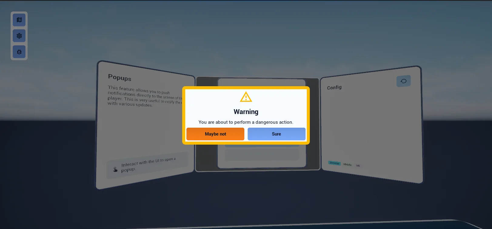
Modal popups anchored in pawn UI space, with configurable buttons, icon, title and body.
What it gives you
- Modal confirmation and message dialogs
- Any number of buttons with hierarchy styling
- Correct spatial placement on every platform
Requires
Required by
None
Description
Popups are for decisions that must be made before continuing. BFL_Popups.Popup_ShowPopup_Default
builds one from an icon, a title, body text and an array of button definitions, anchors it in pawn UI
space and returns the widget so you can bind to the buttons.
Placement comes from a PDA_PawnUIPosition data asset, so a popup sits at a comfortable reading
distance in VR and centred on screen on desktop, from the same call.
Setup
- Enable
AFS_UI_Popups. It requiresAFS_UISpace_PawnandAFS_UI. - Confirm the pawn has
BPC_PawnAbility_PawnUI. - Call the library function.
Usage
Showing a confirmation
Pass two entries in Button Contents and matching Button Presets to style one as primary and one as secondary. Bind to the returned widget's button delegates.
Blocking interaction behind the popup
Use setAbilityRestriction on the pawn to suppress interaction abilities while the popup is open,
then release when it closes.
Key properties
| Property | When to change |
|---|---|
Button Contents / Button Presets | The buttons and their visual hierarchy |
| Position data asset | Where the popup sits relative to the player |
Extending
Derive from WBP_Popup_Default for a different popup layout.
Example map
Map_Examples_Popups demonstrates several popup configurations.
Troubleshooting
The popup appears behind something. Its pawn UI position overlaps another element; give it a dedicated position data asset.
API reference
Every blueprint asset in this plugin. Expand an asset to see its members.
Libraries
BFL_Popups1 members
| Kind | Name | Signature | Description |
|---|---|---|---|
| fn | Popup_ShowPopup_DefaultPopup | (Pawn: Pawn, Outline_Color: PDA_Color, Icon_Color: PDA_Color, Icon: Texture2D, Title_Color: PDA_Color, Title: text, const BodyText: text, ref const ButtonContents: ST_Button_Content[], ref const ButtonPresets: E_UI_Hierarchy[], Sound: SoundBase, __WorldContext: Object, out PopupDefault: WBP_Popup_Default) | Adds a default popup to the given pawn's pawn UI at the shipped popup position, fills it in and returns the widget. The pawn needs the Pawn UI ability component and nothing comes back without one; the popup's On Button Clicked delegate is never broadcast by the shipped design, so override On Button Clicked on a popup of your own to react to a press. |
Widgets
WBP_Popup_Default9 members
| Kind | Name | Signature | Description |
|---|---|---|---|
| event | InitiatePopup | (Outline_Color: PDA_Color, Icon_Color: PDA_Color, Icon: Texture2D, Title_Color: PDA_Color, Title: text, const BodyText: text, ref const ButtonContents: ST_Button_Content[], ref const ButtonPresets: E_UI_Hierarchy[], Sound: SoundBase) | Fills the popup in one pass — colours, icon, title, body and buttons — then plays the given sound half a second later so it lands with the appear animation rather than ahead of it. Called for you by Show Popup Default; call it directly only if you spawned the widget yourself. |
| event | UpdateIcon | (Icon: Texture2D) | Replaces the icon above the title. The image collapses when no texture is given, so the title moves up to fill the space. |
| event | UpdateTitle | (Text: text) | Replaces the popup's title text. The title collapses when the text is empty. |
| event | UpdateBody | (Text: text) | Replaces the body text and re-picks its alignment: under fifty characters it is centred, longer text is left-aligned so it stays readable. The body collapses when the text is empty. |
| event | UpdateButtons | (ref const ButtonContents: ST_Button_Content[], ref const ButtonPresets: E_UI_Hierarchy[]) | Rebuilds the row of buttons along the bottom from the given contents and hierarchy presets, and collapses the row entirely when the contents array is empty. The two arrays are read in step, so the first preset styles the first button. |
| event | UpdateTitleColor | (TitleColor: PDA_Color) | Overrides the title colour with a colour asset, ignoring the theme. Use it to mark the popup as a warning or an error. |
| event | UpdateOutlineColor | (OutlineColor: PDA_Color) | Overrides the colour of the frame drawn around the popup. This is the strongest signal of severity the popup has, so it is worth setting on anything destructive. |
| event | UpdateIconColor | (Color: PDA_Color) | Overrides the tint applied to the icon, ignoring the theme. Pair it with the outline colour so the two agree. |
| event | OnButtonClicked_1 | (Group: WBP_Group_Button, Index: int, ID: name) | Bound to the popup's button row and left empty on purpose. Override it in a child popup to react to a press without binding the On Button Clicked delegate from outside; the index matches the position in the button content array. |